Author Archives: Hope Okoro
Draft Bio statement Homework
My name is Hope Okoro and welcome to my OpenLab ePortfolio. I am currently an ungrad at New York city college of technology studying Communication Design. I’ve originally had a passion for drawing and illustration (still do) since I was small, but I later decided to explore and stretch my potential in the arts by reaching out to Graphic Design when I was 13. From there, I have taught myself to use Photoshop and other digital arts programs, making book covers, fliers, etc for people to build and grow in his field. I have not forfeited my original talent, but I like to try out new things, testing out my potential, which leaves me unsure on whether I want to have a career in the Graphic arts/design, or Illustration.
Getty Images Homework: Topic: Puppies
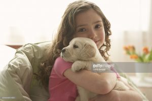
First: Young Girl Holding Her Dog: Image Size 2122 x 1415 px Median | 7.07 x 4.72 in at Resolution 300 dpi, 3.0 MP Credit: Chris Amaral
Choose this one Because it shows a warm relationship between a girl and a puppy. Considering both of them are cute, I’ve decided to choose it.
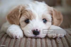
Second: Cavashon puppy: Image Size 5127 x 3418 px Large | 17.09 x 11.39 Resolution at 300 dpi, 17.5 MP Credit:Lee Thompson
Choose this one because, just look at those eyes! just kidding, but who doesn’t like close up shots of puppies?
Photoshop logo exercise 2
Photoshop logo exercise 1
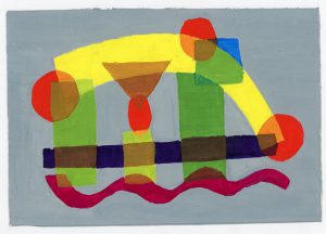
Transparency and Composition Project
This piece, done on Dec 12th, 2016, was another assignment work for Graphic Design Principles 1. The concept of this projects was to find the transparency color where the colors cross or intersect through layering. Some of the shapes had 2 or 3 layers which represented what color that layer will be combined from the shapes. For example, when crossing the blue square and the yellow arc, the transparency revealed a green color. Another example, when crossing 3 shapes thus creating 3 layers; when crossing the red spot, the grass-green rectangle and the yellow arc (all on the left) the transparency revealed the color combination to be a sort of orange-brown color.
Texture figure Ground Project
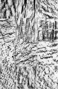
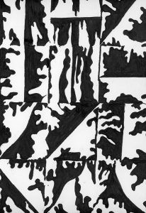
This piece, done on October 13th, 2016, was an assignment work for Graphic Design Principles 1. The concept of this piece is to represent the 50/50 black and white positive and negative spaces (top) from the original textures (bottom). The original texture was traced on to the right in order to figure out the positive and negative spaces and then paint with black ink.

