In the advertisement world, the first thing that catches a costumer’s eye apart from the product, is the company’s logo. A logo (pertaining to a business or company), is an identifying symbol or statement (as used in adverting). A logo can hold different interpretations, positive or negative. Everything about a logo says something about the company; the colors, shape, arrangement, typography, etc. This can sometimes affect the viewer’s interest in what the company is advertising. Therefore, it is the logo designer’s job to make sure the logo correctly represents the company and delivers a vivid message to the audience.
It is the job of a designer to make sure the logo correctly represents the company’s vision. For example, a logo for a cosmetics company, the graphic designer must come with a way to represent the company’s identity and at the same time express creativity to appeal the eyes of the viewers. There are many other cosmetic companies in the world, what will make this one look prominent with its logo alone? The products of the company are important, but the logo, or symbol of the company is also unconsciously important as well. Another component of how a company presents & identifies themselves with the logo to the world is the brand’s tagline or better known as slogans. According to the Merriam-Webster dictionary, a slogan (in advertising) is a brief attention-getting phrase used in advertising or promotion. Famous taglines such as, Nike, “Just Do It”, Apple, “Think Different”, or Nationwide Insurance, “N
 ationwide is on your side”, all are catchy and memorable. The point of these is to appeal the audience even more, creativity appeals the unconscious mind.
The presentation of a logo on online media such as Instagram, Facebook, Pinterest, etc. also matters as the use of social is at an all-time high. When a company aspires to change their logo into something that fits the brand more or brings in more of a “modern look” some may agree some may disagree. Instagram, for example is a popular online photo sharing application media, that allows it users to post and share videos with their friends, which is like Facebook but the pictures are posts, not words. This application was created by Kevin Systrom and Mike Krieger in October 2010. However, the recent change of the Instagram logo sparked controversy in the “Insta-world” leaving the users perplexed at the meaning of the change. The old logo was just a simple vintage-style camera, but was then transformed into a vector-like multicolored camera. This caused dislike for the new logo, some people identified it as “queer” or childish, completely missing the actual message of the logo. According to the company, The new logo hopes to represent “versatility” through its “modernized, simplified shape”, says Instagram, which aims to be better “reflective of the community” using it. Which is agreeable, the logo still represents photography, but the addition however, the multicolor, represents the motley community who use the application. The mastermind behind both logos, Cole Rise, of course, likes it. I Love the minimalism. Regardless of the colors behind it, the white shape – the actual bones of the new symbol itself – is beautiful, and I think that can persist over time. He says. The keys words in his statement are “minimalism”, “symbol” and “persist over time”. This is exactly what the vision of a logo for a brand is supposed t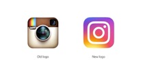 o be in this modern age that it. It can be simple, but communicate the company’s vision all in one symbol. Rise mentioned he was inspired by a good friend of his, Robert Padbury, who is a logo designer as well. He was one of the creators of Apple’s minimal flat design in iOS7. The logo designer’s job is to make sure the logo symbolizes the company, they can have inspiration from modern society to so do. Although the company and the designer are in favor of the new logo design, there are people that criticize it because they aren’t accustomed to the change yet, but over time, hopefully it should make sense to them.
One of the many problems some designers run into when designing a logo, controversy. Here’s another example of a company that made a change to their logo fit a simple, modern look. The Metropolitan Museum aka (The MET). On February of last year, the MET announced its new logo designed by the firm, Wolff Olins. It was sort of a shock in the art community that one of America’s most famous museum, had a logo makeover, an extreme makeover. And like the Instagram logo, people had a lot to say about it. For example, “Mr. Davidson, who saw the design on a Met mailing, wrote that the whole ensemble looks like a red double-decker bus that has stopped short, shoving the passengers into each other’s backs. Worse, the entire top half of the new logo consists of the word the.’” People perceived the logo as “unrelated” to the actual concept of the museum. This current logo is supposed to represent how society changed into a more simple, minimal typography design. It was made into a more ligature typography design, which is quite popular to modern society. MET’s old logo, “…which features the letter ‘M’ and was based o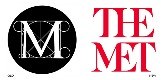 n a woodcut by Fra Luca Pacioli, who taught mathematics to Leonardo da Vinci — has been in use since 1971…’’ This concludes that perhaps people don’t like change, even if it makes sense and it is needed. Or perhaps people do like change, but just no on something that is highly valuable. For example, one designer says, “I’m one for change, but there’s places to do change and there’s places not to do change,” Mr. Rashid, the designer, said. “Museums don’t need to be fashionable.” Think of this like this, what if NIKE suddenly changed their logo? (which isn’t imaginable) People will be always be outraged on logo changes, overlooking the purpose for it, but all takes getting used to. For a fact, all the backlash on a logo change most likely will not change the logo.
Logo are the symbol of a company’s image and their message to the audience. The designer must make sure the company’s message is delivered through the logo. However, While the company and designer are in favor with the design there some problems will face, harsh opinions, backlash, critics, etc. But what the designer understands is that everyone has their own opinions, and if the logo will “persist over time” it will stay.
Sources Used:
Articles
- Dawood, Sarah. “Instagram drops vintage camera logo for new minimal look.” Design Week Online, 11 May 2016. General OneFile, go.galegroup.com/ps/i.do?p=ITOF&sw=w&u=cuny_nytc&v=2.1&it=r&id=GALE%7CA452110984&asid=d402a7fd0bf5f84cf09c6deaa235010c. Accessed 31 Oct. 2017.
- Pachal, Pete. “What the Designer of the Old Instagram Icon Thinks of the New One.” Mashable, Mashable, 11 May 2016, mashable.com/2016/05/11/instagram-old-icon-designer/#owULo9TlzZqT.
- Pogrebin, Robin. “The Met and a New Logo.” The New York Times, The New York Times, 18 Feb. 2016, www.nytimes.com/2016/02/19/arts/the-met-and-a-new-logo.html.
Pictures
Nike logo copyrighted by NIKE
Apple logo copyright by Apple
Instagram logos copyrighted by Instagram crop
The MET logos copyrighted by The MET
PDF Logo Paper

