Final Visual Quote + Explanation

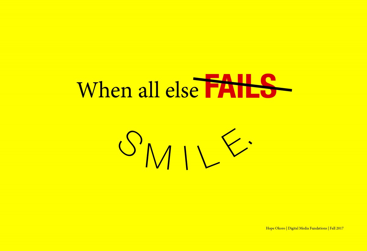
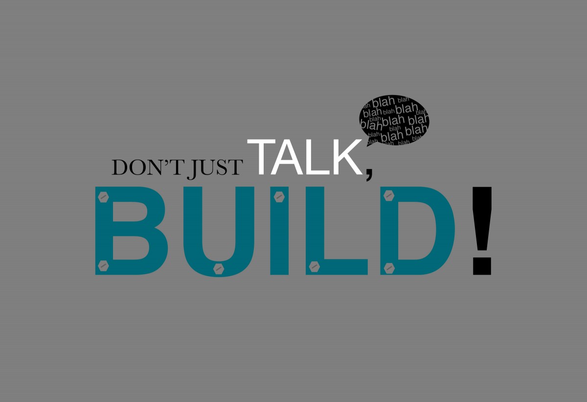
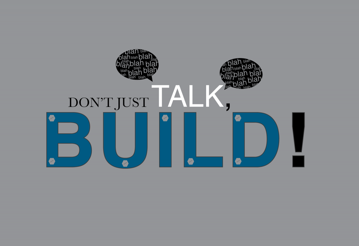
My visual quote, “don’t just talk, BUILD!” derived from a quote I found on the internet saying, “Stop talking and BUILD!”. I did not want to directly “take” the quote so I paraphrased it. I chose this quote because, it not only speaks to me, but to my situation, this is something I always have to remind myself I have a goal I have to build towards.

During the  process in terms of color and font choice, I chose the gray background to add a more of a  serious “attitude” to it. I used two typefaces in this quote, Helvetica and Baskerville. Helvetica for “Talk,” & “BUILD!“, with Baskerville for “Don’t just”. I left “Don’t just in black and in Baskerville, because it’s just not as important as the rest of the message, it’s just the “opener”. The “TALK” is white and about two times the size causes it to stand out. I created speech bubbles with the words “blah, blah, blah” coming from the word “Talk” to visually present the word metaphorically, as though it’s a human being speaking. I had the word, “BUILD!” in (all caps of course), to emphasize the fact a person must build instead of just talking. I put it in a almost navy blue color to add seriousness and a sense of determination as well I also outlined it to stand out further than the rest of the “flat” words.  And lastly, the bolts, I wanted to make the word, metaphorically, look visually as though it’s in the process of being built, and I thought bolts will represent that well.

Museum Response 11/14

Hope Okoro

Museum Response

CDMG 1111

11/14/17

On our class trip to the Cooper Hewitt Museum in Manhattan last week, I found that there were various forms of visual art from different time periods; paintings, clothing (robes, cloths, jackets, etc.), musical instruments, structures and more. This even included graphic design art, something I find the most interest in. Even the art in the museum contributed to the style and design, and convenience of the museum. For Example, the interactive pen, which was the object that helped me save exhibits I found interesting to view later online. Another thing I noticed about the pen was that you draw on a large board that is mainly seen on the first floor that lets a person create designs and find exhibits through a drawing. Personally, I didn’t use that part because I had some trouble with it, so I just observed my classmates use it. However I

One of the exhibits at the museum that I found interesting was Bookshelf, Branch mini, 2010, designed by Joris Laarman Lab with its medium being bronze. Although this isn’t a permanent collection in the museum, Lab was generous to loan it to them. I first thought, before reading the description, this was an old piece that was probably made back in the 18th or 19th century. I didn’t know it was a modern piece. There are many pieces similar to the design but what caught my eye about this particular one was the simplicity of it. Although it’s a bookshelf, the design of it is absolutely art. The arms of the shelf look like tree branches, much like a bonsai tree. It gives me hope that people in this modern age still have this kind of creativity to create art such as so, despite having technology doing almost everything for us.

Another piece I found interesting at the museum was, A Staircase model made in France in the late 18th century. The creator is not mentioned in the museum’s website but this piece was similar to a staircase piece by Robert Adam. This piece was donated to the museum in 2007 by Eugene V. Thaw. The structure looks as though it were made out of wood but, according to the website it’s medium is joined, planed, bent, and carved pear, wrought brass wire, turned bone. This structure is part of the Product Design and Decorative Arts department at the museum. What I found astonishing about this piece is the precise detail, it’s amazing! Especially from the material it was created from, it wasn’t just carved like on regular wood, it went through a long process in order for it to even shape in a certain way. The design overall is beautiful and creative.


Draft Bio statement Homework

My name is Hope Okoro and welcome to my OpenLab ePortfolio. I am currently an ungrad at New York city college of technology studying Communication Design. I’ve originally had a passion for drawing and illustration (still do) since I was small, but I later decided to explore and stretch my potential in the arts by reaching out to Graphic Design when I was 13. From there, I have taught myself to use Photoshop and other digital arts programs, making book covers, fliers, etc for people to build and grow in his field. I have not forfeited my original talent, but I like to try out new things, testing out my potential, which leaves me unsure on whether I want to have a career in the Graphic arts/design, or Illustration.

Getty Images Homework: Topic: Puppies

First: Young Girl Holding Her Dog: Image Size 2122 x 1415 px Median | 7.07 x 4.72 in at Resolution 300 dpi, 3.0 MP Credit: Chris Amaral

Choose this one Because it shows a warm relationship between a girl and a puppy. Considering both of them are cute, I’ve decided to choose it.

Second: Cavashon puppy: Image Size 5127 x 3418 px Large | 17.09 x 11.39 Resolution at 300 dpi, 17.5 MP Credit:Lee Thompson

Choose this one because, just look at those eyes! just kidding, but who doesn’t like close up shots of puppies?