1. What is you’re name and what college are you currently attending
2.what is your major?
3. Why did you choose that major?
4. Where are you from?
5. How was life growing up where you are from?
6.when did you move to NYC?
7. what are the differences between where you grew up and NYC?
8. What do you plan to do after (the college of attendance)?
The Video Interview Project + Explanation
https://youtu.be/laLCF_2kRvc
For this interview project, I would say the process was “fairly hard”. I say this because, I had to meet a deadline; I had to write out the interview questions, get a stable subject, a good location, a decent quality camera and shoot for 45 minutes to an hour (which I ended up not doing). I borrowed my video camera from my mom, since she likes to travel a lot. It’s a bit old but it still did the job. The most difficult part was finding a subject. Everyone I asked were either busy or had an unstable availability time. I had the perfect subject in mind, a good friend of mine, who always knows what to say and is a voice of reason but she had finals and had to study. I couldn’t ask my mother because, she had a cold and in general, she is extremely conscious of how she looks on camera, I didn’t want to deal with that. Randomly asking my classmates to sit down with me for a 45-minute interview isn’t really appealing, they don’t know me well enough to do such a favor for me. So, my last hope, my friend Favour from High school, who goes to a different college (Hunter College) where I visit her sometimes. I was a bit worried on how I was going to convince her to sit down and talk for 45 mins, knowing that she was the type of person to get bored of talking about school appropriate topics after a short while. I then remembered the Professor mentioned that in the end, the video had to be cut down to 2-3 minutes. I asked Favour, and she complied, however, for one condition, if I went to a party with her, the same day she was available for use to shoot. I agreed, then we ended up shooting for a total of 15 minutes at her school, then we partied.
Describing the actual shoot, I shot the interview with my friend Favour, at Hunter College. We shot in various places, because of noise and students walking all over. We shot mid-day on a Thursday, after class (around 3). There wasn’t any place in the school that she knew of that’s small and quiet. That is why in the video, we first shot at some open place, then eventually went to a stairwell. But there were students walking up, down and about, plus the echoing there was making me anxious, I thought that what Favour was saying wouldn’t be audible (but it ended up being alright). I asked her about nursing since that’s her major, what one does with a nursing degree after. She said some interesting stuff about it, even though I despised everything associated to the biology subject. I didn’t shoot the video a straight forward 45 minutes (well, 15 minutes), ended up shooting them in clips, because she kept “messing up” (joking) and I was talking more than I should have.
To the actual editing part, having absolutely no knowledge of Adobe Premiere Pro, except some information the professor told us and showed us. I put the clips on my flash drive from the video camera, and imported them to the program. I used an instrumental version of a song called “I am not my hair” by India Arie as the background music, since it gives off an urban vibe, which fits my subject’s personality. I was learning how to use it as I went along, with the professor and my classmates help. I was actually glad that the video was 15 minutes, otherwise, I would have had trouble picking and choosing what to cut and what to edit if it were longer. For the most part, the editing part went smoothly, despite the slight issue with a clip being missing and the video not saving properly (it was eventually situated). This whole experience, wasn’t fun for me, however, it was disciplining and definitely a learning experience.
Visual Quote Final (revised) + Explanation
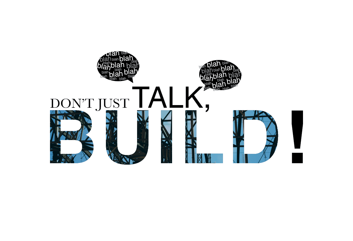
My visual quote, “don’t just talk, BUILD!” derived from a quote I found on the internet saying, “Stop talking and BUILD!”. I did not want to directly “take” the quote so I paraphrased it. I chose this quote because, it not only speaks to me, but to my situation, this is something I always have to remind myself I have a goal I have to build towards.
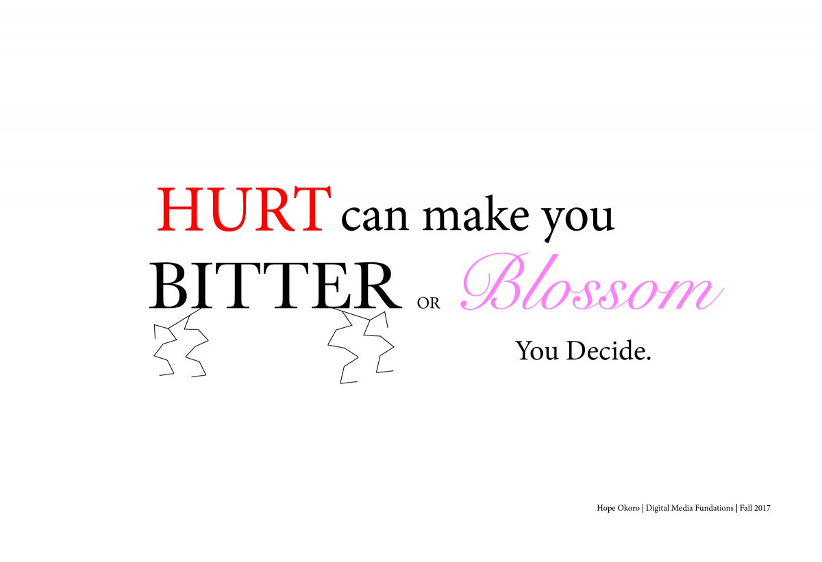
During the process in terms of color and font choice. I used two typefaces in this quote, Helvetica and Baskerville. Helvetica for “Talk,” & “BUILD!“, with Baskerville for “Don’t just”. I left “Don’t just in black and in Baskerville, because it’s just not as important as the rest of the message, it’s just the “opener”. The “TALK” is white and about two times the size causes it to stand out. I created speech bubbles with the words “blah, blah, blah” coming from the word “Talk” to visually present the word metaphorically, as though it’s a human being speaking. I had the word, “BUILD!” in (all caps of course), to emphasize the fact a person must build instead of just talking. In the last one, I put it in a almost navy blue color to add seriousness and a sense of determination as well I also outlined it to stand out further than the rest of the “flat” words. However now, I placed a picture of construction in the form of the text to visually represent the word, “BUILD“. And lastly, I removed the bolts, I wanted to incorporate a real life image of construction to represent the word build, so I removed the illustrated elements to achieve that.
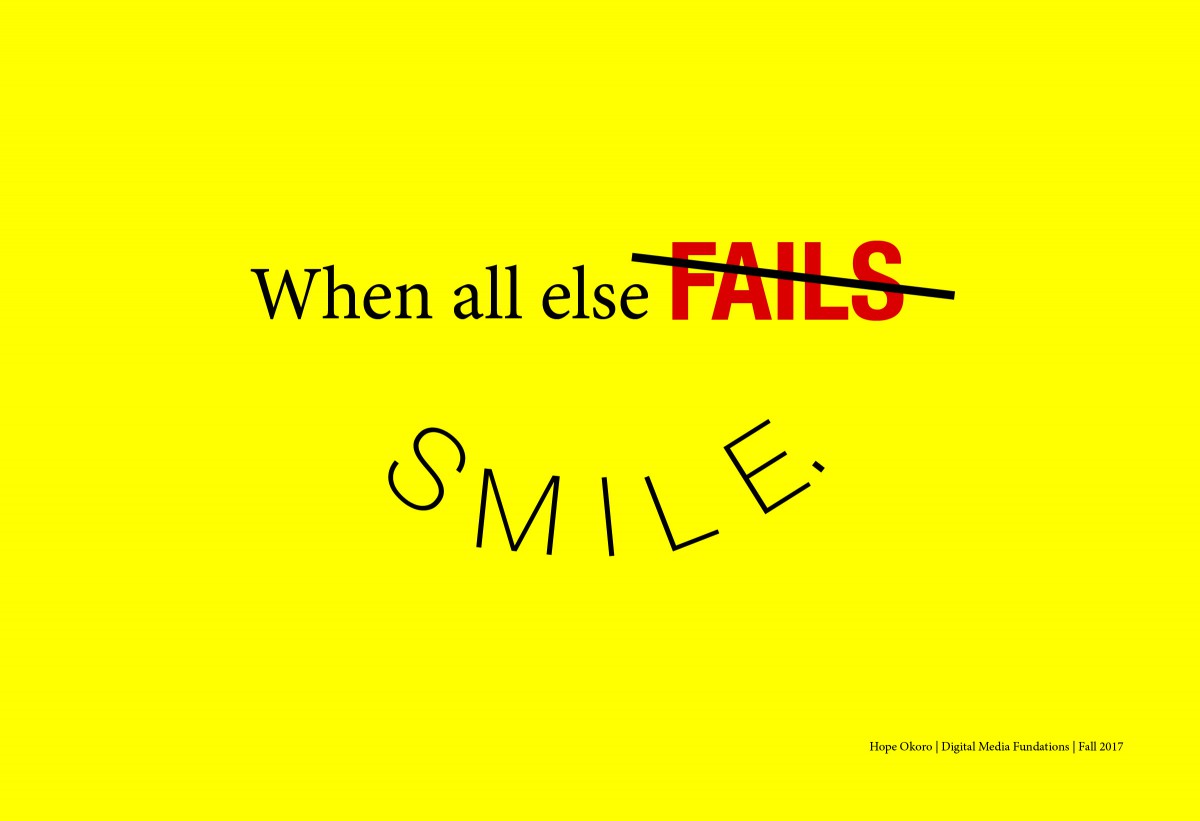
Final Visual Quote + Explanation
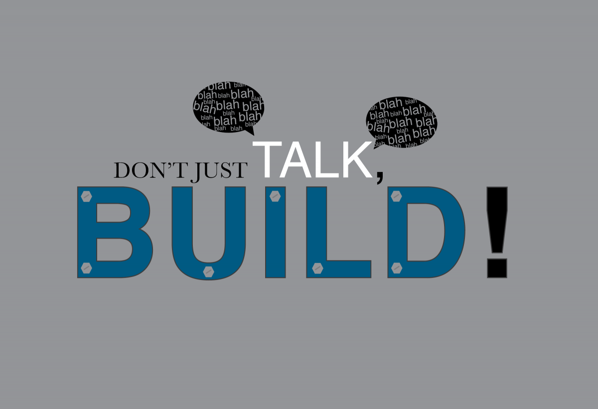
My visual quote, “don’t just talk, BUILD!” derived from a quote I found on the internet saying, “Stop talking and BUILD!”. I did not want to directly “take” the quote so I paraphrased it. I chose this quote because, it not only speaks to me, but to my situation, this is something I always have to remind myself I have a goal I have to build towards.
During the process in terms of color and font choice, I chose the gray background to add a more of a serious “attitude” to it. I used two typefaces in this quote, Helvetica and Baskerville. Helvetica for “Talk,” & “BUILD!“, with Baskerville for “Don’t just”. I left “Don’t just in black and in Baskerville, because it’s just not as important as the rest of the message, it’s just the “opener”. The “TALK” is white and about two times the size causes it to stand out. I created speech bubbles with the words “blah, blah, blah” coming from the word “Talk” to visually present the word metaphorically, as though it’s a human being speaking. I had the word, “BUILD!” in (all caps of course), to emphasize the fact a person must build instead of just talking. I put it in a almost navy blue color to add seriousness and a sense of determination as well I also outlined it to stand out further than the rest of the “flat” words. And lastly, the bolts, I wanted to make the word, metaphorically, look visually as though it’s in the process of being built, and I thought bolts will represent that well.
Visual Quote Semi-Final
Museum Response 11/14
Hope Okoro
Museum Response
CDMG 1111
11/14/17
On our class trip to the Cooper Hewitt Museum in Manhattan last week, I found that there were various forms of visual art from different time periods; paintings, clothing (robes, cloths, jackets, etc.), musical instruments, structures and more. This even included graphic design art, something I find the most interest in. Even the art in the museum contributed to the style and design, and convenience of the museum. For Example, the interactive pen, which was the object that helped me save exhibits I found interesting to view later online. Another thing I noticed about the pen was that you draw on a large board that is mainly seen on the first floor that lets a person create designs and find exhibits through a drawing. Personally, I didn’t use that part because I had some trouble with it, so I just observed my classmates use it. However I
One of the exhibits at the museum that I found interesting was Bookshelf, Branch mini, 2010, designed by Joris Laarman Lab with its medium being bronze. Although this isn’t a permanent collection in the museum, Lab was generous to loan it to them. I first thought, before reading the description, this was an old piece that was probably made back in the 18th or 19th century. I didn’t know it was a modern piece. There are many pieces similar to the design but what caught my eye about this particular one was the simplicity of it. Although it’s a bookshelf, the design of it is absolutely art. The arms of the shelf look like tree branches, much like a bonsai tree. It gives me hope that people in this modern age still have this kind of creativity to create art such as so, despite having technology doing almost everything for us.
Another piece I found interesting at the museum was, A Staircase model made in France in the late 18th century. The creator is not mentioned in the museum’s website but this piece was similar to a staircase piece by Robert Adam. This piece was donated to the museum in 2007 by Eugene V. Thaw. The structure looks as though it were made out of wood but, according to the website it’s medium is joined, planed, bent, and carved pear, wrought brass wire, turned bone. This structure is part of the Product Design and Decorative Arts department at the museum. What I found astonishing about this piece is the precise detail, it’s amazing! Especially from the material it was created from, it wasn’t just carved like on regular wood, it went through a long process in order for it to even shape in a certain way. The design overall is beautiful and creative.
3 Visual Quote Sketches
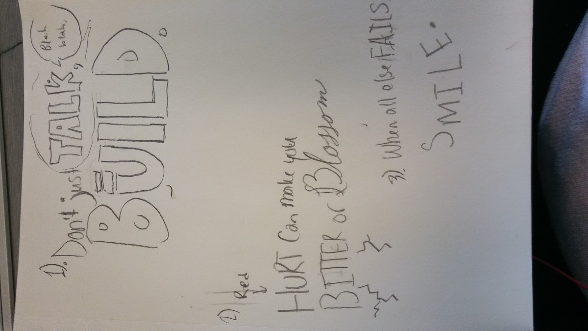
3 Visual quote for 11-7
Homework Exercise: Brightness, Darkness & Contrast
Decreased overall darkness
Increased overall Contrast
Increased overall Brightness
Original

