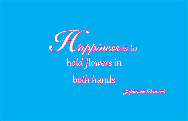
For my first quote I used “SnellRoundhand BoldScript Italic” as my main typeface for my quote. I wanted to give my quote more of fancy look since flowers are known to be pretty I thought making that would go well with my quote. I made the background and made the outline of typeface pink.
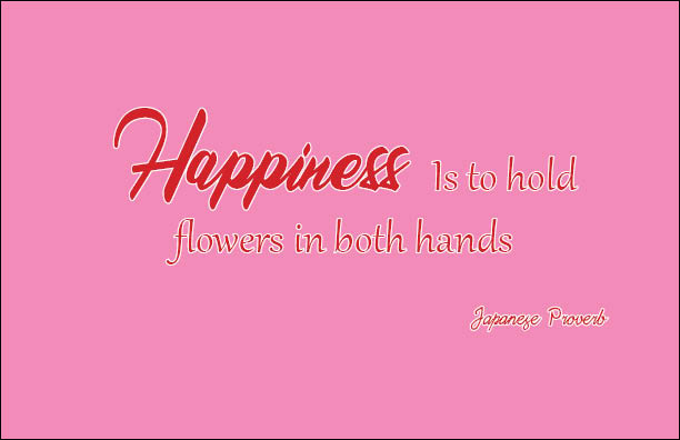
In my second version of the quote I played around with three different typefaces. The word “Happiness” is using the Queensland Free typeface. I guess for my second attempt I wanted to make the first word stand out from the rest. for the rest of the sentence I used the Gabriola typeface. The Japanese Proverb is Daisy Script. I decided to make the background color pink this time and outline my quote in red and white.
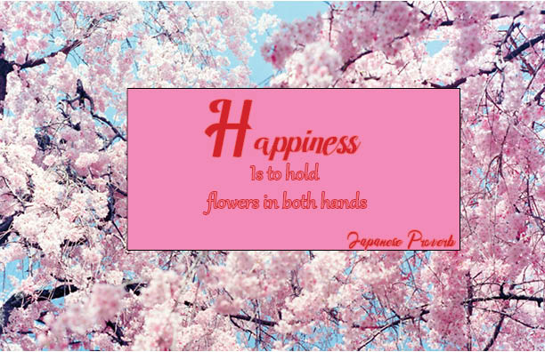
In my third quote I decided to go with Japanese Sakura flowers or cherry blossoms as the background photo. Since my quote is supposed to be connected to Japan using Cherry Blossoms was a great idea to symbolize it. Again wanting the word to stand out, the word “Happiness” is using the Amandella typeface. The rest of the sentence is still using Gabriola typeface, and Japanese Proverbs is using Queensland Free. The colors of the words are pink and red. Now that I think about it I should’ve probably made the color of the textbox something different that way I could make the words stand out more.

