DISCOVER
Reference images
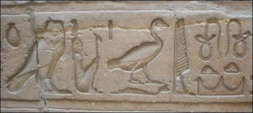
pictograms Hieroglyphs
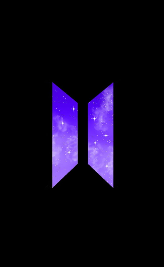
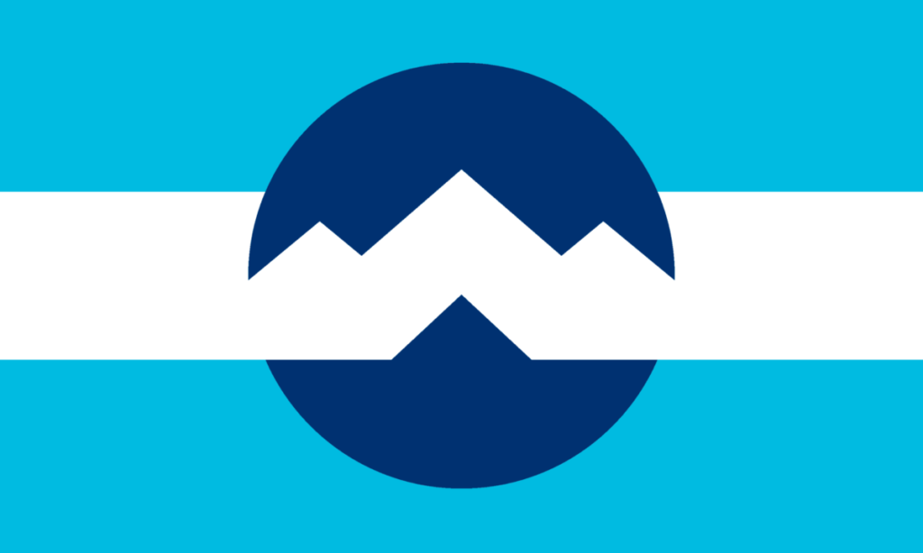
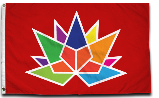
BTS logo/Apple logo/Amazon logo Flags
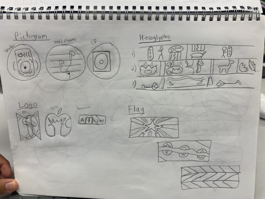
Sketches made from the reference images
DEFINE
Mind Map

final choices (cherry blossoms, unique [bold & wavy line], BTS logo)
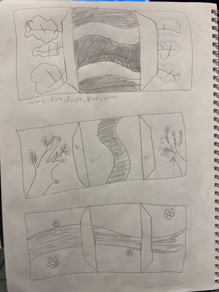
Sketches of my flag compositions
DEVELOP
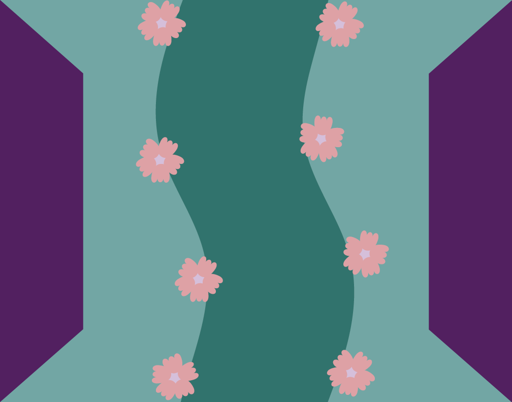
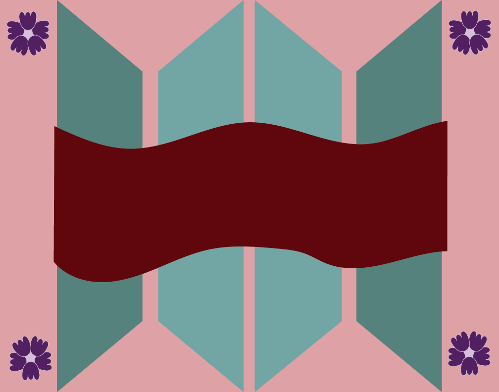
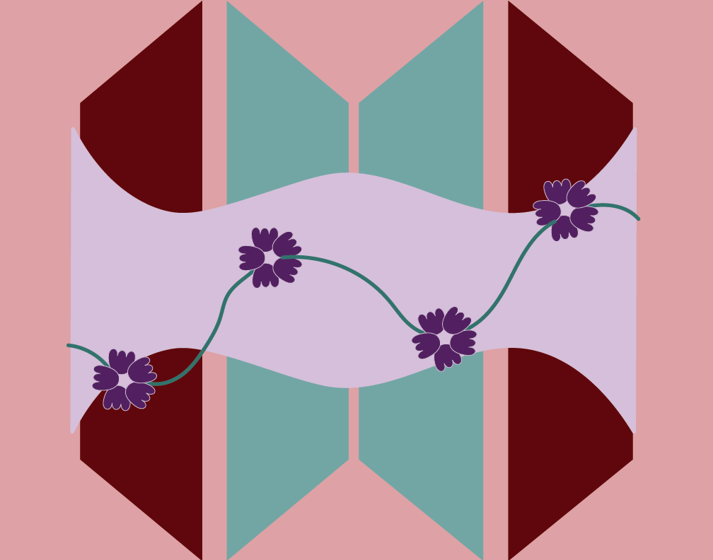
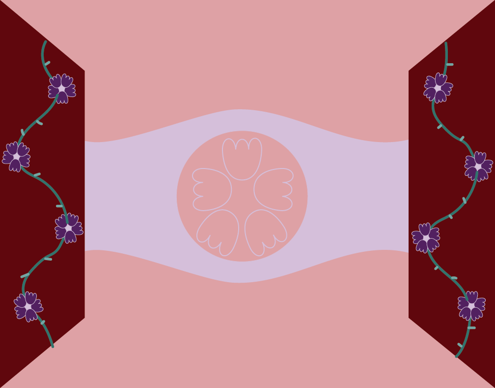
6 compositions of my flag design
Feedback
(was to combine both of these two compositions to create my final outcome)
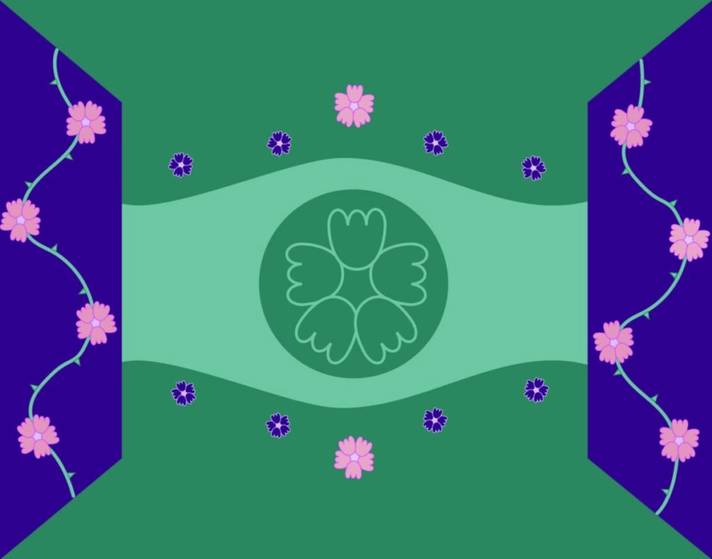
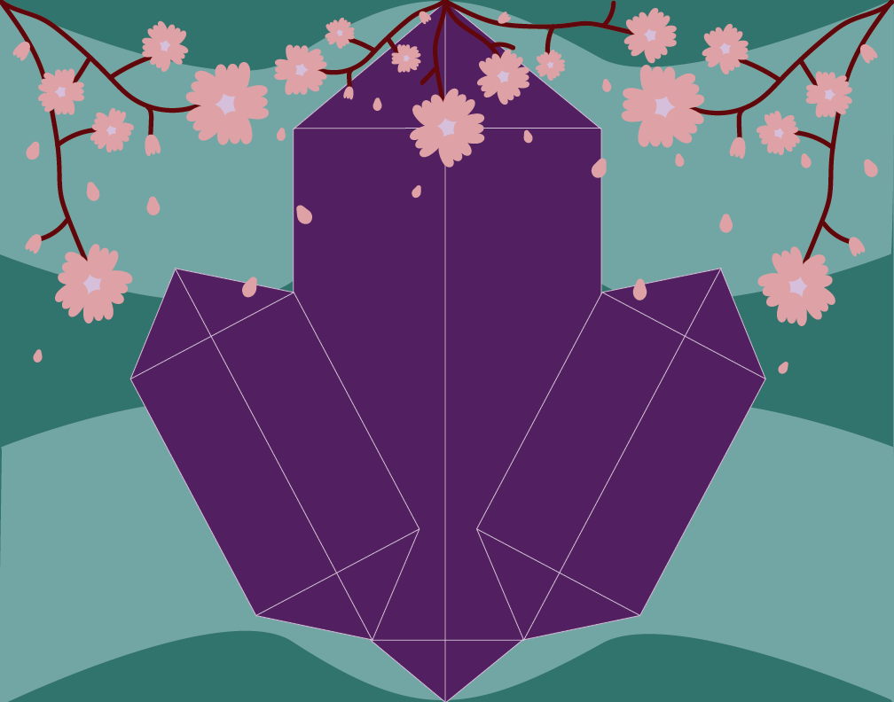
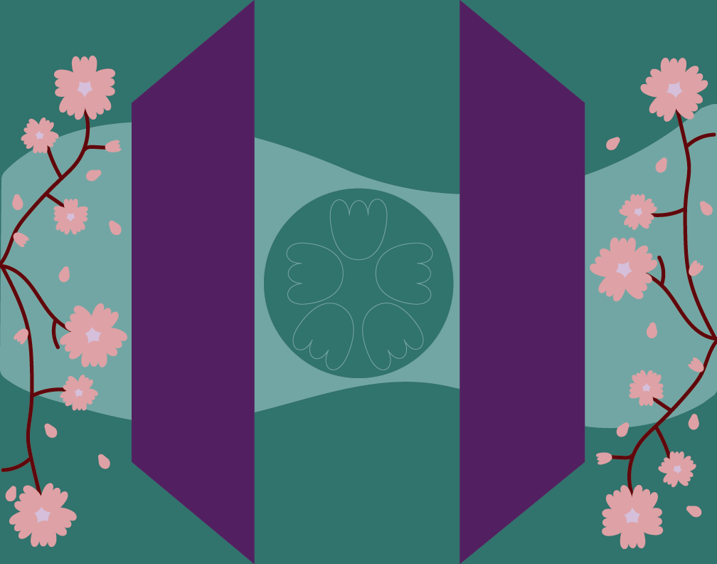
Final outcome of my Flag composition
DELIVER
For the start of this project, I really enjoyed discovering what kinds of elements to use in my flag composition. Ranging from pictograms, hieroglyphs, and logos. When beginning my mind map, I tried to see what aspects represent me. My final choices for those were cherry blossoms, being unique, and the logo of my favorite boyband. To covey the word unique, I thought it could be presented with a bold and wavy line to convey weirdness. I see myself as weird and unique and I see a zigzag as funky which I feel can also interpret the word “weird”. Once I had my final choices, I started on my sketches for my flag. At first, I wanted my flag composition to have the same format as the Mexico flag, being in three columns. That didn’t happen and it came to look like the Korean flag, which I don’t mind considering my favorite boyband is Korean. I wanted there to be cherry blossoms considering I was born in April (where the cherry blossom season begins), so I tried different ways to draw cherry blossoms, I even used Pinterest for inspiration. I tried drawing the cherry tree, cherry branches, and just the cherry flower alone. Another thing that was notable in my sketches was the trapezoid shape, which was the BTS/ARMY logo. BTS is the name of the boyband and ARMY is the name of their fandom, and because I love listening to their music, I consider them to be a big part of who I am. Later on, I was able to put my sketches to vision on adobe illustrator and was able to come up with 6 more flag compositions. In those said compositions I tried changing the arrangement of the trapezoids and the bold wavy lines, along with changing the appearance of the cherry blossoms. I had feedback and was told to try to combine artboard 1 with artboard 6, so I kept the color palette from artboard 1 and just added the elements from artboard 6. I had a tuff time deciding what to put in the middle of the composition, since it looked too bland, but I also didn’t want to make it too crowded. The final outcome of my flag composition was to represent a door with thorny flowers to signify how I can tend to create boundaries with the people I don’t know. But with the door opened can signify how when they get to know me, they are met with a flower-like eye to represent innocence of their surroundings.





Leave a Reply