- Listen & Draw: https://www.youtube.com/watch?v=11iIJ8uSFTw
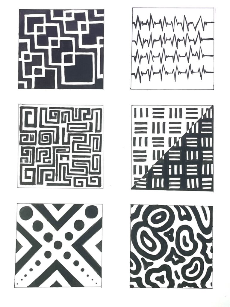
- Define: I chose the song “wutiwant” by saraunh0ly. This song has a very strong instrumental that I wanted to try to convey with negative and positive space. Below I will be explaining my thought process between creating the patterns and how it correlates to the song.

Number layout according to paper:
|1| |2|
|3| |4|
|5| |6|
1 resembles the change in rhythm that occurs in 3:05. I first thought it was the beat that changed, but I realized it wasn’t so I’m not sure what exactly it making the change of rhythm. But regardless, the blocks gradually go further down in the same tune that the beat is slowly going towards the end of the song. Stacking in the middle of each other, like those error pop up messages on window computers.
2 may be a little self-explanatory, but it resembles the beat of the song. The beat is found across most of the song and is the thing that catches your attention the most. I resembled it with a heart beat because of how sharp and deep the beats sound.
3 and 6 reminded me of the sounds that were being made at 0:44, there is a high pitch and a low pitch. The high pitch sound that I tried to recreate with number 3 makes me imagine some kind of maze or noise filter that endlessly goes on. It’s very fast paced and the noise feels very sporadic, hence the random lines going their own direction. 6 resembles the deeper sound in the given timestamp. (Before the part that the beat comes) It sounds like a form being created and constantly expanding. The best way I’d explain it visually would be this example. Every deep noise that is made, another somewhat blob appears and expands, which also pushes them forwards to each other.
5 resembles the incline during 1:40. The song begins to slow down and fade away. I drew that by showing circles slowing descending and shrinking. Showing the
Bristol pad – Measurements

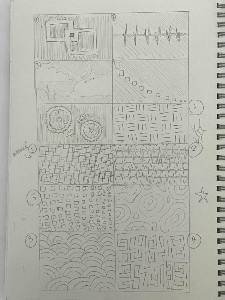
Develop: I don’t have an image showing the sketch done on the bristle pad due to the fact that I work very randomly, and I finished the inking process on some boxes while not even having the rest of the boxes sketched out yet. I usually do that when I still need some time to get more thought and inspiration, while finishing the ones that I already have a full-fledged out idea for to not waste any time. You can tell that the initial sketches and the ones in the finished product look almost nothing the same. For example, 1 in the initial sketch has a LOT of boxes. I was underestimating how much I’d be needing to draw, so I made the load easier for myself and made the boxes bigger, and less of them, to make it easier on the eyes and more comprehendible. 4 Initially didn’t have the line separating and splitting the negative and positives. It was more of an after thought and included it to experiment. 5 got a whole complete makeover. At first it was going to be boxes that become smaller and smaller as they go down, but I thought once again that It’d be too much to handle, and confusing to keep stable. You can tell in the initial sketch I couldn’t really tell anymore where I was supposed to put the squares because of how disoriented everything was. So I fixed it by replacing it with circles that collide with each other. Still keeping that signature wave that becomes smaller. Changing the design during the making of the final product really helps me realize how I can improve, there was a lot of trial and error with this.
Inking – Add Image

Deliver/Reflection: In all, this was a fun exercise. I don’t usually get to work with patterns since I tend to overlook them when creating my own art. I had encountered 2 problems while doing this project. Firstly, alignment. It is very hard to always have your ruler straight, so even if you use a ruler, It still turns out looking crooked. You can definitely see that struggle in 3 and 4. I had initially used the ruler but then gave up when I realized it still looked uneven. The shapes aren’t perfectly symmetrical and the lines are shaky. Another problem I had was inking. Specifically inking the negative spaces. Inking it once isn’t enough, some parts will be lighter than the others. Meaning you have to coat it multiple times. It tends to become very tedious when you have to recoat big negative spaces with a single barley dried out inking pen. There would also be times where I accidentally overshot the pen while inking, completely going over the line. Which I find to be perfectly normal and nothing that white-out can’t fix.


Leave a Reply