Reflection
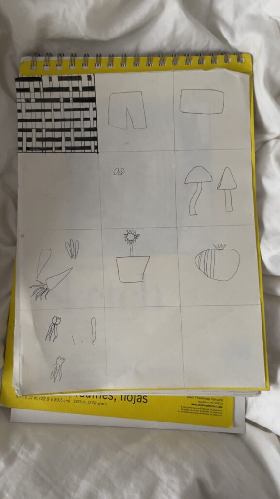
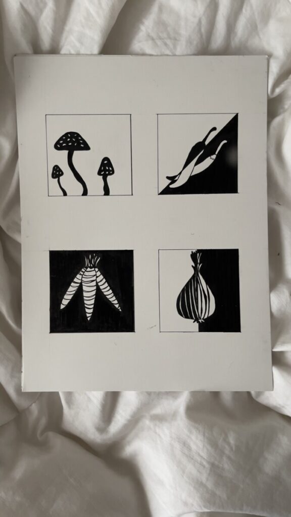
I began this project by exploring three initial concepts: denim, cubism, and mosaics. However, as I dived deeper into the sketches, I realized that these ideas were overly intricate and leaned more towards pattern work, lacking the contrast I was aiming to achieve. After reevaluating my approach, I shifted my focus to simpler, yet effective subject—starting with plants and then transitioning fully to vegetables. Vegetables offer a wide variety of organic shapes and sizes, which provided me with flexibility, and made sketching and inking more forgiving while still allowing for strong visual contrast. I used painter’s tape to achieve the sharp, clean lines, which really brought out the contrast I was hoping for. After stepping away from the project and revisiting it, I could fully appreciate the effectiveness of the contrast.
In hindsight, better planning could have led to a more creative and striking design. Had I started with vegetables from the beginning, I could have spent more time developing creative compositions.
I can improve on maintaining a cleaner workspace to avoid ink marks, and I need to focus on more precise line work during layout creation. Moving forward, I will dedicate more time to the prep phase and ensure that the concept I choose works cohesively across all elements of the project. While I am pleased with the individual compositions, the overall series could benefit from more cohesion and more thoughtful use of space within each composition.


Leave a Reply