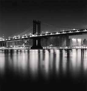
This photograh called Manhattan Bridge by Michael Kenna, was taken in New York City, in 2006. The main subject of this photograph is the Bridge, with it’s lights and the reflection it has towards the water. Which makes the photograph look symmetric. While the lights on the bridge give you the happy feeling, the blurry reflection of the water give you the lonely satisfied feeling. Also it shows the other side of New York City, just because it’s know to be a busy crowed city, it also has its calm beauty within the city where you can relax and be stress free, just by admirring the view.
The way the photograph shows these feelings and moods is by its visual elements incorporated in the photograph. The light it produces comes from the subject, which is called glowing light. With the help of the tone and contrast in full scale, it gives the photograph life to its happy feeling due to the lights on the bridge. Now the lonley but satisfying feeling comes from the water which is considered the texture, emphasizing the light the bridge gives to the blurry water. This can also be considered the negative space, due to it’s major and minor subject. The lines the bridge and buildings produce gives the photograph a clean look, with it’s straight, curved,horizontal and vertical lines. Now the soft focus holds part of the photograph together, with the help of the frame which contains the dark color around it while the light grays and whites are in the center.


I am interested in what you mean by “lonely satisfied feeling.” Kenna’s photos never have people. in that sense, they show an unpopulated city very different from the one we experience day-to-day. By satisfied do you mean that the picture is lonely but not sad? In fact, beautiful and harmonious? I think some of this feeling is created by the photographer’s decision to place the edge of the river exactly in the middle of the picture.
Yes, that is what I mean. I do agree with you that most of the feelings come from the middle.