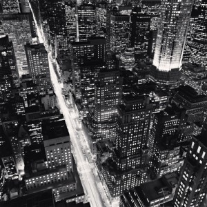
The photograph that attracted my attention was Michael Kenna’s Fifth Avenue picture. The photograph was visually very engaging. The subject matter of this photograph is Fifth Avenue. The feeling is very animated and bright. It shows the liveliness of New York, even though this photograph was taken at night. This photograph is an excellent example of the nickname for New York “the city that never sleeps”. The most amusing part of this photograph is that even though this photograph is photographed in the middle of the night and is a black and white photograph; the viewer can identify the time of day right away.
The photographer has taken this shot from a bird’s eye view. The photograph also uses diagonal lines, the diagonal lines are defined by the Fifth Avenue street and the building structures. The subject matter, Fifth Avenue, is framed with the buildings causing the view to focus on the subject matter, the buildings are also used as a repetitive element in the photograph along with the lights and windows that is creating the rectangular shape. The photograph is sharp overall, there is no part in this photograph that is blurred. The photograph also has glowing light, that is shown by the lights coming out of the windows and the cars passing on the street. The tone is very low key and has a very high contrast since the photograph is a black and white photograph. Michael Kenna also uses a compressed perspective to highlight the fact that there isn’t a lot of space. All the elements used in this photograph helps explain how Fifth Avenue itself is an active and busy place to be. Another thing that makes this photograph so interesting are the windows of the buildings. The light that is shining throughout all the buildings, is something that is very eye catching and make the viewer want to observe the photograph for a long time.


As you note, the strongest visual element in this photo is the diagonal created by the bright light of the traffic on 5th avenue. This would have been taken with a long exposure allowing the cars to dematerialize into streaks of light. We will talk about long exposures later in the semester.