This is my Life In A Day Video that shows my daily routine as a student living in New York City. The video begins with me waking up in my small apartment in Manhattan, taking a shower, and heading outside to start my day. I walk through my neighborhood in the lower east side of Manhattan and take the F train to my internship at City Graphics where I make logos, posters, and banners for government officials, including Mayor Bill de Blasio. I also study animation and create characters using my Wacom tablet to do these tasks. After my internship is done for the day, I take a quick trip to the Metropolitan Museum of Art during my break in between school and work to look at some famous art pieces and be inspired to get started on my own personal art projects. After, I head to my classes at New York City College of Technology where I take three classes. These classes are Art History, World History, and another Art History class. After my classes end, my day is over and I walk past the beautiful Brooklyn streets at night into the train station and head home. This is a daily routine that I have all year long. I hope you enjoy my Life In A Day Video. Thank you.
Visually Enhanced Quotes
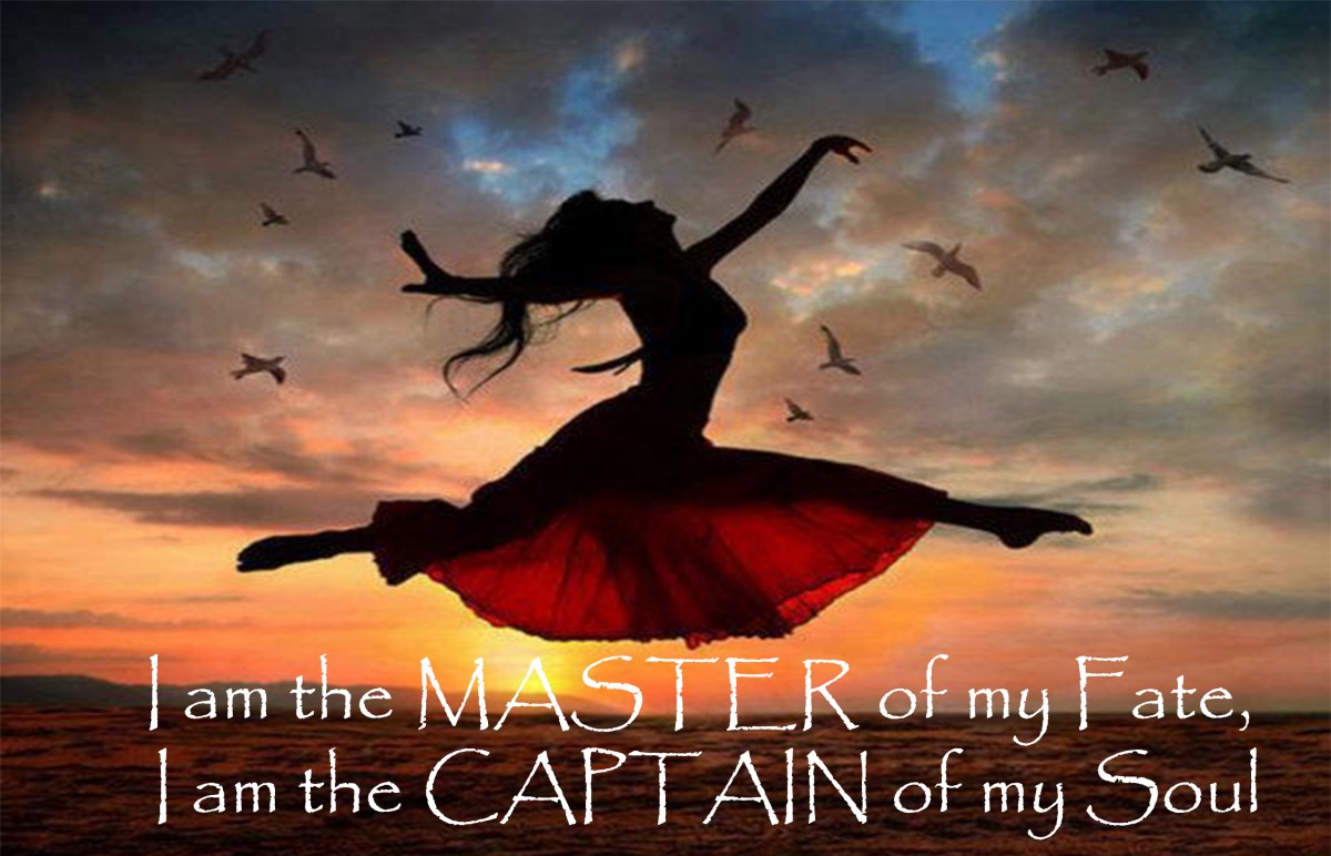 The quote I decided to use for the visual enhanced quote project is one by William Ernest Henley. In his poem called, Invictus, he ends his poem saying, “I am the master of my fate, I am the captain of my soul”. Ever since I read the poem the last two lines always stuck with me and I felt I could best represent this quote with my art. I decided to create an image through Adobe Photoshop with a woman soaring through the air with joy. This carefree woman best represents what it means to feel alive and what I believe is one of the themes this quote represents, that is being able to master your fate, or in other words, be in control of your life. This woman seems to be confident and enjoying her life with her movement as she as free as the birds around her. The font I used for the quote is Papyrus. I believe this font matches the overall feel of the entire sunset and silhouette of the woman.
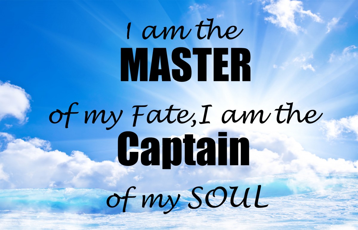 For the second design I decided to create an image also using Adobe Photoshop, of the sun over the clouds and ocean waves blending into them. In the center of the image is the quote itself in an all-black font. I created this image because I felt it emphasizes the meaning of being the captain of the soul or being the one leading your spirit into success. Where a captain who has been in his ship is hopeful of the journey ahead as he looks to the horizon. I feel everyone must be a captain in their life and lead themselves into success. The font I chose was Lucida Handwriting and Impact. I used Impact for the two words “master” and “captain” to emphasize the two important words than went well with the image.
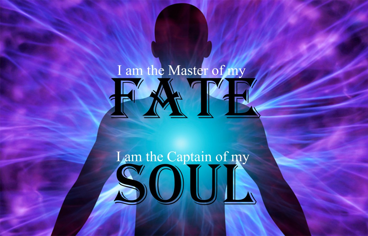 The final design I created using Adobe Photoshop is a silhouette of a man and his soul glowing within his body. The aura of his soul surrounds his body with the text in black and white in front of him. I created this image because I wanted to emphasize the importance of the soul in this quote. To be a captain of the soul means to be charge of your spirit because the soul is what defines all life on earth. I chose Algerian and Mongolian Baiti as the font. I decided to use Algerian for the words “fate” and “soul” because they make the words stand out and be bolder than the rest. These two words are the most important words that match the overall theme of this piece.
Personal Poster

For my personal poster, I decided to spread awareness to texting and driving. I believe texting and driving is a topic that everyone around the world must take seriously. Many people get into car accidents while texting behind the wheel and have caused numerous deaths. I believe if everyone is mindful of themselves while driving, the streets can be a better place for all. I decided to use Adobe Illustrator to illustrate the side of a sports car with blood on it to show the aftereffects of hitting someone while driving because the person was on their phone behind the wheel. On the bottom of my art piece, I put “Don’t Text and Drive” inside of a caution tape to show the severity of the situation. My goal is to make everyone think twice about texting and driving the next time they enter their vehicle.
Personal Logo
![]()
This logo that I created represents who I am in a few ways. I decided to use the first letter of my name as a symbol that lets viewers know that it is my artwork that is being shown below to the audience. I decided to put a crown on top of the letter because the crown is a symbolic headgear that represents power, glory, immortality, royalty and sovereignty. Much of my personal art represents power in the arts and this crown gives power to all aspects of artists around the world. I put a pencil next to my name to symbolize the arts that will mainly be displayed in my page and my personal favorite medium to use. Lastly, I decided to have the letter made from gold to match the overall theme of power and royalty in my logo.
Banner
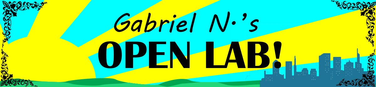 The rationale behind the banner was to make the viewer who enters my open lab page to feel welcomed. A taste of the sunlight beaming through the horizon felt like the most welcoming image that came to mind. At the front is the text, “Gabriel N’s OPEN LAB!” which is a bold statement that suggests you are in right place to see great content. I personally felt that the grass would also be another welcoming item to add to my banner. Surrounding that, I wanted to show an abstract vine of different shapes to show creativity and that anything interesting can be on my page. Finally, I put a small city in the background to give a taste of who I am and where I was raised which I feel really defines me and my art.
Field Trip Report

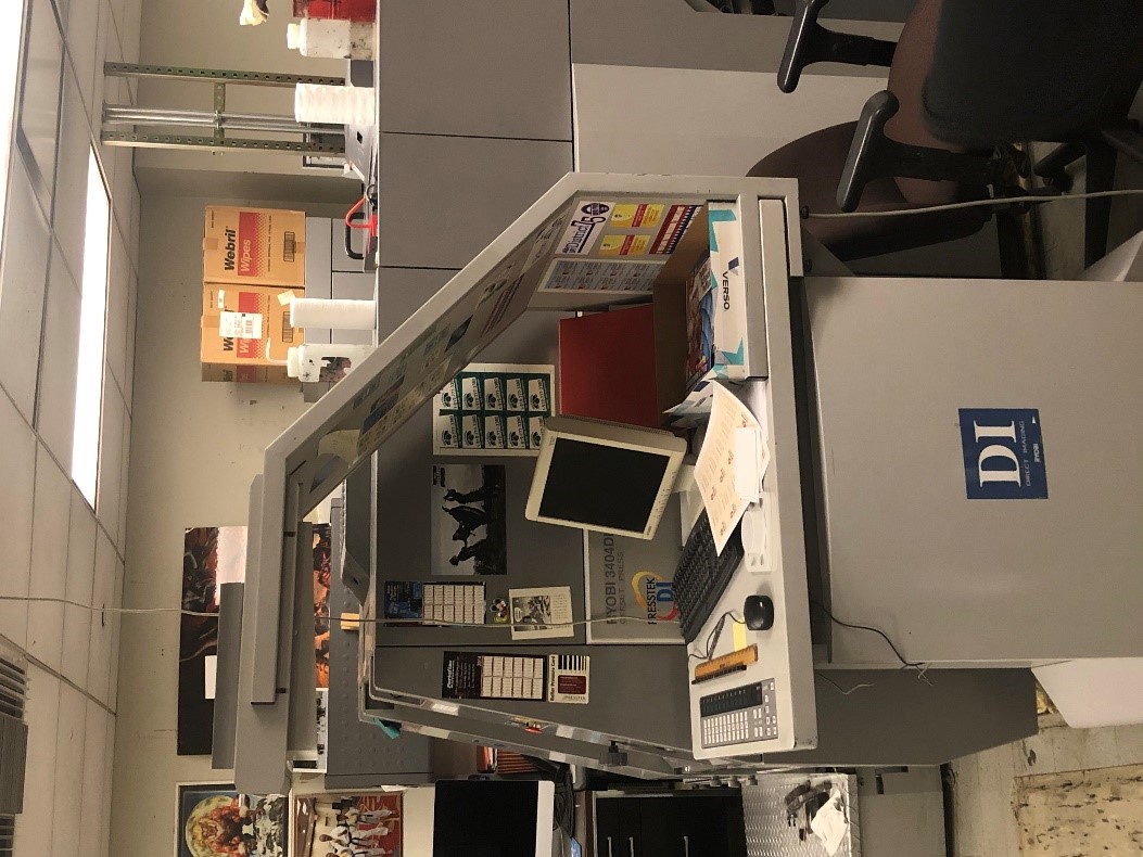
During this filed trip to the United Federation of Teachers Print Shop I learned a great deal on how the production side of graphic design works. I learned that.digital printing can be done in various ways. Two technologies dominate the industry, inkjet and xerography. Digital printing is increasingly utilized for print jobs that were previously printing using offset, flexo or screen printing. There are several other digital printing processes that are geared towards specific niche markets. I also learned about three important printing machines they use for production. The first printing machine used is the RYOBI 3200PFA. This printer can print both sides of the full A3 size, or full 11×17 inch size sheet simultaneously at top speeds of 10,000 sheets per hour. There are quick and easy image registrations on both sides of the sheet that is accomplished by turning dial knobs. This machine offers high speed, superb quality, and significant savings in cost and time.
 The second important printing machine they use for production is the ICTP Platewriter 2000. The PlateWriter 2000 is the second-generation range of Computerto-Plate systems, which produce press-ready aluminum plates without the use of chemical processing. The PlateWriter applies a patented Liquid Dot image on to non-photosensitive aluminum printing plates. The imaged plates are manually fed through an integrated finishing unit that dries the plates and bonds the liquid dots to the plate surface. The finishing unit includes a built-in gumming station to finish the plates for storage or immediate use on the press. This machine is important for production because it sets new standards in cost flexibility and speed. The PlateWriter produces digital plates, which deliver accurate registration and high quality for small to medium format offset printers.
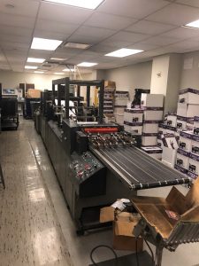
The Final machine that intrigued me and learned about for production is the Didde Glasier 1750. This machine is unique because The Glasier 1750 press is ideal for short run direct mail, business forms or commercial printing applications. It allows maximum versatility in a single press. The process section of the press accepts perforating, die cutting, or punching units interchangeably in any position, providing maximum flexibility for a wide range of jobs. The oil bath system provides maximum lubrication of the gears for high speed production and uses bearings on the plate, impression, and blanket cylinders to provide durability. Finishing options include roll-to-roll, roll-to-fold or roll-to-sheet. The machine not only eliminates tracking but allows it to run very lightweight papers at full speed. All three of these machines help create an efficient production company in the world of graphic design.
Logo/ Research Project
Detective Comics
DC has had a very rich history of producing the world’s top created fictional characters. This includes Superman, Batman, Flash, and Wonder Woman. This company has created content for over 70 years. There world is featured on not only comic books, but video games, posters, television shows, and films. Many of the talented and bright minds of America helped develop this company and see to it that their vision is seen throughout the world for all to enjoy. Not just their characters, but their logo must be iconic as well. DC has undergone may logo changes in its history. DC is known to being very adaptable with their logos with a total of 10 logos from 1940 – present that have been created, each with its own unique personality.
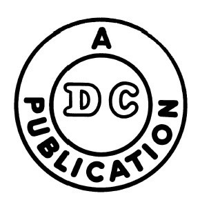
The first logo that was created appeared in 1940 and was created very simply so that readers of the comic books could have an understanding as to who created the comic. This logo contained two circles. One outer circle and one smaller circle on the inside. Outside of the small circle contained the text “A Publication” in bold lettering, all capital letters, and in sans serif type face. Inside the small circle contained the comic book company’s name “Detective Comics” abbreviated to “DC”. These letters are also in monospace, as you can see by the space in between the letters. The text is enlarged with a black stroke and white fill inside in capital letters. There is no ascender or descender in any of these words as they are all the same x-height. The company added no color to this logo to be as simple as possible.
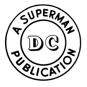 In 1941, a few changes were applied to their logo as they began to develop their reputation for printing their first comics for almost a decade. Nothing drastic was done to the previous logo as it became recognizable to the audience and comic book industry. This version was twice the size of the previous one. The concept remained the same with the two circles. However, the outer words surrounding the smaller circle changed to “A Superman Publication” with the same typeface, but removed the bold lettering style, making it more subtle. The reason for this is because the company developed and the types of comics began to expand, specifically with the introduction of Superman to the company. Superman became very popular, thus having his name included in the logo would give the company more recognition. The text “DC” changed its typeface to serif and included a drop shadow. This gave emphasis to the text jumping out at you and giving it a 3D effect.
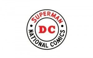 In 1949, DC temporarily changed its name to National Comics, so rebranding had to be done. The company kept the same format, being two circles. However, the wording changed to two different titles which were “Superman” and “National Comics”. They are separate because bullet points are separating the words. Although the company name changed, the abbreviated word “DC” was decided to remain in the same type face, but the drop shadow was removed. The sans serif style remained the same from the previous logo, but red was added to make the logo pop out more. The same color was added to the word superman as well.
 In 1970, DC changed its logo completely, they retired the circular logo in exchange for an actual drawing of its most successful character, Superman. The character is fully detailed, soaring through the air with a black background inside of a circle. However, the wording was placed at the bottom; inside a rectangle keeping the name “DC” and “Superman” which is in proportional space. Yellow is the background color for the rectangle and includes the text “DC Superman” in sans serif type face. However, the “man” in superman is bold, relating to the audience as being a more human figure like everyday people rather than a fictional person. This logo targeted many of its audiences because superman was popular all throughout America during this time.
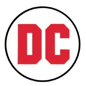 In 1972, DC changed its logo again, but was inspired by their classic logo shape of the circle. DC decided to take on a less detailed and simplistic approach by having a small circle with “DC” in bold letters right in the center. The focus is the typeface itself, being a mix of sans serif and serif. The letter D has no slight projection finishing off a stroke of the letter, but the C does have an inspiration of that. The lettering is also shaved off at the corners to give a more robust look. The letters were the focus, meant to be bold, big, and at your face. These words reflected their characters like Superman and their other iconic character, Batman, in most of their comics at the time. The background was replaced from black to white and the color letter was red with no color strokes.
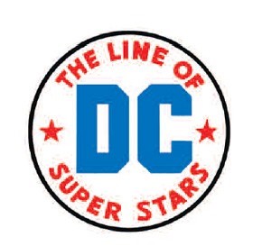 Two years later in 1974, small changes were added to the previous logo. These changes were made because their creation of the Justice League started gaining much popularity. Thus, another rebrand was needed. For example, DC decided to take inspiration from their original logos once more and added wording inside. Not including a second circle but have the words, “The line of super stars” surrounding the DC text. The words are in serif type face, in proportional space, and there are no ascenders or descenders just like in the 1940’s. The old bullet points have been replaced with stars. The color red stayed in the logo, but instead is used as the coloring for the words and stars. Blue has been added to the logo and has replaced the DC’s text color. The DC type face has remained the same. The white background has remained unchanged. The logo was created by Milton Glaser.
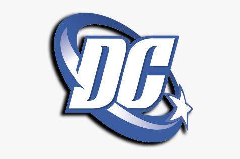 After many years, in 2005, DC decided to update its brand but distort its iconic circle shape and was known as the DC spin. This logo was designed not only intended for comic books, but other forms of media, such as tv shows, films, collectibles, and merchandise. DC was looking to expand its horizons, so a new logo was needed. In this design, the abbreviation, “DC” is the center piece, but the typeface has changed. The D is in serif and letter C is in sans serif. Also, the word spacing is closer in width and almost joined as one in capital letters. The company has removed other words and sentences but kept a single star on the right. The star appears to be circling around the letters because the circle is the tail of the star that goes behind the letters, making the logo itself more 3 dimensional. The color scheme has changed in that blue is the primary color and is the main stroke color for the star, circle, and background color behind the letters. The logo was designed by Josh Batman of Brainchild Studios and DC executive Richard Bruning.
In 2012, DC changed its logo again, but in a completely different turn just like how it did in 1970. This logo was more unique in a sense where their aim was to be more mysterious rather than obvious. It is a clear departure from the almost straight evolutionary path the DC logo had taken over the past 70 years. This logo features a sans serif font underneath a stylized “DC” icon in which the D is peeling back from the C. The idea behind it is the logo is supposed to embody the turning of a comic book page or tearing off an outer layer to unveil a secret identity much to those of their famous fictional characters. Also, the company decided to include the text “DC Comics” all capitalized in serif text, in proportional space, with the text alignment being to the left underneath the logo. The logo color remained the same in that the “peeled off” D is blue, while the C underneath is black.
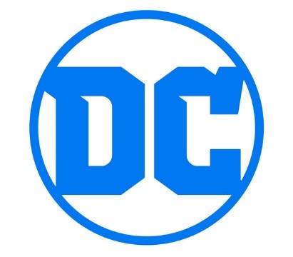 DC’s latest logo, which is the logo they still use today was changed in 2016. The reason behind changing their previous logo was not only the backlash they received, but DC wanted to reproduce and redesign all their original comics into a series they call “Rebirth”. DC worked with an independent design firm called Pentagram to come up with their new logo design. This logo was influenced by their original logo in 1972, where it is very simple and contains their iconic circle shape. The design concept is much the same in that it features a circle with the letters DC inside of it. However, font has changed to both be in serif text and connect with the circle, except the spacing in between the words. The lettering still has the shaved ends but keeps the blue color from the past logo. In fact, it is the only color used, as it is used as the stroke of the circle as well.
DC has had many design changes over the course of its history. Many times, DC has had inspiration from its previous logos. Either keeping the same letters, words, colors, or completely changing it design, DC tries to experiment whenever it has a chance to. This company is still recognizable to his day because of the content is creates and DC can make as many logo changes as it wants because it is so well known today. It is known that DC never sticks to a logo, but it is always interesting to see the next one when it is created.
Bibliography:
- Chris-Sims. “The History of the DC Comic Logo, As Seen Through 70 Years of Internet Comments.” ComicsAlliance, 17 Jan. 2012, comicsalliance.com/dc-comics-logo-history/.
- Edwards, Jim. “Why Everyone Hates DC Comics’ Weird New Corporate Logo.” Business Insider, Business Insider, 17 Jan. 2012, www.businessinsider.com/why-everyone-hates-dc-comics-weird-new-corporate-logo-2012-1.
- “DC Comic Logo Evolution.” Refining Designers-The Elegance of Refine With Basic Principles, www.sureewoong.com/logo-design/dc-comic-logo/.
- “DC Comics.” Logopedia, logos.fandom.com/wiki/DC_Comics.
- “Dc-Comics-Logo-1972.” Logos! Lists! Brands!, loodibee.com/dc-comics/dc-comics-logo-1972/.

