Detective Comics
DC has had a very rich history of producing the world’s top created fictional characters. This includes Superman, Batman, Flash, and Wonder Woman. This company has created content for over 70 years. There world is featured on not only comic books, but video games, posters, television shows, and films. Many of the talented and bright minds of America helped develop this company and see to it that their vision is seen throughout the world for all to enjoy. Not just their characters, but their logo must be iconic as well. DC has undergone may logo changes in its history. DC is known to being very adaptable with their logos with a total of 10 logos from 1940 – present that have been created, each with its own unique personality.
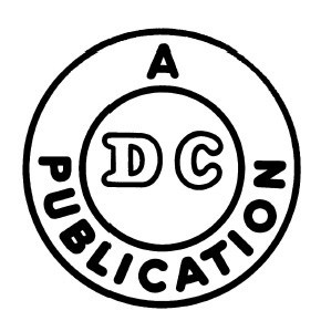
The first logo that was created appeared in 1940 and was created very simply so that readers of the comic books could have an understanding as to who created the comic. This logo contained two circles. One outer circle and one smaller circle on the inside. Outside of the small circle contained the text “A Publication” in bold lettering, all capital letters, and in sans serif type face. Inside the small circle contained the comic book company’s name “Detective Comics” abbreviated to “DC”. These letters are also in monospace, as you can see by the space in between the letters. The text is enlarged with a black stroke and white fill inside in capital letters. There is no ascender or descender in any of these words as they are all the same x-height. The company added no color to this logo to be as simple as possible.
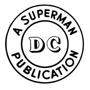 In 1941, a few changes were applied to their logo as they began to develop their reputation for printing their first comics for almost a decade. Nothing drastic was done to the previous logo as it became recognizable to the audience and comic book industry. This version was twice the size of the previous one. The concept remained the same with the two circles. However, the outer words surrounding the smaller circle changed to “A Superman Publication” with the same typeface, but removed the bold lettering style, making it more subtle. The reason for this is because the company developed and the types of comics began to expand, specifically with the introduction of Superman to the company. Superman became very popular, thus having his name included in the logo would give the company more recognition. The text “DC” changed its typeface to serif and included a drop shadow. This gave emphasis to the text jumping out at you and giving it a 3D effect.
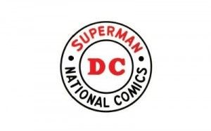 In 1949, DC temporarily changed its name to National Comics, so rebranding had to be done. The company kept the same format, being two circles. However, the wording changed to two different titles which were “Superman” and “National Comics”. They are separate because bullet points are separating the words. Although the company name changed, the abbreviated word “DC” was decided to remain in the same type face, but the drop shadow was removed. The sans serif style remained the same from the previous logo, but red was added to make the logo pop out more. The same color was added to the word superman as well.
 In 1970, DC changed its logo completely, they retired the circular logo in exchange for an actual drawing of its most successful character, Superman. The character is fully detailed, soaring through the air with a black background inside of a circle. However, the wording was placed at the bottom; inside a rectangle keeping the name “DC” and “Superman” which is in proportional space. Yellow is the background color for the rectangle and includes the text “DC Superman” in sans serif type face. However, the “man” in superman is bold, relating to the audience as being a more human figure like everyday people rather than a fictional person. This logo targeted many of its audiences because superman was popular all throughout America during this time.
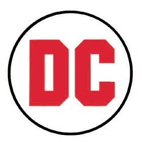 In 1972, DC changed its logo again, but was inspired by their classic logo shape of the circle. DC decided to take on a less detailed and simplistic approach by having a small circle with “DC” in bold letters right in the center. The focus is the typeface itself, being a mix of sans serif and serif. The letter D has no slight projection finishing off a stroke of the letter, but the C does have an inspiration of that. The lettering is also shaved off at the corners to give a more robust look. The letters were the focus, meant to be bold, big, and at your face. These words reflected their characters like Superman and their other iconic character, Batman, in most of their comics at the time. The background was replaced from black to white and the color letter was red with no color strokes.
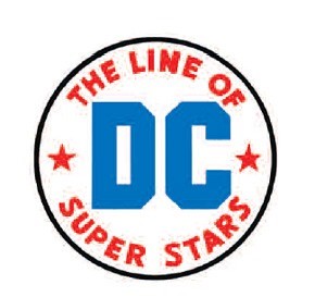 Two years later in 1974, small changes were added to the previous logo. These changes were made because their creation of the Justice League started gaining much popularity. Thus, another rebrand was needed. For example, DC decided to take inspiration from their original logos once more and added wording inside. Not including a second circle but have the words, “The line of super stars” surrounding the DC text. The words are in serif type face, in proportional space, and there are no ascenders or descenders just like in the 1940’s. The old bullet points have been replaced with stars. The color red stayed in the logo, but instead is used as the coloring for the words and stars. Blue has been added to the logo and has replaced the DC’s text color. The DC type face has remained the same. The white background has remained unchanged. The logo was created by Milton Glaser.
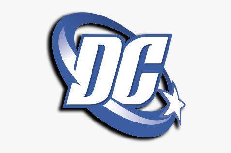 After many years, in 2005, DC decided to update its brand but distort its iconic circle shape and was known as the DC spin. This logo was designed not only intended for comic books, but other forms of media, such as tv shows, films, collectibles, and merchandise. DC was looking to expand its horizons, so a new logo was needed. In this design, the abbreviation, “DC” is the center piece, but the typeface has changed. The D is in serif and letter C is in sans serif. Also, the word spacing is closer in width and almost joined as one in capital letters. The company has removed other words and sentences but kept a single star on the right. The star appears to be circling around the letters because the circle is the tail of the star that goes behind the letters, making the logo itself more 3 dimensional. The color scheme has changed in that blue is the primary color and is the main stroke color for the star, circle, and background color behind the letters. The logo was designed by Josh Batman of Brainchild Studios and DC executive Richard Bruning.
In 2012, DC changed its logo again, but in a completely different turn just like how it did in 1970. This logo was more unique in a sense where their aim was to be more mysterious rather than obvious. It is a clear departure from the almost straight evolutionary path the DC logo had taken over the past 70 years. This logo features a sans serif font underneath a stylized “DC” icon in which the D is peeling back from the C. The idea behind it is the logo is supposed to embody the turning of a comic book page or tearing off an outer layer to unveil a secret identity much to those of their famous fictional characters. Also, the company decided to include the text “DC Comics” all capitalized in serif text, in proportional space, with the text alignment being to the left underneath the logo. The logo color remained the same in that the “peeled off” D is blue, while the C underneath is black.
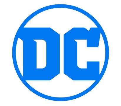 DC’s latest logo, which is the logo they still use today was changed in 2016. The reason behind changing their previous logo was not only the backlash they received, but DC wanted to reproduce and redesign all their original comics into a series they call “Rebirth”. DC worked with an independent design firm called Pentagram to come up with their new logo design. This logo was influenced by their original logo in 1972, where it is very simple and contains their iconic circle shape. The design concept is much the same in that it features a circle with the letters DC inside of it. However, font has changed to both be in serif text and connect with the circle, except the spacing in between the words. The lettering still has the shaved ends but keeps the blue color from the past logo. In fact, it is the only color used, as it is used as the stroke of the circle as well.
DC has had many design changes over the course of its history. Many times, DC has had inspiration from its previous logos. Either keeping the same letters, words, colors, or completely changing it design, DC tries to experiment whenever it has a chance to. This company is still recognizable to his day because of the content is creates and DC can make as many logo changes as it wants because it is so well known today. It is known that DC never sticks to a logo, but it is always interesting to see the next one when it is created.
Bibliography:
- Chris-Sims. “The History of the DC Comic Logo, As Seen Through 70 Years of Internet Comments.” ComicsAlliance, 17 Jan. 2012, comicsalliance.com/dc-comics-logo-history/.
- Edwards, Jim. “Why Everyone Hates DC Comics’ Weird New Corporate Logo.” Business Insider, Business Insider, 17 Jan. 2012, www.businessinsider.com/why-everyone-hates-dc-comics-weird-new-corporate-logo-2012-1.
- “DC Comic Logo Evolution.” Refining Designers-The Elegance of Refine With Basic Principles, www.sureewoong.com/logo-design/dc-comic-logo/.
- “DC Comics.” Logopedia, logos.fandom.com/wiki/DC_Comics.
- “Dc-Comics-Logo-1972.” Logos! Lists! Brands!, loodibee.com/dc-comics/dc-comics-logo-1972/.

