This is a few pieces from my trip to the Society of Illustrators museum.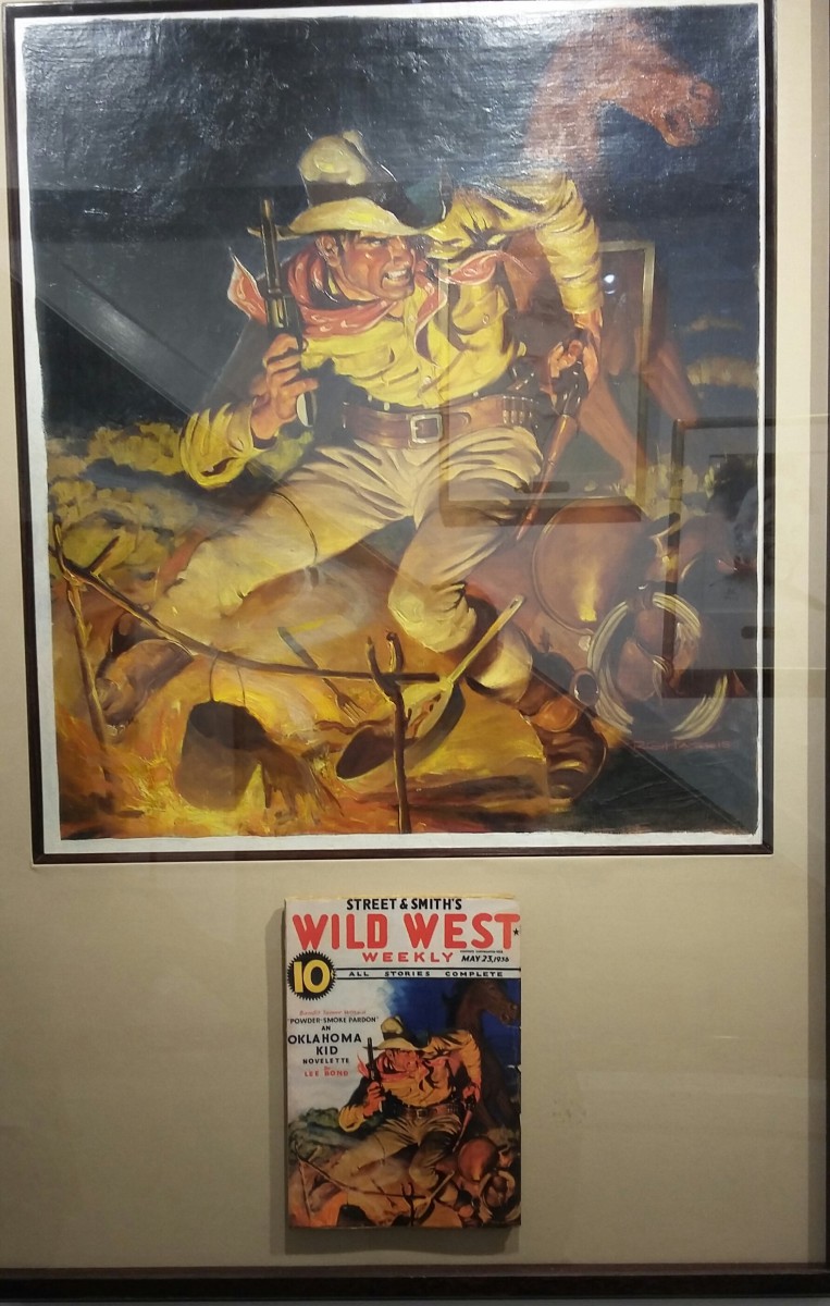
 The painting is incorporated into the cover of this magazine. The painting depicts a cowboy with his guns drawn to portray the wild west. I believe this illustration does a better job of showing tension than with a graphic design approach. Because of the cowboy’s facial expression and body language it makes you want to read the story. The text on the cover follows visual hierarchy. The title and price are the first two things you see followed by the rest of the text.
 +
+
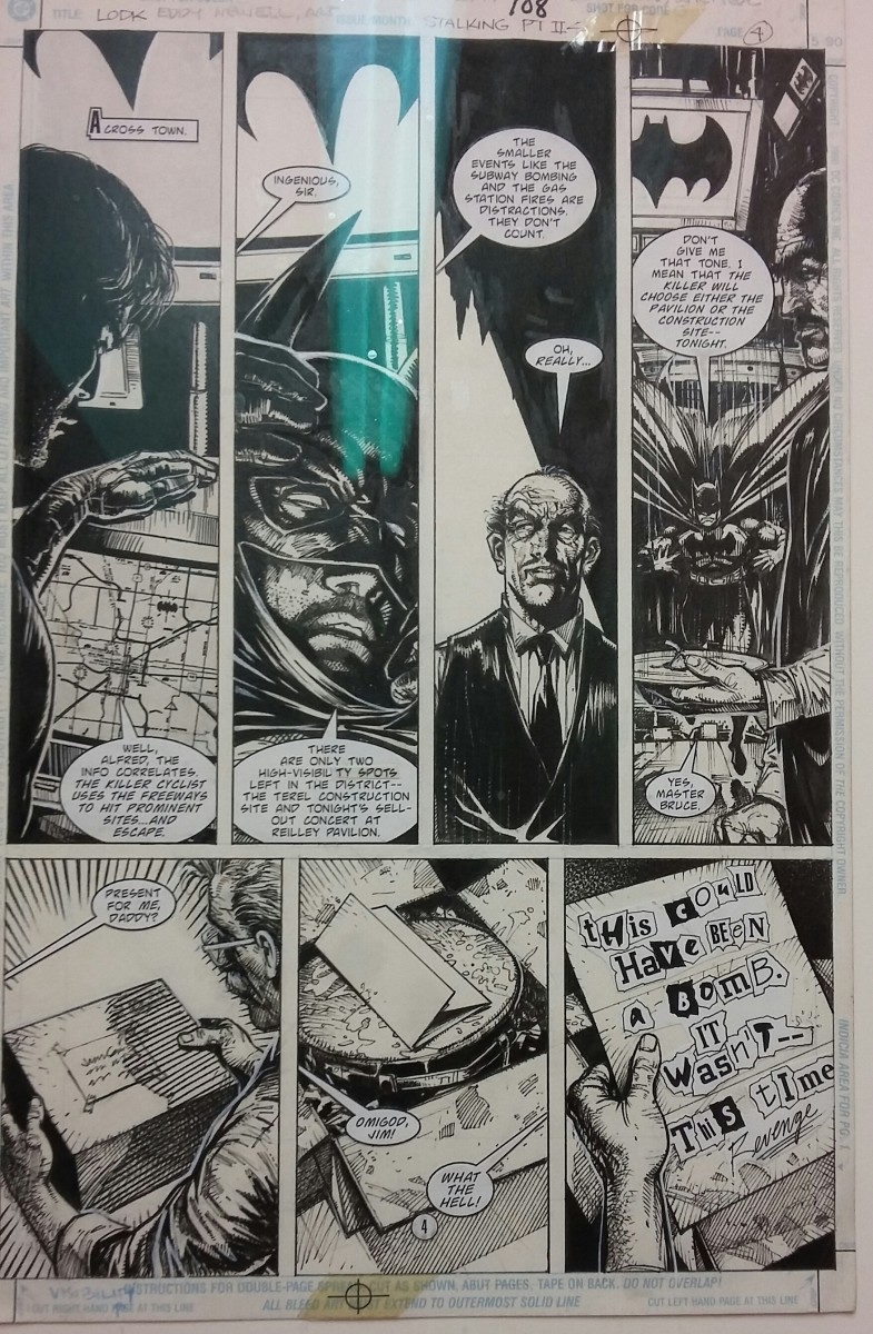
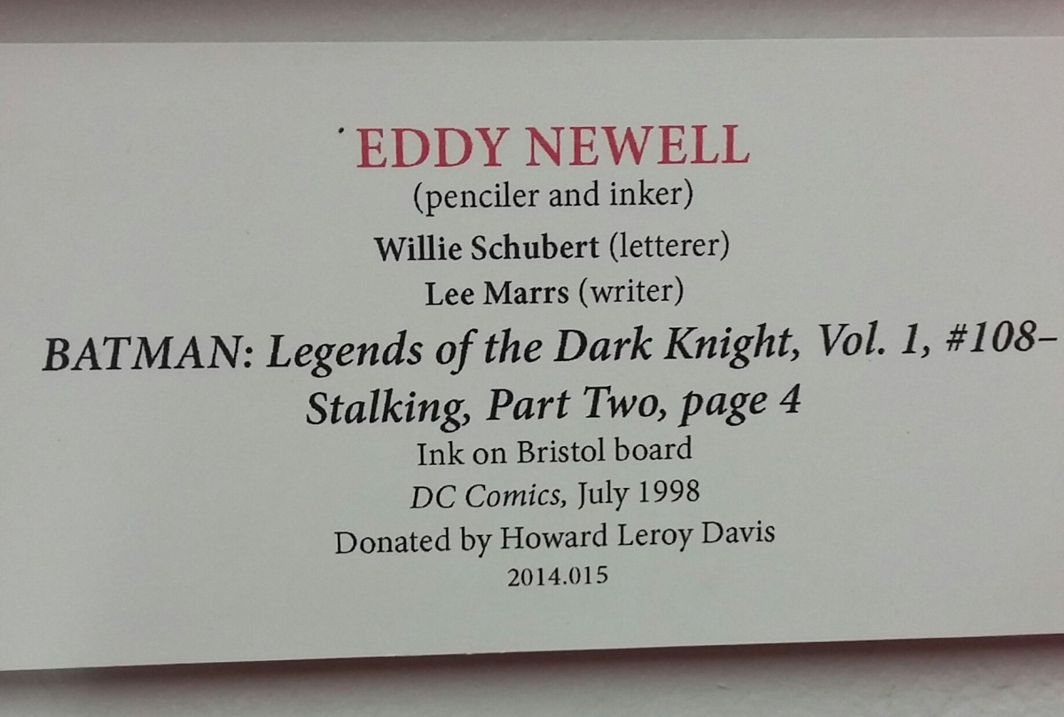
The story for this piece is Batman is trying to determine where a bomber is going to strike next and the same bomber sends a present for James Gordon with a possible clue to the investigation. The title is Stalking and the last three panels portray this well. Each panel is in chronological order. The text is the form of voice bubbles as well the note in the last frame.
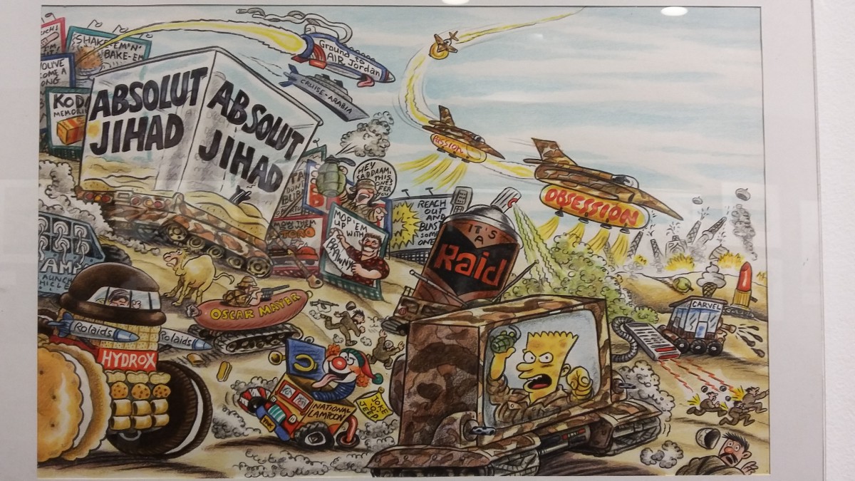
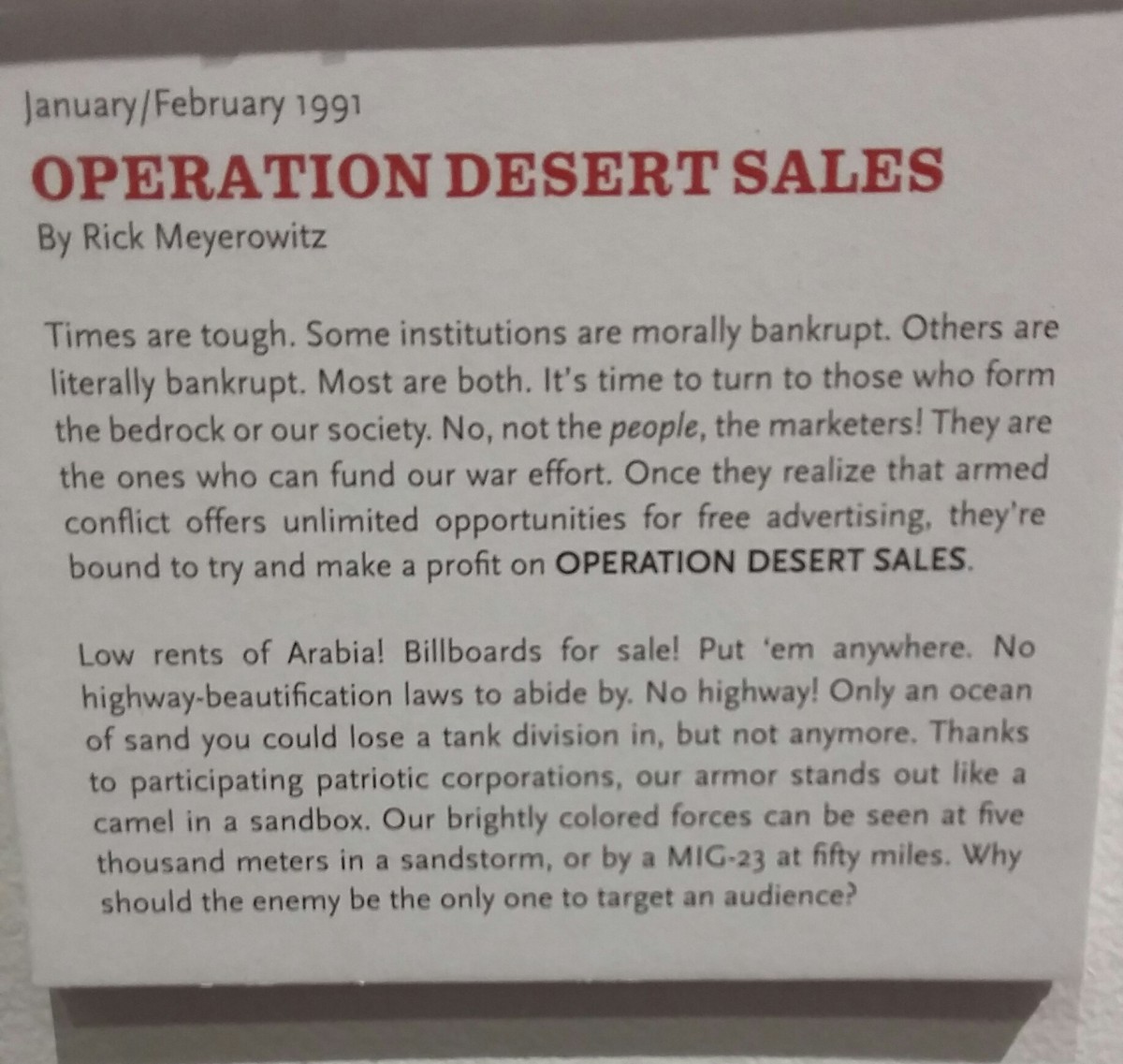
The three themes I noticed in most of the illustrations are satire, pop culture, and political messages. Most of the illustrations has humor in them like in the example above. Even the story that goes with the image is satirical. The example contains pop culture references such as many brand names as well as an image of Bart Simpson. Like most of the art in the museum the illustrator filled the frame with as much content as they can. Most illustrations in the museum are political cartoons. The example I used is a parody of Operation Desert Storm.

