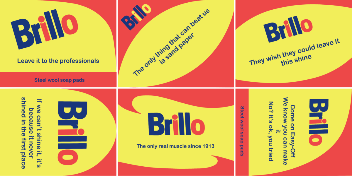
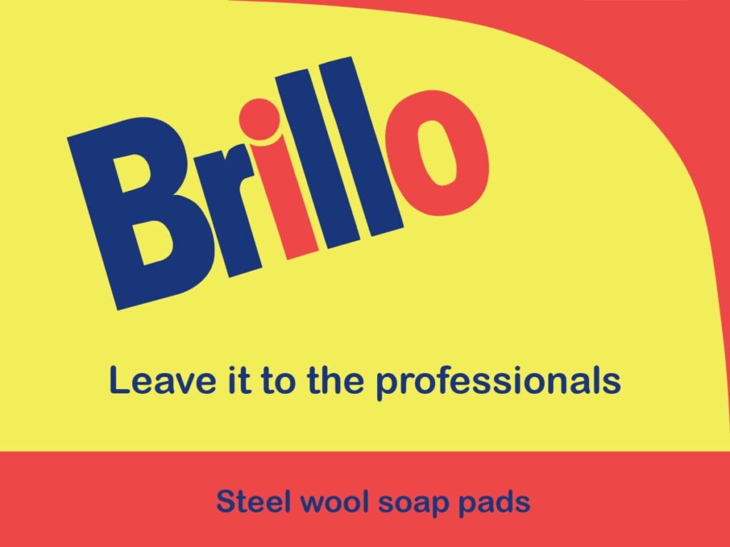
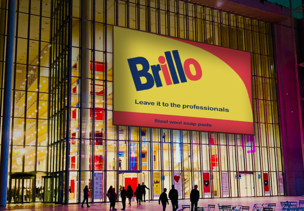
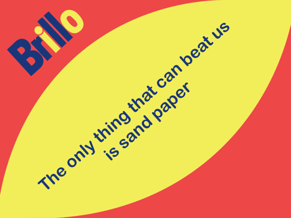
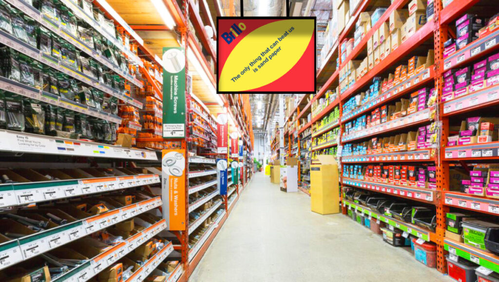
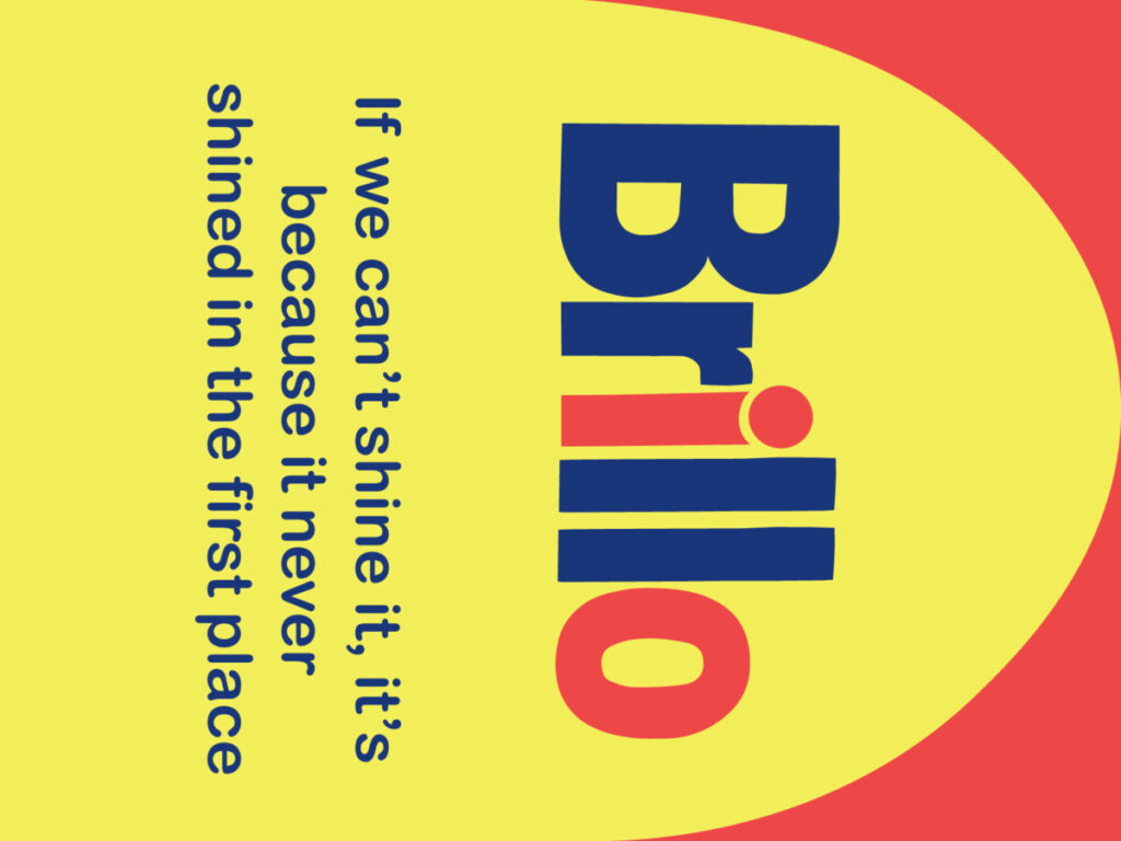
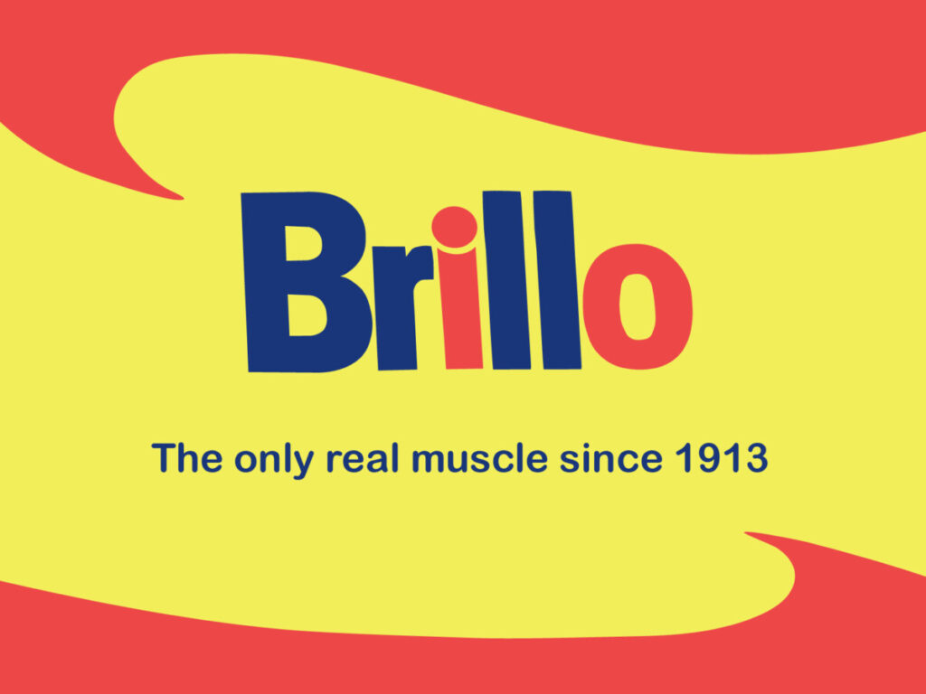
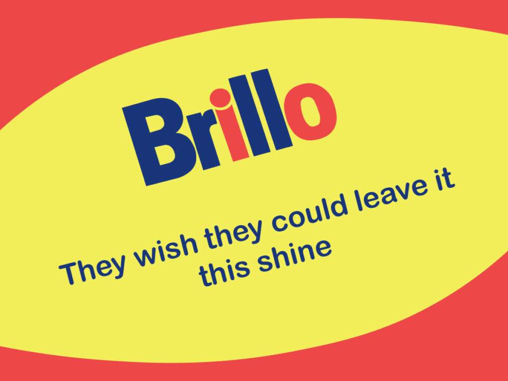
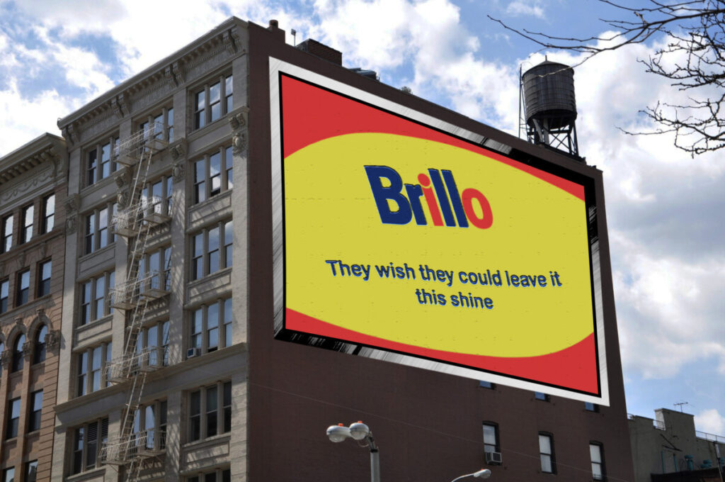
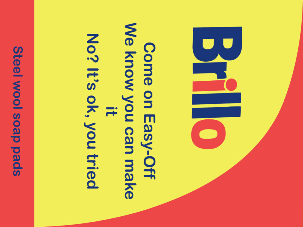
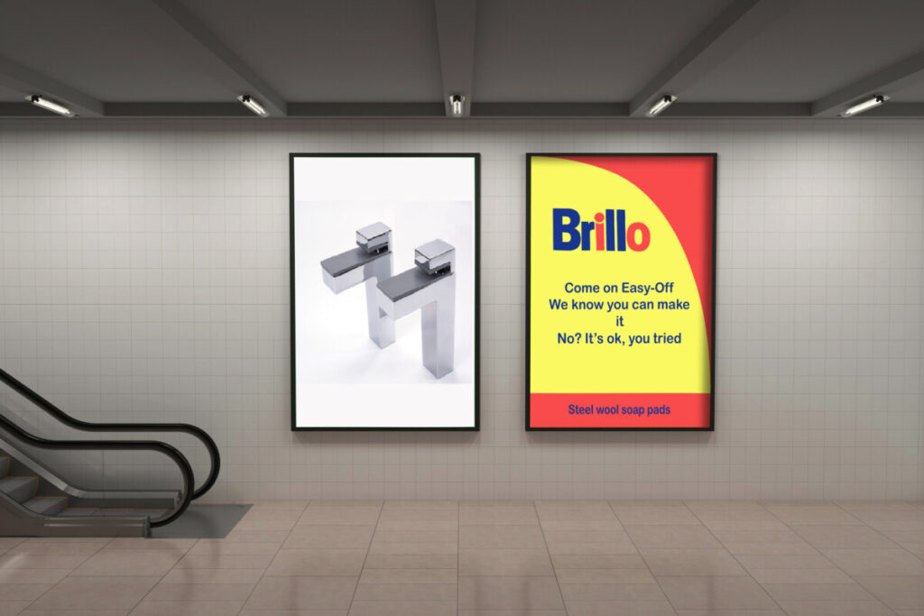
Logo development (Fiallos Entertainment)

Project Description

For this project, the objective was the creation of various logos related to the entertainment industry. The process starts from the creation of the company name, Fiallos Entertainment, to the various sketches, mood boards, color palettes, and fonts that would be used for the final products.

Reflection

The biggest challenge presented in this project was the polishing of what would be the final logo designs. The path of going from sketch to final design took more time than expected, and more changes because they did not meet my final expectations. However, after trial and error, I managed to reach a balance between the message that I was obliged to give and my tastes. I think the result can be improved, but I also believe that they comply with sending the correct message and being easy to identify.

Additional Images

Typography (Canserbero Book)

Project Description

This project is a sample of the different ways in which typography can be used, while also teaching us the characteristics and components of letters and text. This project uses as an example the name and biography of one of the most influential rappers in Latin America called, Canserbero.

Reflection

Typography is one of the most difficult design elements for me to master due to its sheer complexity and certain rules that must be followed in order to successfully convey the message. In this case, it was a challenge to keep the order, structure, and parameters the same, like the font size, typefaces, and legibility. However, I feel that the end result successfully conveys the meaning.

Additional Images

Rihanna Layout

Project Description

A project to create a cover for “W” magazine with the image of Rihanna following the concepts of hierarchy and importance. Its purpose is to know how to distribute the different headlines and the company logo so that the final cover looks orderly and balanced.

Reflection

A project that at first glance, seems simple, but in reality it is more complicated than that. Knowing where and how to place the different headings is not an easy task, it took me a little time to find the correct spacing, typeface, and font size of the different texts so that in the end there would be harmony when I saw this cover. I feel that the final result was better than expected due to its visual simplicity, it does not feel heavy and is easy to read.

Additional Images (Process)