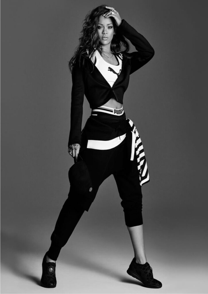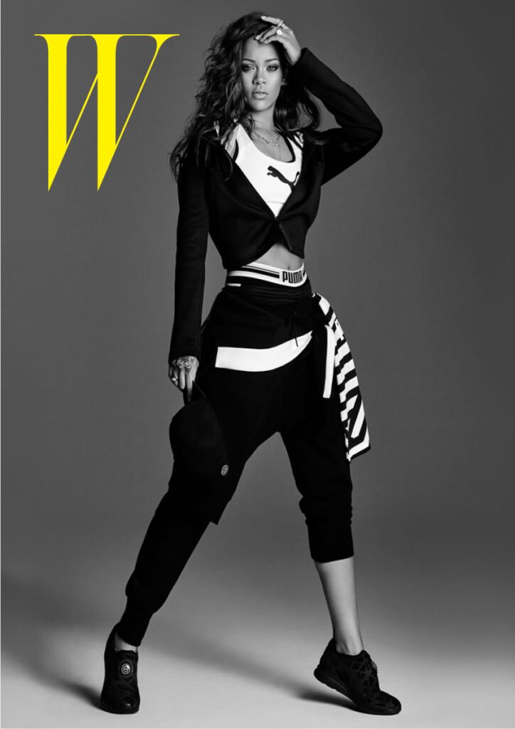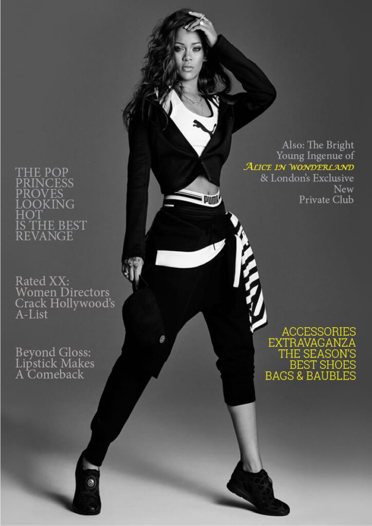
Project Description
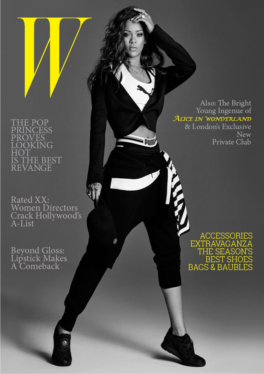
A project to create a cover for “W” magazine with the image of Rihanna following the concepts of hierarchy and importance. Its purpose is to know how to distribute the different headlines and the company logo so that the final cover looks orderly and balanced.
Reflection
A project that at first glance, seems simple, but in reality it is more complicated than that. Knowing where and how to place the different headings is not an easy task, it took me a little time to find the correct spacing, typeface, and font size of the different texts so that in the end there would be harmony when I saw this cover. I feel that the final result was better than expected due to its visual simplicity, it does not feel heavy and is easy to read.
Additional Images (Process)