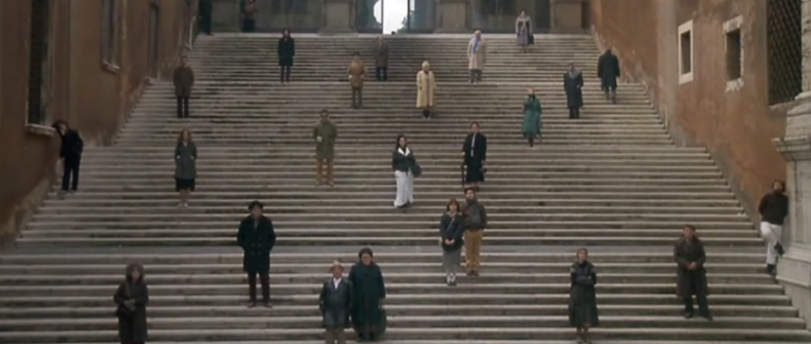
We discussed visual depth in class (see some info. stated below). Your assignment before next session is to take your own photos, and upload at least two of them expressing some of the elements to indicate visual depth.
…There are, of course, times when we wish to make the frame more two-dimensional, even replicating the flat space of an animated cartoon, for example; in that case, the same visual design principles apply, they are just used in a different fashion to create that visual effect. Many visual forces contribute to the illusion of depth and dimension. For the most part, they relate to how the human eye/ brain combination perceives space, but some of them are cultural and historical as well—as film viewers, we all have a long history of visual education from everything we have seen before.
In working toward establishing this sense of depth and three-dimensionality, there are a number of ways to create the illusion—Figure 2.5 is a deep focus shot from Citizen Kane, photographed by Gregg Toland; it shows a great sense of depth in a visual field. In terms of the editing, it is useful to view a scene from more than one angle—shooting a scene entirely from a single angle creates what we call flat space. Elements that create a sense of visual depth include:
Overlap
Size change
Linear perspective
Foreshortening
Chiaroscuro
(there are more!)
Overlap
Overlap clearly establishes front/back relationships; something “in front of” another thing is clearly closer to the observer…
Relative Size
Although the eye can be fooled, the relative size of an object is an important visual clue to depth… Relative size is a component of many optical illusions and a key compositional element in manipulating the viewer’s perception of the subject; it can be used to focus the viewer’s attention on important elements. There are many ways to manipulate relative size in the frame, using position or different lenses.
Linear Perspective
Linear perspective was an invention of the Renaissance artist audience, such as this frame from Brunelleschi. In film and video photography, it is not necessary to know the rules of perspective, but it is important to recognize its importance in visual organization. Director Stanley Kubrick uses it to reinforce the rigid nature of French society in Figure 2.10, a frame from Paths of Glory; he uses strong geometry in Dr. Strangelove (Figure 2.23) for similar storytelling purposes.
Foreshortening
Foreshortening is a phenomenon of the optics of the eye. Since things that are closer to the eye appear larger than those farther away, when part of an object is much closer than the rest of it, the visual distortion gives us clues as to depth and size.
Chiaroscuro
Italian for light (chiara) and shadow (scouro, same Latin root as obscure), chiaroscuro, or gradations of light and dark, establishes depth perception and creates visual focus. Since dealing with lighting is one of our major tasks, this is an important consideration in our work. Figure 2.11 is a shot from Apocalypse Now. See also Figure 4.1 at the beginning of the chapter Visual Storytelling: a masterpiece by the painter Caravaggio, one of the great old masters of the use of chiaroscuro.
Brown, B. (2016). Cinematography theory and practice: Image making for cinematographers, directors, and videographers. (3rd ed.). Boston: Focal Press.


https://openlab.citytech.cuny.edu/ent3290fall2017/wp-admin/upload.php?item=132
https://openlab.citytech.cuny.edu/ent3290fall2017/wp-admin/upload.php?item=133