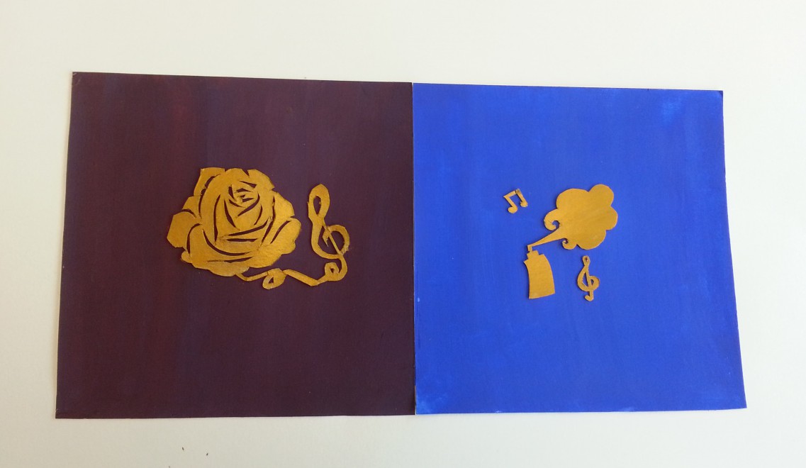
For this assignment we had to work with a partner to make a composition that shows color interaction. we had to create a logo and choose a specific color to represent our partner meanwhile the color of the logo is a shared color we must both agree on. My composition is the one to the right. I was working with my friend Luis and the logo I made for him was a spray can being sprayed with musical notes. I chose this because he likes graffiti and also music and I also made the background bright blue because that’s the color that seemed to match him the most. We agreed on gold as the shared color because it represents prosperity, luxury and success. personally its one of my favorite colors. I couldn’t make the color gold out of regular paint so I had to buy the gold paint. I thought it might be distracting to have the center color in gold because of its shine but I tested it out on scrap bristol before i painted the logo and it turned out just fine.
About Me
Write a brief paragraph about yourself and your academic or career goals.Contents
Learning Blog Archives
-
Recent Posts
Categories
Tags
- adv1100
- analagous
- black and white
- blue
- chromatic
- collage
- colors
- cool
- cut out
- cutpaper
- figure ground
- gold
- green
- grey
- greyscale
- high key
- hue
- inked thumbnails
- interactions
- interlocking shapes
- logo
- low key
- mosaic
- muted
- portrait
- prismatic color
- purple
- saturation
- split complementary
- spring
- squares
- stable ground
- symmetry
- Topography
- value
- warm


