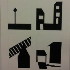
Starting this project I really had a set image in my head of what I wanted to draw, and by the end I had completely changed what I wanted to accomplish. At first I wanted to show just one angle, but adapt it and add new details in each time. But I ended up just doing four different angles with only a few similarities between them. I think my work came out pretty good, and for the time I spent just cutting the paper to shapes I needed I hope it came out well. All together this project showed me to look at this deeper, take in all the shapes and make each one of them their own character. From top left to bottom right, the cut-outs represent a street sign, the sides of 2 separate houses, a garage and a fence, and the last one is part of a house, a garage/driveway and a walkway. Yeah.
Dillon Sykes's ePortfolio
A City Tech OpenLab ePortfolio


Good job on the cutout. I can easily tell the difference between stable and ambiguous. I can’t tell what the third thumbnail is really, like I don’t know whats on top of that building or something. But its still cool.
I like your description. I can actually see it in my head. The cut outs look really neat. As well I am able to tell what is the difference to what is ambiguous and stable. My favorite is the bottom left corner thumbnail. It looks like the stairs are running into the small house. The top left corner is really nice too. Bam! This is my comment.
I can tell which ones were ambiguous and stable in the cut compositions. They really help me picture a story of what you see from your window. You view a street sign, houses and train tracks, kind of like a suburban view of your area. Furthermore, the way you economize your composition is very good. You used less on your stable compositions and can tell which is the foreground based on the black and white contrast. What I would improve on would be to make your 2nd ambiguous composition better since there is no focus point and you can only tell it is a garage and house of some sort. Overall great composition.