Table of Contents
Project Overview
Theme: Discover, define, and visualize what drives your curiosity while learning about the basic principles of composition to improve your design practice.
Problem: Create 4 figure-ground compositions (2 ambiguous, 2 stable) using simple black and white shapes.
Limits: simple, flat, black and white shapes, no lines or text.
Materials: Sketchbook, camera/phone, pencils, marking pens, 1 sheet Bristol Board 9×12″, ruler/t-square, tracing paper.
Concepts: Shape (Organic, Geometric), Frame, Positive/Negative Space, Composition, Figure-Ground Relationships (Stable, Ambiguous), Economy/Less is More, Unity.
Technical Skills: mind map, thumbnail sketching, measuring with ruler, inking.
Learning Outcomes
For the successful completion of this project, you should be able to:
- Practice design thinking using mind mapping.
- Discover and communicate abstract concepts through writing.
- Develop multiple versions (iterations) using thumbnail sketching and refined sketches.
- Demonstrate an understanding the basic principles of composition.
- Demonstrate attention to detail and craft using precise ruler measurements, drawing techniques, and inking pens.
- Share each phase of the design process by posting to the class site and providing critical supportive feedback to classmates.
Design Process
- Discover: Make a Mind Map
- Define: Sketch + Iterate
- Develop: Inked Compositions
- Deliver: Post and Comment
1. Discover
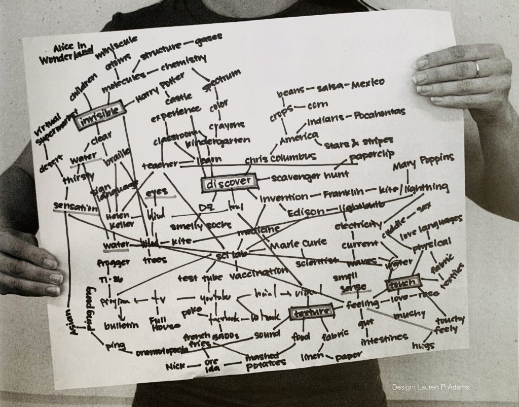
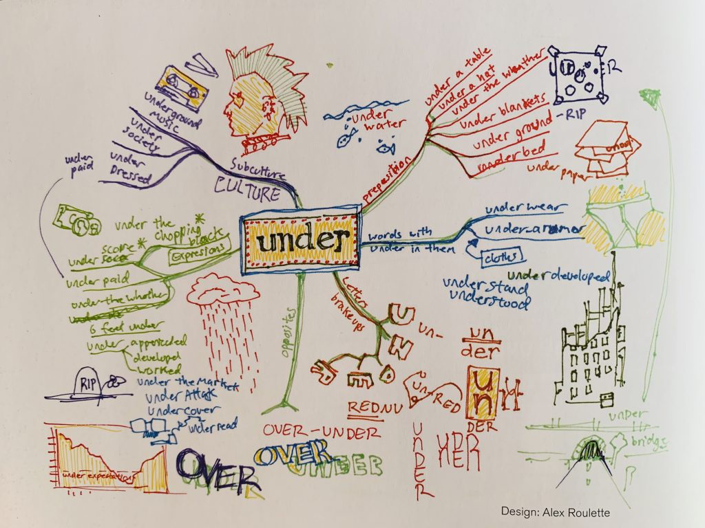
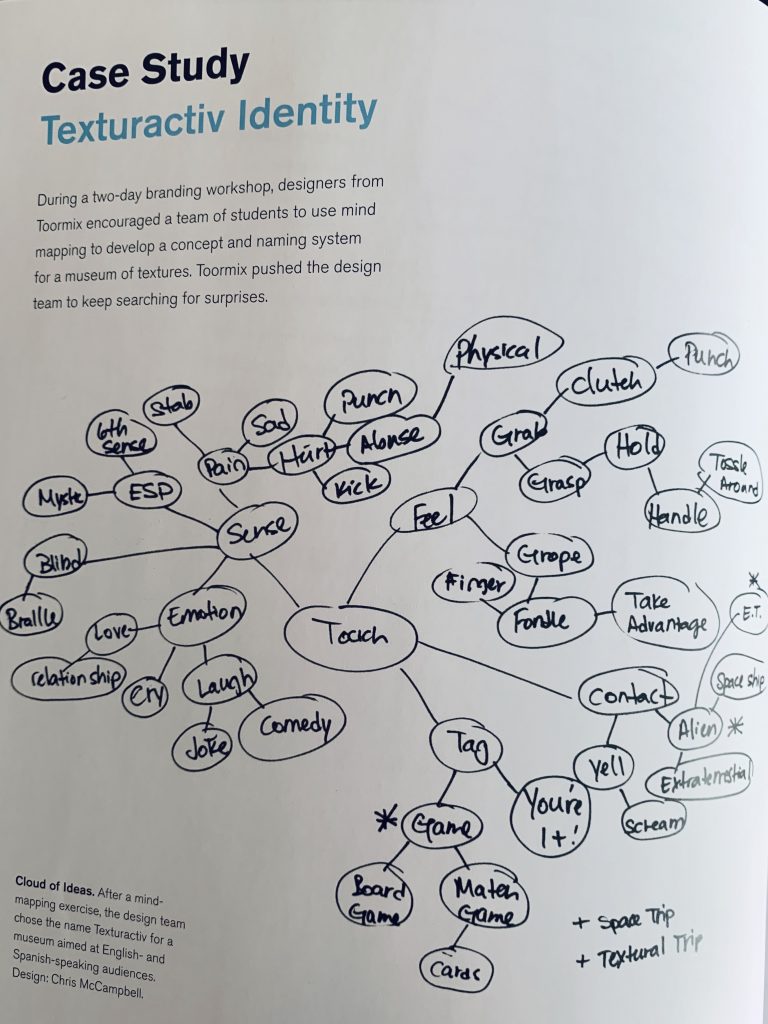
Make a Mind Map
Mind Mapping is a research tool that helps designers to quickly explore a concept or design problem. Starting with a central term or idea the designer quickly finds associated words or concepts.
- Find Quiet. Find a quiet space to think. Or use headphones or earplugs.
- Open a Blank Page. Open a new page in your sketchbook.
- Write Curiosity. In the center of the paper write the word Curiosity. Draw a box around it.
- Branch Out. Draw lines out from the center box. Add words or drawings that represent curiosity; the things you do, think, feel, see, that give you that feeling of curiosity- of wanting to know more.
- Organize. Are there certain words or concepts that hold more importance than others or that are actually subsections of a main idea? Visually group these in some way using boxes, circles, patterns, arrows, colors, etc.
- Highlight. Choose 2 concepts from all the words or concepts in your mind map that give you that feeling of curiosity, or wanting to know more.
Document & Write about it
Take a photo of your mind-map.
In your sketchbook, preferably on the page following your mind map, write the heading: ‘Curiosity” and the two chosen concepts from your mind map. Compose a minimum 1-paragraph explanation about why the final concepts from your mind map drive your curiosity. What does curiosity feel like? Is it like playing a game or trying to solve a puzzle? What other thoughts or feelings does it bring to mind? How might you represent these concepts?
Study the Design Principles
- Composition: The formal organization of elements in a composition arranged according to principles that will support the communication of the concept.
- Frame: This boundary (rectangle, square, circle) is represented by the edges of the paper or the margins drawn within.
- Shape: Created by line (contour) or a grouping of points, it is an area that is separate from other areas, defined by its perimeter.
- Organic shape: is one that resembles the flowing contours of an organism.
- Geometric shape: such as circles, triangles or squares often have precise, uniform measurements.
- Figure (positive space): The shape of a form that serves as a subject in a composition.
- Ground (negative space): The space surrounding a positive shape or form; sometimes referred to as ground, empty space, field, or void.
- Figure/Ground: The relationship between positive and negative space.
- Stable Figure/Ground: A figure/ground relationship that is demonstrated when a form stands clearly apart from its background. A stable figure-ground relationship will generally have an imbalance of figure and ground (70%/30% or visa versa), but the compositions feel unified. The ground “supports” or surrounds the figure.
- Ambiguous Figure/Ground: A figure/ground relationship that challenges the viewer to find a point of focus. The figure and ground seem unclear. An ambiguous figure-ground relationship will generally have a balance of figure and ground (50%/50%) and the differentiation between figure and ground become blurred. Often the figure (positive space) will intersect the boundaries of the frame.
Find Examples and Ask Questions
Look at these examples of figure-ground compositions:
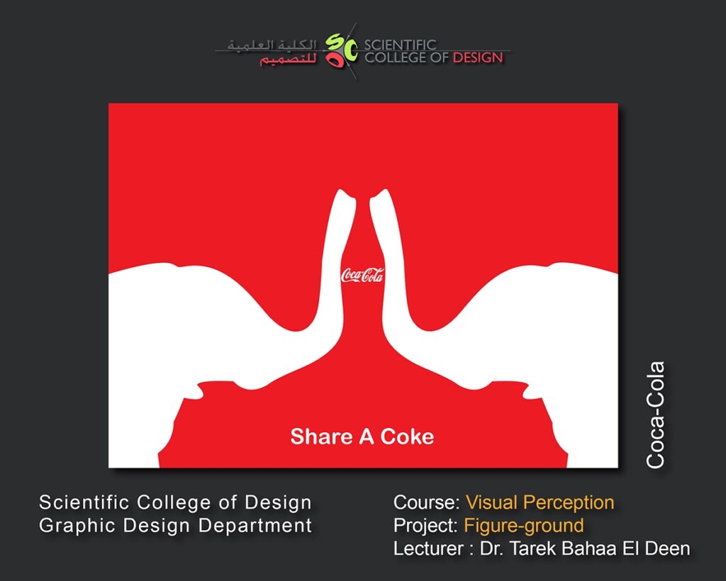

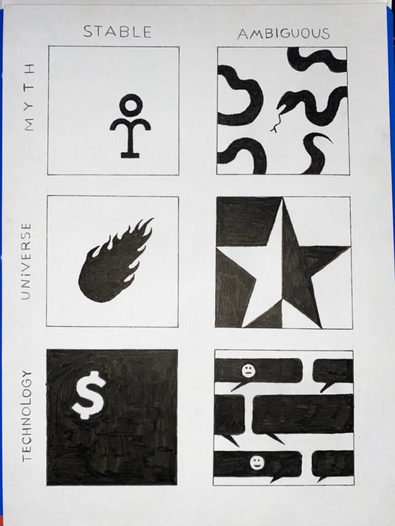
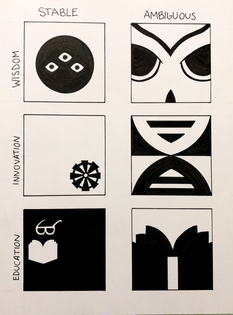
- Can you identify the positive space in both examples?
- Which ones of these examples have a stable figure-ground relationship?
- Which ones have an ambiguous figure-ground relationship?
- Which one more clearly communicates a point of focus or subject?
- Regarding the Coke ads, what if this brand was unknown? Would your understanding of the composition change?
- Can you find other art or design examples of ambiguous and stable figure-ground?
2. Define
Thumbnail Sketches / Iterations
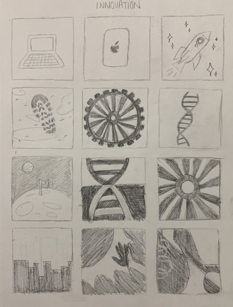
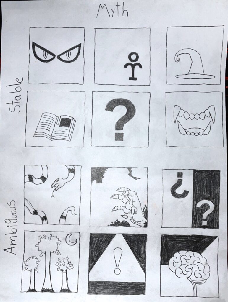
Thumbnail sketches or roughs are used to explore layout and compositional options. These are QUICK drawings that allow the designer to try out a range of ideas and find the best solution. Do web search to see examples of thumbnail sketches.
Get started! Using simple shapes, draw representations of each of your three “curiosities” from your mind map.
For example:
- Nature = Leaf or Tree
- Love = Heart or Fireworks
- Ancestry = Group of people
- Travel = Map
You may do some research for inspiration on your individual ideas: for example, if you chose Nature, find a plant around you to sketch from observation of a plant, or searching the web: research nature sketches, logos or pictograms. Do not copy directly! Use what you see for ideas only.
- Draw Boxes: Using a soft pencil, draw out 6 square boxes on a page in your sketchbook. These boxes are an example of “framing.”
- Sketch: Inside first box, draw your first concept using simple shapes. Remove all lines and shade in the positive space. This is your figure. It’s okay if your drawing is abstract rather than realistic.
- Create Stable Figure-Ground Compositions: Try it again in the next box, but this time think about where you will place your figure (positive space) before drawing. It’s important to think about the placement of the figure within the ground (negative space). Try to create a composition where the figure takes up 30% of the space within the frame and the rest is the ground. The ground is as just as important as the figure when creating a composition.
- Repeat this until you have completed at least 6 thumbnail sketches depicting stable figure-ground compositions using your first word. Avoid placing the figure in the center of the frame, but sometimes this is the easiest approach. Challenge yourself and experiment. Get curious!
- Ambiguous Figure-Ground Compositions: Now let’s try creating 6 more thumbnail sketches where the figure and the ground are interchangeable. An ambiguous figure-ground relationship will generally have a balance of figure and ground (50% positive space / 50% negative). We lose the ability to identify one or the other. One way to do this is to make your word-shape intersect the boundaries of the frame.
- Repeat this process for each of your 2 chosen words.
Reflect and Consult
Stand back from your thumbnail sketches. Spread them out if you have space.
Work with a partner to select the strongest images.
- Your forms should be sketched in two ways:
- as a series of an obvious figure-ground compositions
- as a series an ambiguous figure-ground compositions
- Look at all of your sketches and make sure you are working with filled shapes, no lines, texture or pattern – just black and white shapes.
- Observe how the figure and ground relate. Are the figure and ground present in equal proportions or unequal? Does the ground support the figure or fight for dominance? Is the artifact still recognizable or has it been abstracted?
- Make a star or circle next to the three best stable and the three best ambiguous compositions.
Study the Design Principles
- Unity: Refers to the unifying quality that makes a composition look complete and finished. Unity gives us the feeling that all the elements relate to each other to form a unified whole.
- Economy: Using only the elements necessary to communicate an idea, emotion, or formal concept. Less is more.
Refine – Final Sketch
Choose your 2 best obvious and 2 best ambiguous figure-ground thumbnail sketches. Each concept should be represented in a stable figure-ground composition and in an ambiguous figure-ground composition.
Refine: Use a full page in your sketchbook (9×12″) to redraw and refine your 4 compositions.
- Draw 4 squares (3×3″) with 1″ borders and between them across your 9″ page and a 2″ border and between them along your 12″ length..
- Using a soft pencil fill in all the negative space. Leave the positive space white. Or visa-versa, if you’ve reversed the positive and negative shapes.
- You should have only solid, black and white shapes when you are finished. No lines or patterns.
- Using an economy of organic and/or geometric shapes, the final compositions should feel unified.
- There should be a clear transition from your thumbnail sketches to your refined, final sketches.
Document
When you are finished, take well-lighted, well-composed photographs of your thumbnail sketches and your refined sketch. These images will be uploaded to class blog for critique and grading.
Use this guide to avoid common mistakes when photographing your work with a camera phone.
3. Develop
Inked Compositions
Goal: Finalize the compositions you refined to create (4) culminating compositions in ink on Bristol board: (2) obvious figure / ground relationship and (2) ambiguous figure/ground relationship . Using an economy of organic and/or geometric shapes, the final compositions should feel unified.
Process:
Your finalized refined sketch should be a culmination of the creative process so far. It should represent your most successful attempts at this design problem. Transfer this sketch to bristol and carefully ink. Your finished ambiguous and stable figure-ground compositions should be designed with solid, black and white shapes. Using an economy of organic and/or geometric shapes, the final compositions should feel unified.
- Measurement/ Proportions for page
- Framing: On the long side of your page (12″ sides) measure 2″ borders and mark 2 squares (3×3″ each) with 2″ margins between them.
- Next, on the short side (9″ sides), measure 1″ borders and mark 2 squares (3″x3″) with 1″ margin between them.
- Trace/Redraw: Lightly redraw or trace your refined sketch onto the bristol. Use the light table to trace, if your wish. The lines should be barely visible.
- Compare: There should be a clear transition from your thumbnail sketches to your refined, final sketches. Compare with your refined sketch. Do the compositions still feel unified?
- Ink: Use a fine inking pen (.02 or .05) to outline all the elements and then use the big brush pen to fill in the black areas. In most cases you will want to outline the frame of each composition with .02 or .05 inking pen. If you outline one frame, you should outline all frames.
- Tidy up: Erase all extraneous pencil lines and measurements. The final work should be neat, clean and well-presented.
- Protect: Package and protect your work using tracing paper (refer to class demo).
Document
When you are finished, take a well-lighted, well-composed photograph of your inked composition. This image will be uploaded to class blog for critique and grading.
Use this guide to avoid common mistakes when photographing your work with a camera phone.
4. Deliver
Submitting in your work
Follow the How to Post Your Work guidelines and include the project-specific details below:
- Post Title: Curious Compositions
- Written Project Reflection: Document your thoughts about this project. Think about what you learned, what you could have done better (planning, material use, craft), and how you will apply what you learned to your next project. Consider and respond to the comments made in class during the critique.
- Images: Organize your post to include all images from the three other Design Process phases for this project. (Discover, Define, Develop).
- Category and Tags:
- Category = Project #1 Posts
- Tags = Deliver, Curious Artifacts
Providing Feedback
Part of your Project grade is leaving well-written comments for your peer-critique partner and at least one other student. Follow the How to Comment and Critique guide for specific guidelines for leaving constructive feedback.
REMINDER: You will receive a grade and comments from the Professor on your posts and peer comments. Without your deliver post, you will not receive a grade.
Critique
- Bring all parts of this project to class: Discover, Define, Develop.
- When presenting your work, start with following: your name, the project title, the theme of the project, what you feel you did successfully, what you can improve on next time.
- Your peers and the professor will provide supportive, constructive feedback.
- You will have an opportunity to revise your work based on the feedback and improve your work and your grade.


