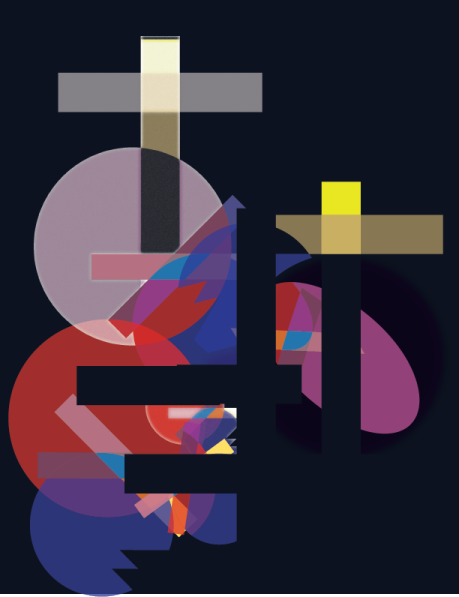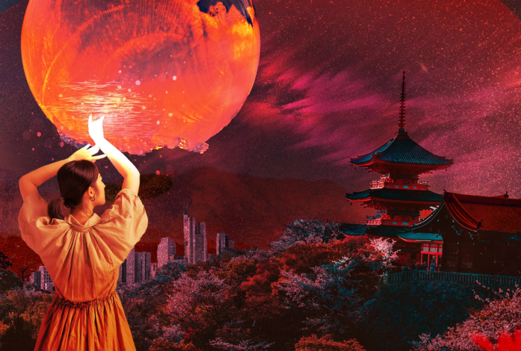

For the illustrator piece, I didn’t have anything particular in mind besides high contrast images, and this piece helped me gain a better understanding of composition. For the photoshop image, I am showing a feudal Japan style temple in combination with a large moon and a city skyline. There is also a woman seemingly interacting with the moon. In terms of mood, I wanted to communicate the idea of something more sinister under the surface, and something more moody. I chose to use the rule of thirds in this piece and a overall reddish color pallete in order to accentuate the idea of a narrative and the mood I was going for. I mostly use the direct select tool and the lasso for corrections, as well as masks and various blending modes.
Print this page


Leave a Reply