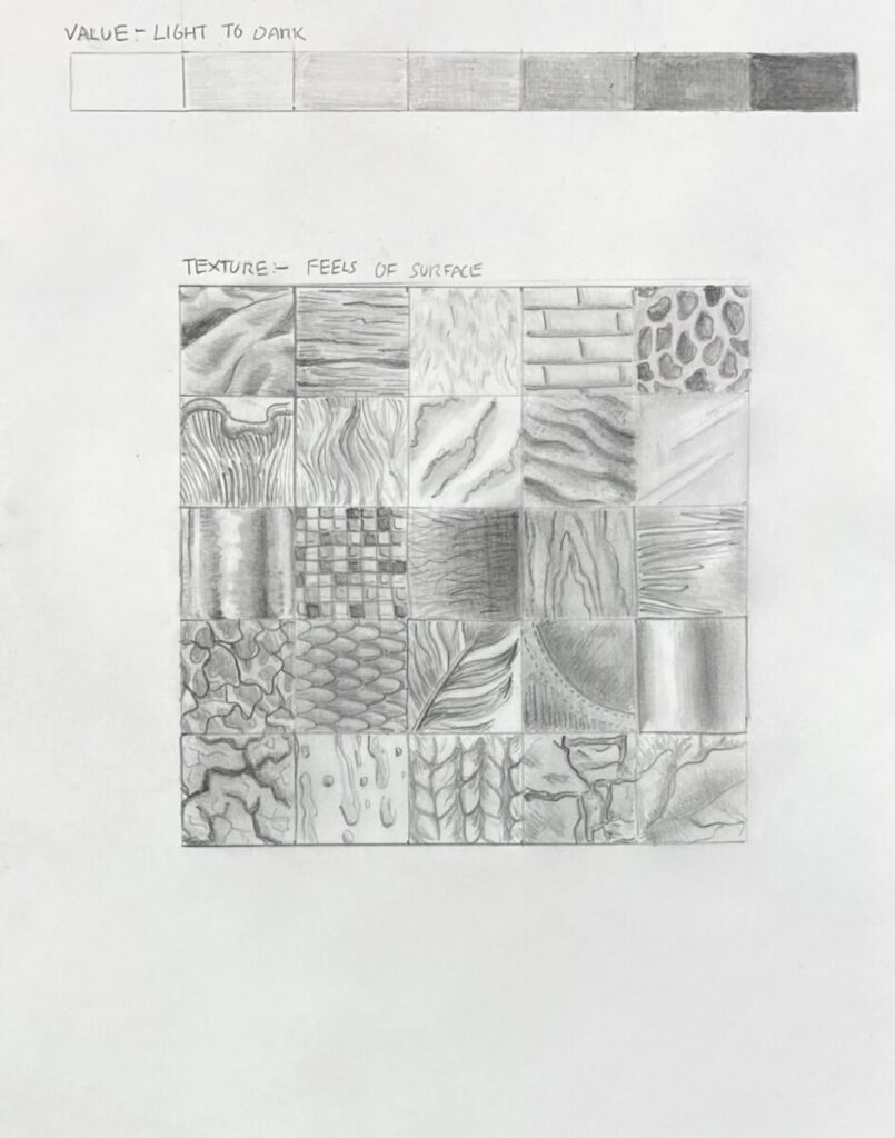
We began Project 3 by doing a hand drawn value/ texture grid in our sketch book where we fill each square of the grid with a different type of drawn texture from objects using our pencils and full value range as a way to study texture through hand drawing approaches and rubbings.
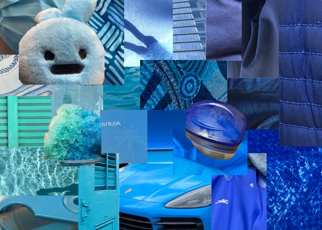
Using Adobe Photoshop, we than created a monochrome value digital collage to better understand monochromatic value range from dark to light, chromatic gradation dynamic and use of texture/motion from our composition. We were tasked to create a collage using photo based visual textures found from our own photography and a gradation of values in a choice of monochrome color palette.
For my digital collage, I went with a blue color palette which I took and used my own photographs of textured objects found in real life that were tints and shades of that hue. I arranged my photographs based on its value, hue and intensity to organize and create a gradation from light to dark and high/ low intensity. It was interesting putting it all together and see how texture and color connect and work together. I feel like next time, I could be a little more creative with my composition and play around with scale, hierarchy and contrast to make something more interesting.
Print this page


Leave a Reply