Table of Contents
Contents
Project Overview
Problem: Create a black and white, grid-based composition. Inspired by your favorite piece of music, use scale, variety, repetition, pattern and texture to demonstrate an understanding of visual rhythm.
Materials: Sketchbook, pencils, inking pens, Bristol Board 9×12″, ruler/t-square, tracing paper.
Concepts: Line, Rhythm, Repetition, Variety, Pattern, Grid, Modular Grid, Scale
Technical Skills: thumbnail sketching, mark-making, draughmanship with ruler/t-square, inking pens, digital imaging, animation
Design Process
- Discover: Listen & Draw
- Define: Refined Patterns & Textures
- Develop: Modular Grid Layout & Inking
- Deliver: Post and Comment
Modern Art History: Early Modernists and Music
Paul Klee and Music- read this article at home
Romaire Beardon and Jazz music
1. Discover
Listen and Draw
Find a place to work without visual or auditory distractions, if possible. Locate your favorite piece of music.
- In your sketchbook, while listening to your favorite piece of music, draw the sounds that you hear.
- Imagine what the sounds would look like if they were shapes, lines, dots, and patterns.
- Consider how the sounds relate to each other.
- Do you hear repeated patterns and an overall rhythm?
- Are some sounds rough or sharp and other smooth and flowing?
- Draw without thinking. Just let the music that you hear direct your pencil. Cover 1-2 pages
Write about it
Spend 10 minutes writing about your favorite song; describing it in terms of shapes, lines, dots, patterns, variation. Consider how some sounds repeat to create rhythm. How do these observations affect how you understand the meaning of the music or the intention of the composer/songwriter/artist?
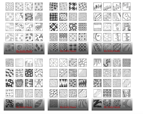
Thumbnails: Pattern Squares
In your sketchbook, draw at least 12 squares. In each square create a unique pattern to represent the sounds you hear in your favorite piece of music. Try varying the line weight (thick and thin) and the spacing (tight and wide) between the lines. Experiment by drawing the same pattern light and dark. Let the rhythm of music influence the look and feel of your pattern squares.
For more research on creating patterns read : Pattern Wong PRinciples
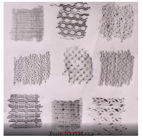
Thumbnails: Texture Squares- rubbings and drawings
On a few pieces of tracing paper, draw at least 12 squares. Using a soft graphite pencil, go around your apartment or out into the world and create rubbings of different textures that relate to your favorite song.

For example, if the song has a heavy, dark sound, perhaps you might do a rubbing from subway grate or bark from a rough tree. Or if your song has a light, delicate sound, perhaps you might do a rubbing from a leaf, lace curtain, or piece of jewelry. Let the rhythm of music influence the look and feel of your texture squares.
You can also combine your rubbings page with half hand drawn textures- see this link. draw your own textures, looking closely at objects with texture and using pencil to recreate the feeling of the surface.
2. Define
Refine Patterns & Textures
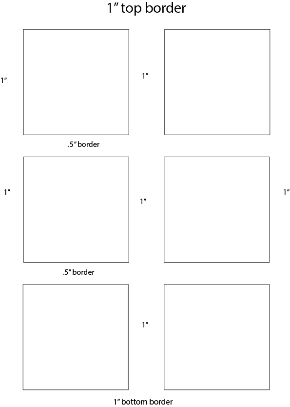
Following a similar layout that we used in Project #1, layout 1 piece of sketchbook paper with 6 squares.
- Top, bottom and sides: 1″ margin
- Squares: 3″x3″ with 1/2″ margin between each square along long direction of page
- 1″ margin between two columns of thumbnails, along short side of page

Lightly redraw a selection of 3 patterns and 3 textures, one in each square. Use your inking pens or a very black pencil to refine and finalize your patterns and textures. These should look neat and clean.
Grids for Composition
Research
A grid helps a designer organize information to provide a sense of unity, consistency, clarity, and hierarchy.
- 15 reasons why a grid based approach will improve your designs
- Thinking with Type: Modular Grid
- Types of Layout Grids
- MOMA’s Grid Layout
Find at least 5 examples of grid-based designs in web design, magazine layout, poster designs, book designs, etc.

Copy
For each grid you find (print it out if it’s online), use a piece of tracing paper to copy the grid layout. Draw a box around each element in the layout.
Experiment with several different types of grids to see which ones you like best.
Iterate
Use your refined sketch with your collection of 3 patterns and 3 textures to experiment with how you want your final layout design to look.
Using the modular grid template provided and several sheets of tracing paper, sketch out how each pattern or texture will fit within the grid.
Organize your patterns and textures to communicate the mood, feeling-experience, and rhythm of your favorite piece of music.
Create multiple mockups of your composition to get a sense of how your patterns will work within a grid layout.
Try to use each pattern at least twice, varying size and orientation, to create a sense of rhythm and to help unify the composition.
3. Develop
Grid Layout
Choose the best modular grid mockup to use as a guide. Trace (using the light table) or measure and lightly redraw the final grid and patterns onto a piece of bristol.
Ink Composition
- Ink: Carefully ink your final composition using inking pens. If you’d prefer to use bottled ink and pen, feel free.
- Tidy up: Erase all extraneous pencil lines and measurements. The final work should be neat, clean and well-presented.
- Protect: Package and protect your work using tracing paper (refer to class demo).
Document
When you are finished, take a well-lighted, well-composed photograph of your inked composition. This image will be uploaded to class blog for critique and grading.
Use this guide to avoid common mistakes when photographing your work with a camera phone.
4. Deliver
Critique
- Bring all parts of this project to class: Discover, Define, and Develop
- Be prepared to present, discuss and analyze your finished work in terms of concept, craft, what you learned, and the design process.
- State the following: your name, what you are presenting (title and design problem), which parts are successful and why, which parts are unsuccessful and why.
- Your peers and the professor will provide feedback. You will have an opportunity to revise your work based on the feedback to improve your work and your grade.
Documentation and Feedback
Submitting in your work
Follow the Submitting Your Work guidelines and include the project-specific details below:
- Post Title: Pattern Mashup
- Images: Organize your post to include all content from the three other Design Process phases for this project. Create headings for each phase and include images or a gallery, where appropriate:
- Written Project Reflection: In the Deliver section of your post, document your thoughts about this project. Think about what you learned, what you could have done better (planning, material use, craft), and how you will apply what you learned to your next project. Consider and respond to the comments made in class during the critique.
- Category and Tags:
- Category = COMD1100 Project #2
- Tags = Deliver, Pattern Mashup
REMINDER: You will receive a grade and comments from the Professor on this post. Without this post, you will not receive a grade.
Providing Feedback
Part of your Project grade is leaving well-written comments for at least one of your peers. Follow the Providing Feedback for specific guidelines for leaving constructive feedback.Search for:
CREATIVE COMMONS LICENSE
This site is curated and maintained by Prof. Jenna Spevack.
Except where otherwise noted, content on site is licensed under a Creative Commons Attribution-NonCommercial-ShareAlike 4.0 International License.
You are free to share and adapt the content on this site if you provide appropriate credit, provide a link to the license, and indicate if changes were made.


