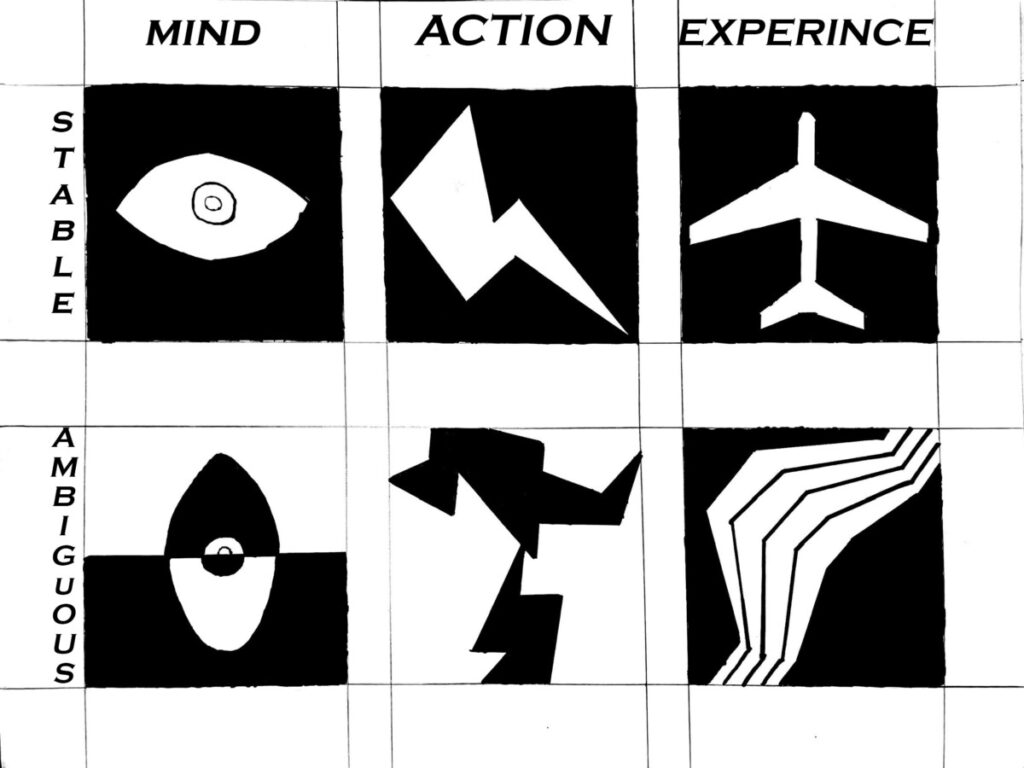
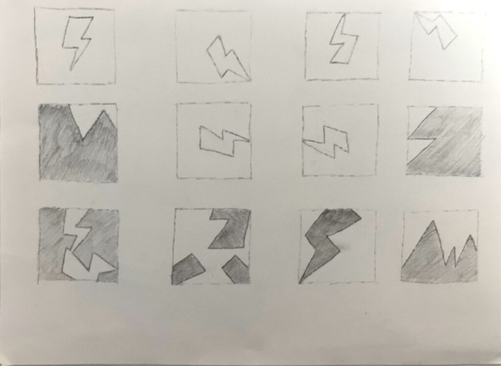
With this first project, I learned the real differences between ambiguous and stable images and how they correlate with one another. Using the core subject of an image and placing them in different ways makes a whole new image come to life. Most of the time you can’t even correlate them from each other since most of the original object has been cut off. Using the ruler made everything seem more symmetrical as well which I personally like more than hand-drawn lines. I realized while working that using pen/ink to draw and color in is more difficult than expected. You have to really be precise and know what you are doing before you’ve started.
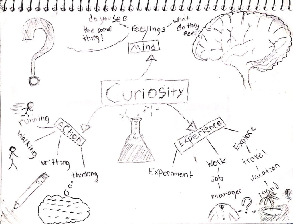
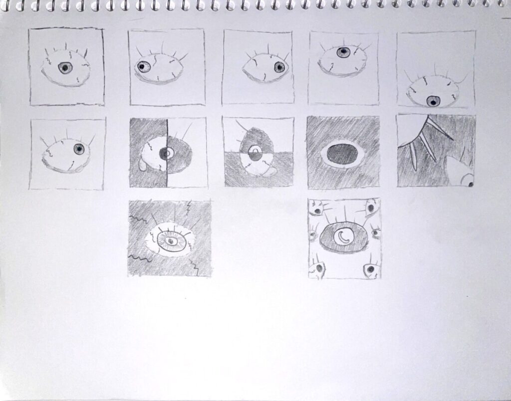


You did a really nice job coloring in the lines and making them clean and crisp. If you wanted to eye to look neater try using a protractor or a compass would make the shape neater. Aside from that, I would never think an eye would be under the “Mind” column. I would assume there was a drawing of a brain or a thought bubble but it makes the viewer think a little bit more. Maybe how the eye is connected to the mind.
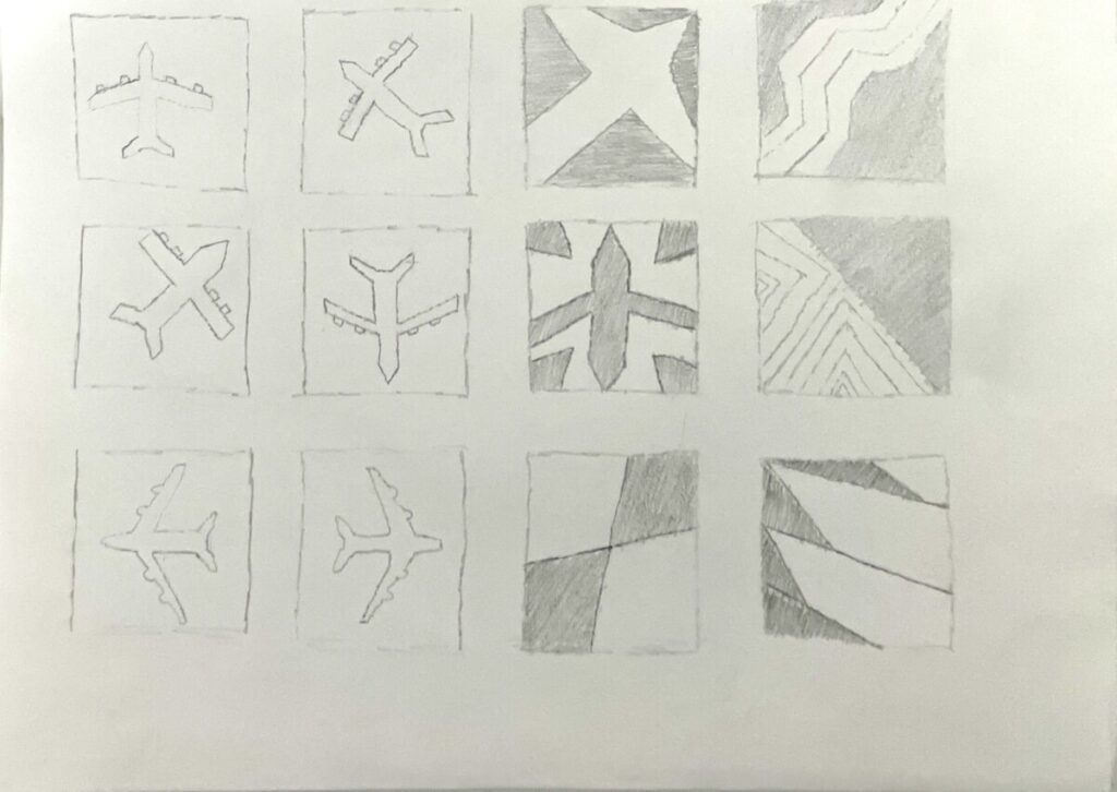
I like how you nailed the Ambiguous thumbnails. I’ll definitely have a question about the 3rd ambiguous thumbnail, I’m stuck.