Contents
Two Articles Below on Portfolio Site Building:
The ultimate guide to creating a portfolio website
A Guide to Designing a Portfolio Website
1. The ultimate guide to creating a portfolio website
https://www.creativelivesinprogress.com/article/work-ready-portfolio-website
From perfecting your personal branding to nailing those networking skills and navigating finances, preparing for the world of work is no easy feat. That’s why, in partnership with Wix, we’ve developed four guides designed to help you step into your creative career with confidence.
It might sound a little dramatic, but in terms of showcasing your work to the world, not having a website is a bit like being lost at sea without a life jacket and whistle. How is anyone supposed to find you? The thing is, with so much choice out there, there are now countless ways to showcase your work online. We’re talking about everything from dedicated Instagram accounts and Behance profiles to spreadsheets. So why bother creating your own portfolio website?
Well, there are a few reasons. As well as the flexibility and freedom to curate your online persona, a portfolio website is one of the most practical and memorable ways to share your work with press, potential collaborators or employers. And here’s the best part: you don’t have to be a coding genius to make a brilliant portfolio website…
In this guide we’ll be taking you through the essential steps to creating a portfolio website that best represents you and your work, while calling on some industry professionals for their expert tips on how to make a splash online.
1. Representing Yourself Online
Consider your online presence
Deciding to create your own website is pretty exciting. It means you’ve already done the hard bit: You have a handful of work you’re proud of, and that you’re ready to share. But before you start drawing up your dream website, we’ve got some thinking to do.
Consider all the platforms you’re already using online. You might have an Instagram account, or several. You might also have a LinkedIn profile or a Behance page. Collectively, all of these touchpoints make up your ‘online presence’, and individually, they represent different sides of your practice and personality.
This means that when people are searching for you online, they could find themselves landing on any one of those touchpoints. And if you’ve ever Googled yourself to find a handful of embarrassing Facebook photos emerge in your search, you’ll know that the World Wide Web can be a cruel place, with an unforgiving memory. Being searchable is a good thing, but you want to make sure it’s for the right reasons.
Your portfolio website is a chance to control and curate the way you want to be seen and perceived. It means that an employer’s first impression of you is the one you want them to have, rather than the one Facebook decides to show them. And as a bonus, you won’t have to worry about other platforms owning your data or changing their user interfaces overnight.
Let your personality shine
Above all, a portfolio site is a chance to put your best foot forward, and give recruiters, employers or collaborators an understanding who you are as a creative, regardless of your discipline.
Michael Bierut is a partner at New York-based design consultancy Pentagram in New York. Like many other employers, when he’s looking at portfolio sites, he naturally likes to see great work that’s been “beautifully documented and carefully presented. But I also like to get a sense of the personality of the designer behind the work,” he adds. “Make your site distinctive, but also make sure it’s understandable (at minimum) and compelling (ideally) to someone who’s never met you. The visitor should want to meet you in person!”
It’s a big order to fill, so how do you go about doing that? Well, we recommend taking a look at some examples to help you get inspired…
Caroline’s website, designed and developed by Samuel Bassett
Caroline Dussuel, creative stylist
When you’re just starting out, the chances are you’ll be looking to showcase the best projects from your portfolio. Paris-based creative stylist Caroline Dussuel’s image-led website is a great example of this. She’s opted for an understated yet experimental layout, collating each project as a group of collapsible individual photos, presenting them as though scattered on a table.
The site feels relaxed and informal, and mimics the way you might look through printed photos. With no written captions, Caroline ensures all focus stays on the images. Her logotype, in the top left-hand corner, even disappears when photos scroll across it, so as not to distract from the work.
Nice! Can you show me some more?
Alan Trotter, writer
Some creatives decide to focus on demonstrating a specific skill in a more conceptual way. Take Edinburgh-based fiction writer and copywriter, Alan Trotter, whose site essentially writes itself in front of you. Opening up on a few words, the more you click, the more the narrative unfolds – revealing a witty tone and charming personality as a writer. After it launched, Alan even got 13,000 visits to the site in one day!
Manshen Lo, illustrator
London-based visual artist and illustrator Manshen Lo decided to disperse images of her work against a pale grey background, on a long horizontal scroll. Clicking into the work isolates the image while clicking the ‘i’ icon allows you to read a short caption or credit.
The calm, considered design lets her work and unique aesthetic speak for itself. This is something that CNN’s art director of special projects, Sarah-Grace Mankarious, is always looking out for – especially when it comes to illustrators. “As an art director I’m looking for a distinctive style that should be clear to see within the first three projects or pieces,” she shares.
David Massara, graphic designer
Swiss graphic designer David Massara graduated from ECAL last year. His website is split into two scrolling sections: one for text on the left and images on the right. Clicking on project titles aligns the images with the project description and the simple blue dot cursor complements the very rigid, structured and well-considered design.
Ultimately, a successful portfolio site is one that looks and feels right for you. So whether you go big with a conceptual coding extravaganza or incorporate small but charming additions with your choice of typeface, everything from the URL to your cursor can be used to express who you are as a creative.
2. Finding Your Purpose and Making a Plan
One of the biggest misconceptions about creating websites is that designing or building them is the hard part. But in fact, it’s often deciding what goes on there in the first place. To help get to the core of this, we’ve developed three questions whose answers can form the basis of your site:
What is my website’s purpose?
Think back to your online presence and all the different ways you’re currently representing yourself online. What role does your website play within that? For example:
• One clear destination for your work to live
• A playful demonstration of your skills
• A drive people to a shop, blog or social media profiles
There’s no right or wrong answer here, and you might want to combine a few of these. But ultimately, knowing the goal behind your site will inform and inspire your entire decision-making process.
What pages do I need to build?
These will make up the different layers of your site. These are some good starting points:
• Homepage
A landing page, the first thing your visitor sees.
• ‘About Me’ or ‘Biography’ page
This can include a short statement about your practice, where you studied or worked, or what you’re interested in.
• Contact page
This should contain essential info, such as your email address (with a working link!) and social media links. As web designer Craig Jackson puts it, “Don’t take people on a treasure hunt to find your contact details!”
• Project pages
These tend to consist of images, GIFs or videos alongside a caption describing the project and listing fellow contributors or credits. How might you tell the story of your project?
Depending on the goal you’ve set yourself, the pages you’ll need will vary. For example, if you’re happy to keep using Instagram as a way to share your finished work, why not consider making a single-page website that acts like a business card with your contact information? This might link to your social media accounts, blog, or even a shop.
Rifke Sadleir, developer
When she was starting out, developer Rifke Sadleir’s portfolio website was a way to contain her work in one place. While it was an easy way to showcase her skills to potential employers, as her career progressed Rifke started sharing more of her projects on Instagram. And now? “My website serves as more of a business card than a portfolio. I decided to remove all of the project pages from the site, as it seemed silly to post every bit of work to two places at once.”
The clue’s in the name with ‘business card’ sites: they place emphasis on the basics. But they can be great ways to point people to other parts of your online presence, particularly if, like Rifke, you use other platforms to host your work. These sites can also be brilliant creative opportunities to represent an element of your practice or personality. You’ll often see creatives integrating ‘toys’ or interactive tools to do just that. In Rifke’s case, the user is encouraged to re-paint the background colour using a drawing tool. “It seemed like an obvious way to make my site a bit more fun,” Rifke remembers.
Jennifer Xiao, illustrator
Freelance illustrator Jennifer Xiao is another example of someone combining several elements on a landing page for easy access. Each button or icon is hand-drawn in her illustrative style, leading you directly to different sections for social media, comics, and her shop.
Ester Mejibovski, designer
University of the Arts student Ester Mejibovski’s portfolio site is made up of only two pages: one is a visual chronological timeline of her work with her most recent projects at the top; and the other for her CV. But scroll down and there’s no denying what her end goal is: to get hired! The flashing purple and red banner with her email address and ‘HIRE ME’ in capital letters leaves no room for miscommunication, and also serves as a playful addition to the more serious-looking design.
What work do I want to show?
This is quite possibly the trickiest part of all. You’ll likely have been through a similar process if you’ve put together a print portfolio, or PDF, but while it can be hard to make the cut, here are some universal top tips to help you do so…
Less is more
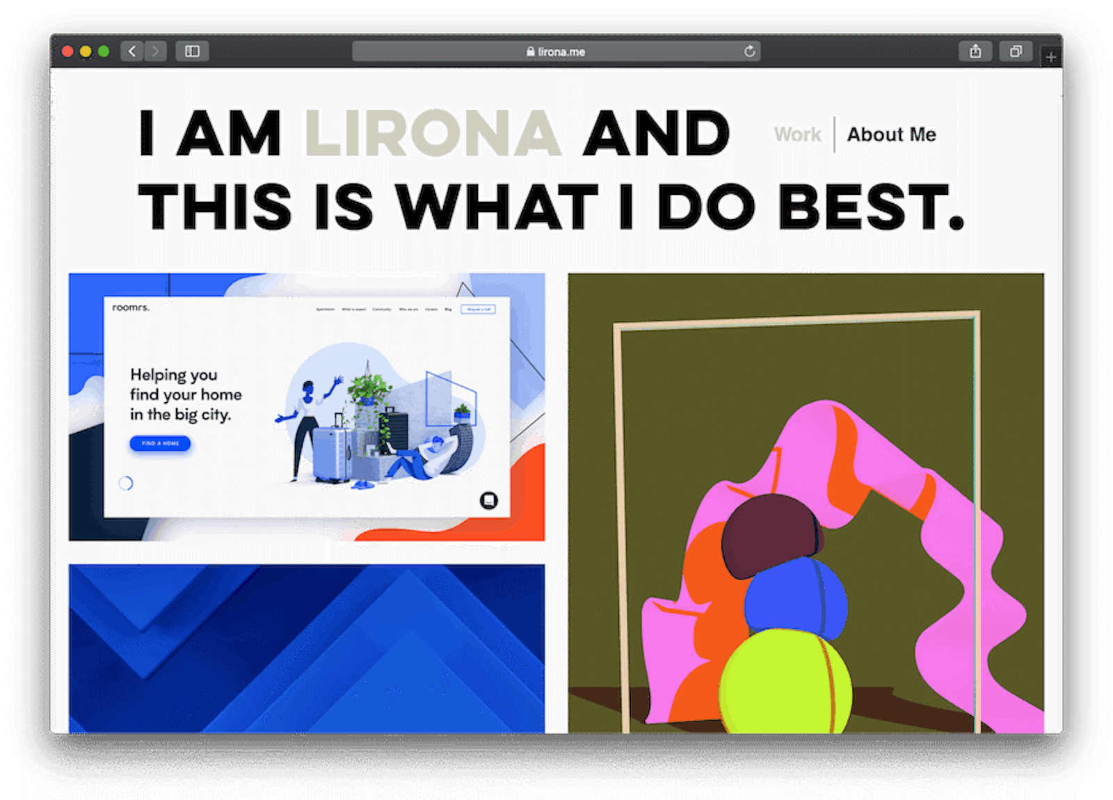
It sounds obvious, but when it comes to curation, choose your very best work. Don’t be tempted to include dozens of projects, and remember that you’re only as good as your worst project. For Micheal Bierut, the most important rule is to “only show things you are truly proud of. Show the kind of things you want to be doing professionally.” New York-based designer Lirona Ashkenazi-Eldar’s portfolio practically announces this idea, with a headline at the top that reads: “I am Lirona and this is what I do best.” It’s a literal take, but the sentiment is universal.
Michael also advises prioritising finished work on your website: “I find that preliminary sketches and other process documentation works best in a live conversation,” he adds. So if you’re someone with a keen interest in showing your process, consider a link to an external blog or separating your site to include a ‘sketchbook’ page.
Making long stories short and big images small
The less-is-more mentality also applies to the images you choose to upload and the words you write to accompany them. Massive images can be a nightmare to load, so Rifke Sadleir advises you to save non-transparent images as jpegs, and reduce the quality rather than the resolution. “This reduces the file size massively, without making the image look pixelated,” she says.
And when it comes to writing captions, digital designer Myles Palmer offers a word of warning: “Communicate what the work is and your role in it clearly, in small, bitesize chunks. Don’t have page after page of text – just enough to inform [your visitor].”
Show the work you want to do more of
You might have completed a variety of briefs at university, but it makes sense to select those most relevant for your career. “I only want to see the work you enjoyed making,” says Wallpaper* magazine’s photography director, Holly Hay, “[And] if you show work you’re very proud of, it leads to being commissioned for more of the same.”
3. Design: What’s It Going to Look Like?
Now it’s time to consider how your portfolio website will look, feel and behave, and thinking about the nature of your own work is a great starting point. What kind of style or design aesthetic might complement your projects? Do you want your work to take centre stage, or do you want the way your website behaves to do the talking? Here are some suggestions:
Personality
• Funny
• Serious
• Absurd
• Characterful
• Emotional
• Reserved
• Sensitive
• Thoughtful
• Critical
Look
• Polished
• Playful
• Chaotic
• Ordered
• Minimal
• Futuristic
• Experimental
• Abstract
• Sophisticated
This can be tricky if, like the growing numbers of creative multi-hyphenates out there, you find that your work spans a few disciplines. Our advice? Embrace it. When we asked chief production officer Olivia Chalk for her thoughts on curation, she agreed that while there’s nothing wrong with showing breadth, you just need to consider categorising your projects “so they don’t all appear on the same page at once” and cause confusion.

Dennis Krawec and Son Ayong’s websites

Dennis Krawec and Son Ayong’s websites
Take recent Rhode Island School of Design graduate, Dennis Krawec. Dennis groups and signposts his projects via disciplines (everything from art direction and set design to editorial design) in the margins of his site, brought together by a fun and unifying design aesthetic. Or have a look at Son Ayong’s site. She splits her work (‘Illustration’, ‘Graphics’ and ‘Websites’) by vertical dividers that expand as you click on them, making it easy to navigate.
Try out some templates and go (browser) window shopping
If you have a clear vision for your website and are ready to start building, Wix gives you the option to start from scratch with a blank template. But if you’re still unsure or stuck, browsing design suggestions online can be a great place to get inspired. A platform like Wix makes this super-easy with a range of templates and themes to choose from for designers, photographers, filmmakers, illustrators and more. This can help you quickly work out what you like, and what might suit your work.
You can also sketch out how your site might look with some of the templates in mind – what will the visitor see first? You can try drawing wireframes to plan the layout of your pages, and what links you might need and where. This will help put you in the mind of your visitor, and their journey as they go through your website.
4. The Technical Bit: Getting Your Site Online
Now you have the content and site-design sketches, it’s time to bring it to life, and there are lots of ways to do this. You can of course build your site from scratch, or even team up with a friend who can code or collaborate with a developer. However, if you do collaborate, make sure it’s someone you trust and that you’re clear on the price and how to update the essentials.
When we asked founder and director of EVERYONE Agency, Helen Parker, for her advice on this, she was keen to stress that you don’t need to “spend lots of money on creating something with clever wizardry – sometimes the simplest sites are the best.” Besides, as Michael Bierut puts it, you should always aim to avoid anything that is “slow and needlessly elaborate.”
But if you’re still worried about not being able to code, don’t be! One of the great things about using Wix in particular, is that you can also use their templates to start building on straight away. There’s a misconception that using a template means you risk your website looking like everyone else’s. But you can change everything from the typeface, layout, image size to background, colours, menus and more.
6. How to maximise your site’s potential
Once you have a site up and running, you’ll naturally want to shout about it! One way to do this is of course sharing it on social media. But you’ll also want to think about SEO, or Search Engine Optimisation. Having good SEO helps search engines like Google find your site and make it appear higher on the results when someone searches you online. This might sound complex, but it’s actually very straightforward if you use something like Wix SEO Wiz to help you.
6. Updating your site
Keeping things fresh
It might seem premature to start thinking about reworking your website, but knowing when to update it is an important consideration. “A lot of designers get lazy and never update their projects, so things can get stale quite fast,” says designer Craig Jackson, whose own portfolio site has seen four different incarnations, each one varying in tone and style. You want to make sure that your site continues to represent your practice as your career progresses, so keep it up-to-date where you can.
And as a final note, in the words of American designer, artist and writer Laurel Schwulst: “A website…is inherently unfinished. It’s imperfect…but that’s the beauty of it. Websites are living, temporal spaces.” It’s a reassuring thought, because – as most creatives will agree – you’ll go through numerous phases in your career. And as you grow and reinvent yourself, know that your website can do the same.
Now you’ve brushed up on your portfolio website-building skills, we recommend reading our guide to making industry connections.
8. Practical Resources
Hoverstates
An industry-leading blog showcasing the best in alternative digital design.
hoverstat.es
Crazy Cool Websites
A Facebook group showcasing interesting website design. facebook.com/groups/393558204075688
I Want My Name
A tool for exploring available domain names.
iwantmyname.com
Wix Domain Names
For searching for, and buying your own domain name.
wix.com/domain/names
8. Further Reading
• Rifke Sadleir’s guide to creating bespoke portfolio websites
Via Lecture in Progress
• Your body text is too small
Via Noteworthy
• Web design as architecture
Via Arc
• 100 websites that shaped the internet as we know itVia Gizmodo• My website is a shifting house next to a river of knowledge. What could yours be?
Via The Creative Independent
• A holistic approach to creating a design portfolio
Via Wix Playground
• Create the portfolio for the job you want
Via Wix Playground
• How to make your design portfolio rank on Google
Via Wix Playground
• How to create an image-based grid layout for your website
Via Wix playground
• How to create a column-based site with scroll effects
Via Wix Playground
• How to create a gallery-based site with strips
Via Wix Playground
• A collection of portfolio website templates for creatives
Via Wix Playground
• Creating a Wix site from a blank template
Via Wix Playground
• 25 of the best homepage design examples and tips to make your own
Via Wix Playground
• How much does a website actually cost?
Via Wix Playground
• 50 website colour schemes for your inspiration
Via Wix Playground
• 10 outstanding website navigation menus
Via Wix Playground
2. A Guide to Designing a Portfolio Website
![]() By Trevin Shirey ~ 10 minutes to read
By Trevin Shirey ~ 10 minutes to read
What is a Portfolio Website?
Let’s start by defining what a portfolio website is. At its most basic form, a portfolio website provides professional information about an individual or a company and presents a showcase of their work.
Below are two portfolio website examples.
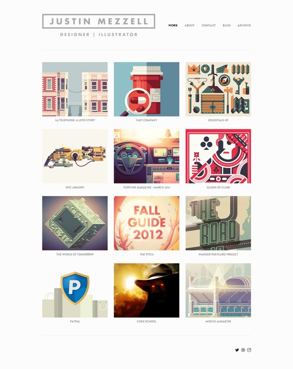
Justin Mezzell’s site is a portfolio website example of an individual:
The Grain & Mortar site below is an example of a design agency’s portfolio website:
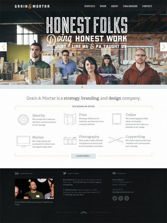
Notice the similarities between a portfolio website that represents an individual and one that represents an entire company; the foundational concept is the same in both:
- To supply site visitors with information about the individual or company
- To showcase work
The Purpose of a Portfolio Website
In the design process, the first step should be a statement of purpose. Answering the question Why are we doing this? should be done before any work is started. By specifying the purpose of a design, the process becomes meaningful.
In the portfolio websites I’ll talk about, you’ll see the same primary purpose: To display compelling content and to provide basic information in a way that leads to getting more clients.
Examples of Compelling Content in Portfolio Websites
Compelling content convinces potential clients to hire the portfolio website owner.
Examples of compelling content on portfolio websites are below.
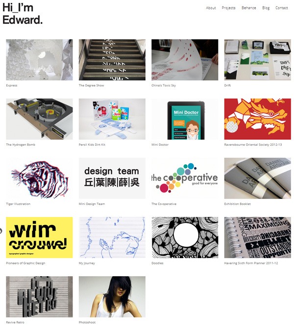
A showcase of your work. This can be executed in a wide range of ways — slideshows, thumbnail galleries, video presentations, etc. — but the intent remains the same in all of them: to give site visitors an idea about what the portfolio owner can do.
At Ed Yau’s portfolio website, the showcase of the designer’s work is done using a thumbnail gallery:
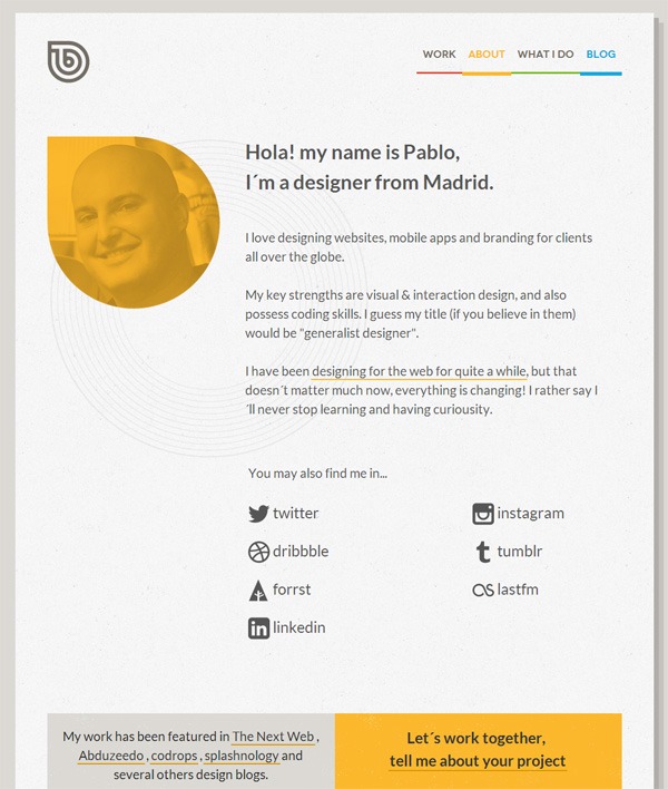
Summary of experience and credentials. Typically found in the “About” section.
Shown below is an example of an “About” page in a portfolio website. Web designer Pablo Dominguez, who operates under the name Tinybigstudio, has a three-paragraph description of his professional background and a list of places where his work has been featured (to demonstrate his credentials):
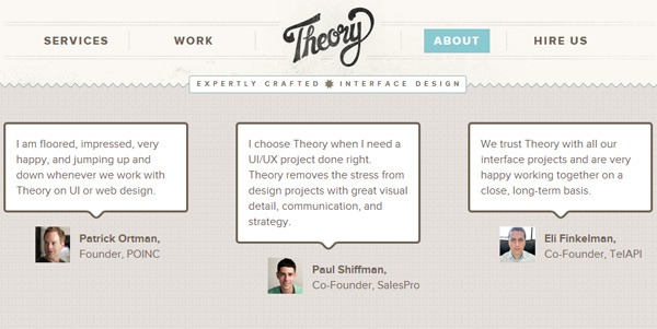
Testimonials. Compelling content also comes in the form of testimonials written by relevant people, such as you existing clients.
In the example below, you can see how Theory, a design agency, provides compelling content by showing the testimonials of business owners they’ve worked with before:
Examples of Basic Information in Portfolio Websites
A portfolio website is also meant to give site visitors general information about the owner of the site. Basic information comes in the form of things like:
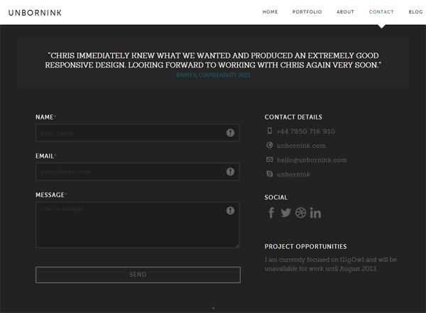
Contact information. This is a statement of your preferred methods of communication, such as email, a contact web form, your phone number, your office’s address, and so forth.
Here’s an example of this on Christopher Mead’s portfolio site:
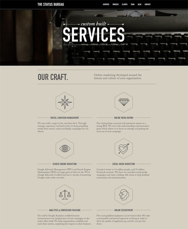
Services being offered. Having a list of your services is a good idea. It helps interested site visitors figure out whether or not you can provide solutions to their problems. Here’s The Status Bureau’s “Service” page outlining the things they do:
Basic Sections of a Portfolio Website
There are certain components of a portfolio website you simply can’t live without. If you have these sections in your portfolio website, you’re all set.
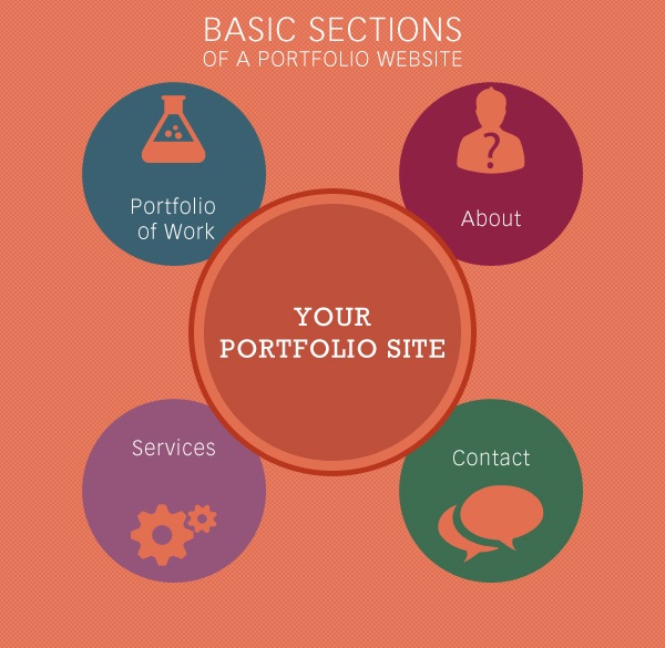
“Portfolio of Work” Section
The “Portfolio of work” section is a place on your site where you present a selection of your past work.
Examples
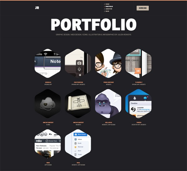
The following example demonstrates the basic design pattern of a “Portfolio of work” section (found on Julien Renvoye’s site). The first screen is a gallery of thumbnails that gives the viewer a bird’s-eye view of the all the work being showcased:
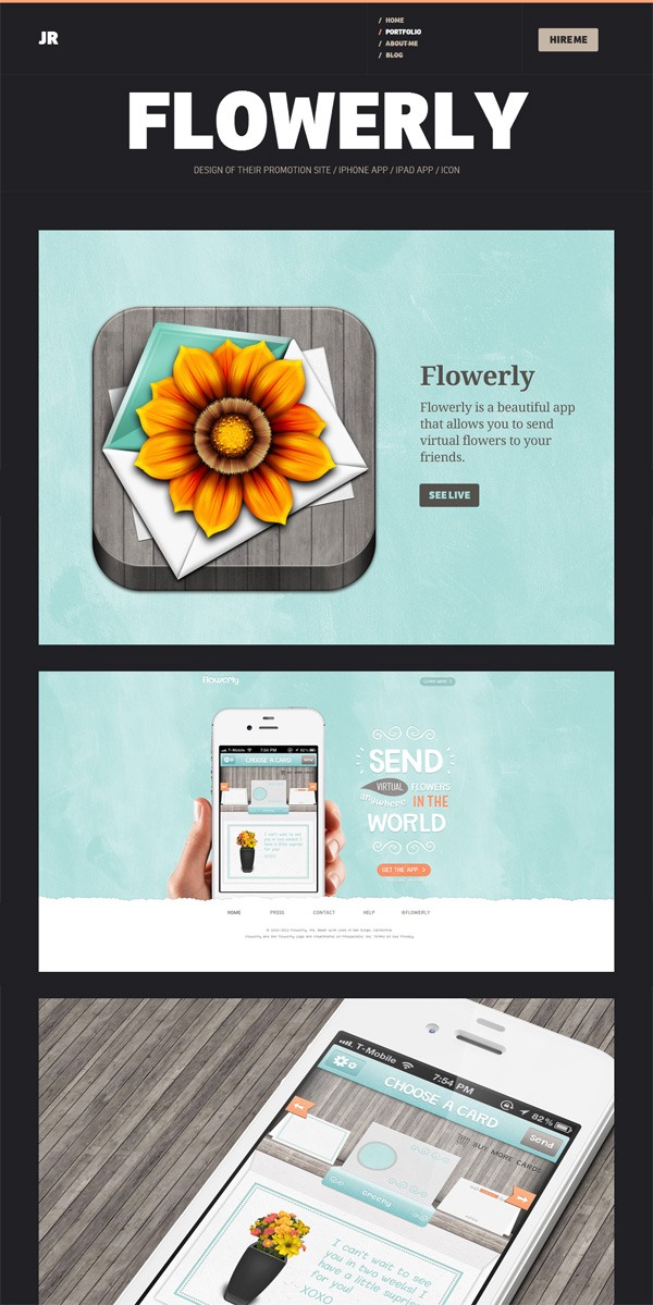
When you click on the thumbnail of a portfolio piece, more information about it is shown:
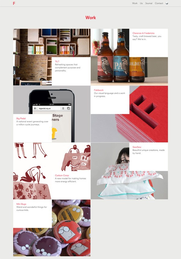
We can see the same “Portfolio of work” design pattern at Fieldwork. The section has a thumbnail-style display of the company’s portfolio pieces:
Clicking on the thumbnail of a portfolio piece will bring you to another page with details about it:
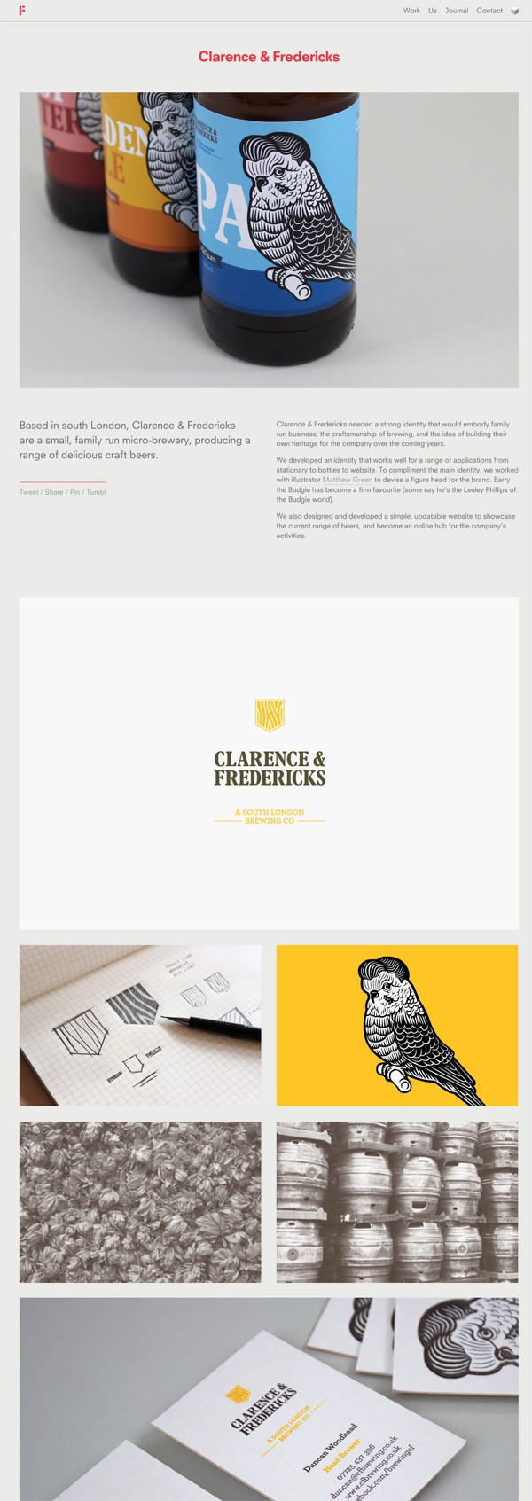
Tips for Your “Portfolio of Work” Section
When in doubt, stick to a design pattern. Providing an out-of-the-box interactive experience for site users viewing your “Portfolio of work” is alright, with proper execution. Doing so is another opportunity of displaying compelling content on your site and a way to demonstrate your skills.
However, the tried-and-true design pattern of presenting a thumbnail gallery and then progressively disclosing more information about a portfolio piece when its thumbnail is clicked on works well, and is a familiar UI pattern.
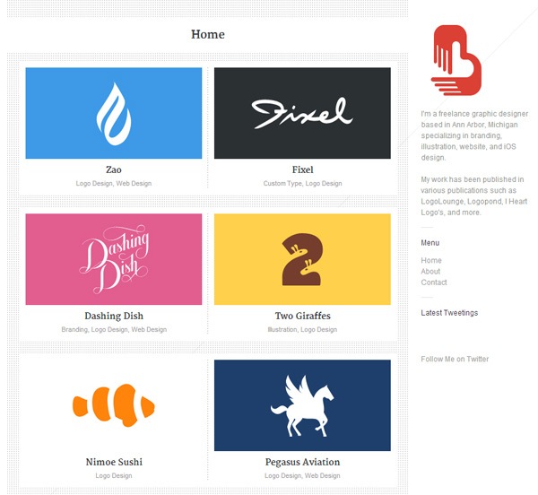 The Brandclay portfolio site features the familiar thumbnail gallery design pattern.
Only present your best work. Pick the projects you’re most proud of. When putting together your “Portfolio of work” section, always choose quality over quantity.
“About” Section
Your “About” section should be written in a context that’s relevant and compelling to the types of clients you want to work with.
Examples
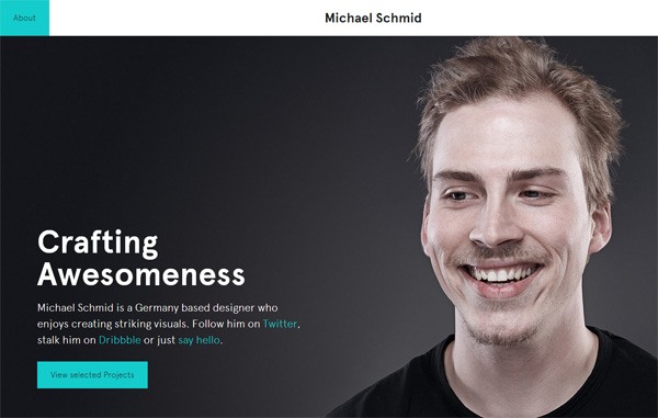
Your “About” section could be as simple as German designer Michael Schmid’s “About” page — it has a succinct statement about what he does and a series of links that point people to compelling content (like his Dribbble page) and basic information (such as his email address):
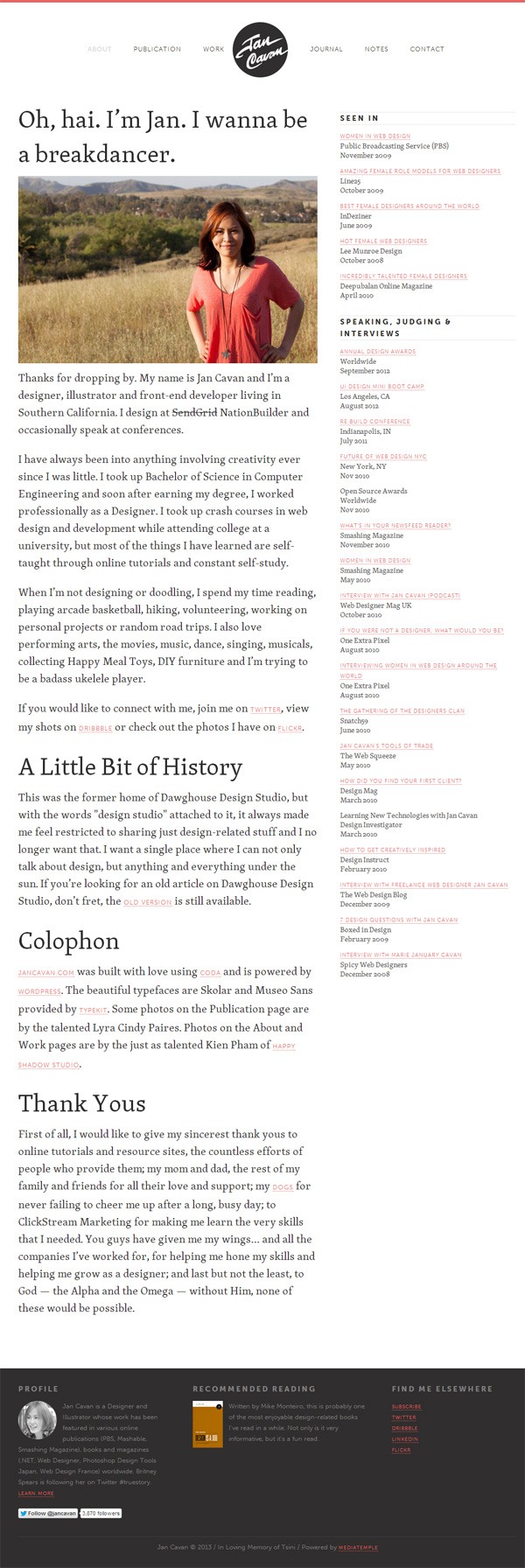
Jan Cavan’s “About” page is a bit longer, but it achieves the same objective: It gives the reader an idea about the person behind the website:
Tips for Your “About” Section
Don’t be afraid to show your personality. Creating a connection with the reader makes your “About” section more likely to become compelling content.
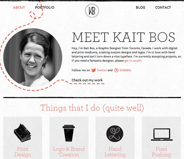
Include a real photo. Having a real photo humanizes your website. People want to work with people.
The photo in Kait Bos’s “About” section dually serves as a visual that helps draw attention to her call-to-action, Check out my work:
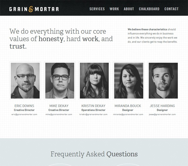
The Grain & Mortar “About” page features headshot photos of the staff:
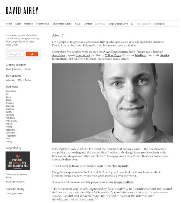
The “About” page on David Airey’s portfolio website has a large headshot of the designer:
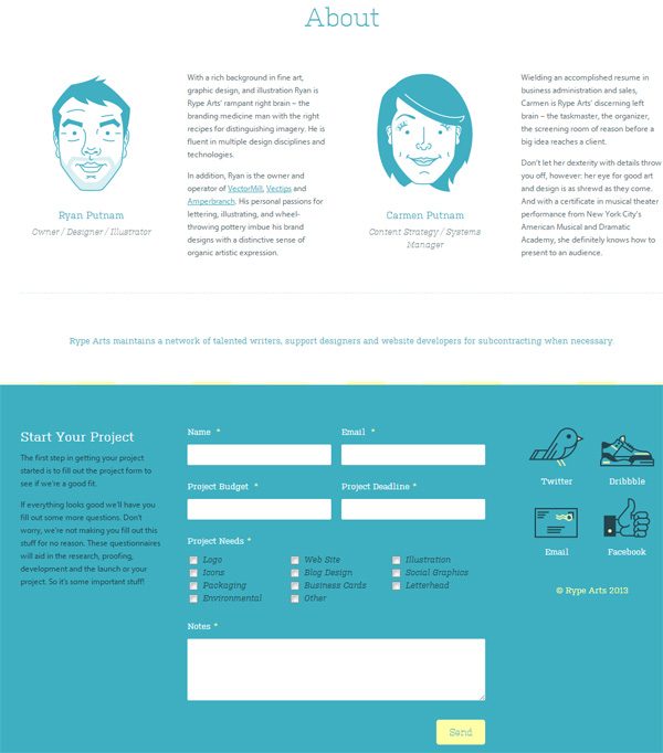
Have a call-to-action. We can reasonably assume that a person reading your “About” section is an individual who’s considering to hire you. This means you have an opportunity to move him/her into action.
The “About” section of Rype Arts is quickly followed by a call-to-action to start a project with them, as well as a contact web form and alternative secondary action options like following them on Twitter and Facebook. This preserves the continuity of the user experience:
“Services” Section
This is a list of your skills and service offerings. Some choose to put this section within their “About” section. Providing this information lets interested people know that they’re on the correct website.
Examples
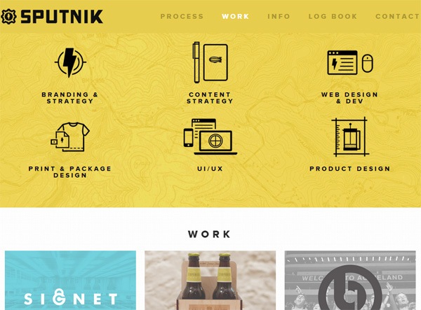
The “Services” section on Sputnik Creative lists the six main services the company provides:
The “Services” page of Fohke is an example of something more elaborate, but it achieves the same purpose of providing information about the company’s services:

Tips for Your “Services” Sections
Be specific. It’s best to excel and specialize on a few things rather than trying to please everyone.
State your unique value proposition. Along with your list of skills, it’s a good idea to provide information about what makes you different from other service providers.
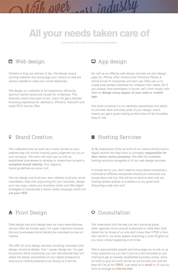
For example, the value proposition on the “Services” page of By Association Only is the comprehensive service they can provide. The value proposition is convenience — clients don’t need to deal with multiple service providers for their various needs:
“Contact” Section
The “Contact” section tells people how they can get in touch with you.
Examples
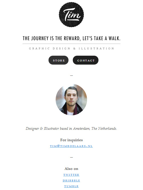
Your “Contact” section doesn’t have to be elaborate. You can choose to keep it simple by just stating your email address, like in the case of Tim Boelaars’s “Contact” page:
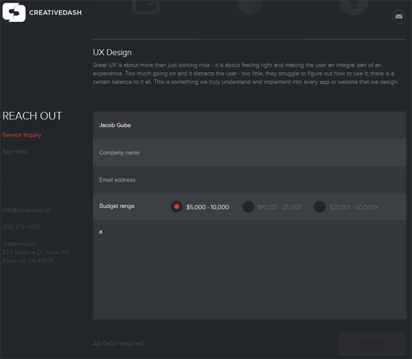
You could use a contact form if you’d like to make it slightly more convenient for the person wanting to send you a message. Using a web form can also give structure to the information being sent to you.
The contact form at CreativeDash Design Studio exemplifies this concept of structure; by having a web form that asks for the full name, company name, and budget range, the design studio ensures relevant information is being provided to them on first contact:
Tips for Your “Contact” Section
Provide multiple communication options. Make contacting you as easy as possible by supplying several channels of communication. This gives the user the ability to choose the mode of contact she’s most comfortable with.
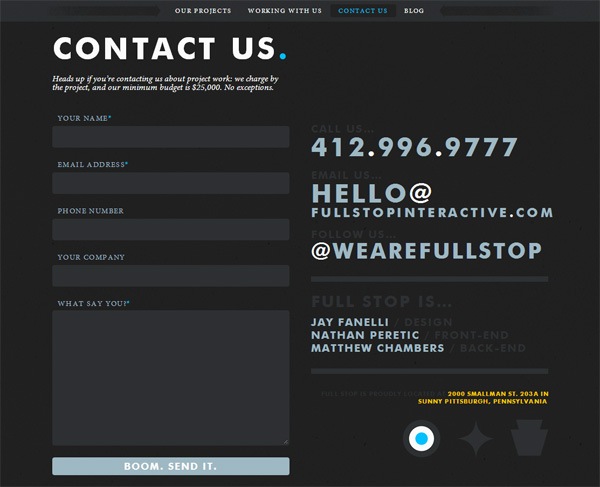
For example, on Full Stop’s “Contact Us” section you can see they’ve provided four modes of communication (web form, email, phone, Twitter):
Make this process as easy as possible for the end-user. Contacting you is the first action a person will take before they hire you — it’s a crucial process. You want to do anything you can to make the contacting process as simple and trouble-free as possible.
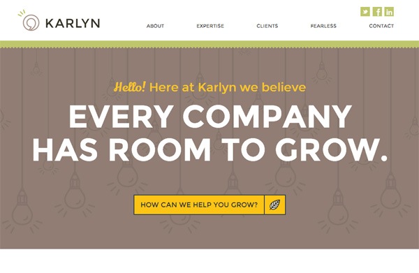
A good example of this is on Karlyn. They have a big call-to-action button at the top of their landing page to ensure site visitors see it immediately:
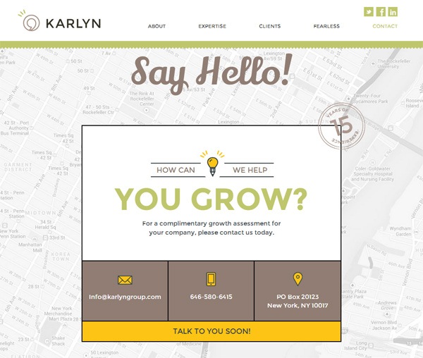
They’ve gone as far as incentivizing the contacting process by giving you complementary services if you contact them:
Other Popular Components of a Portfolio Website
Many portfolio sites go beyond the four basic sections of a portfolio website.
Other components you should consider having on your website are listed below. As you decide which components to have on your site, keep these two questions in mind:
- Will it help me create compelling content?
- Does it provide basic information about me?
Blog
You’ll often find a blog in portfolio sites. Blogs give site visitors more compelling content to consume. A blog gives people insights about your knowledge, expertise, and personality. A blog can also bring in new site visitors to your portfolio site.
Examples
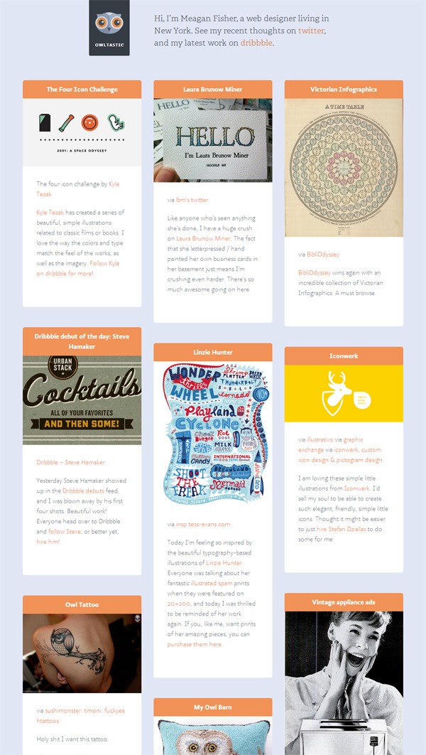
The blog at Megan Fisher’s site is a good example of using a blog as an additional way of adding compelling content on a portfolio site. Her blog allows readers to get an idea about her personality and creative tastes:
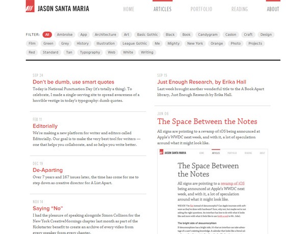
The blog on Jason Santa Maria’s portfolio site is another good example of how a blog can add value to an online portfolio:
“Process” Section
Many online portfolios will have a section that outlines the project’s workflow. This gives prospective clients insights about what they can expect if they work with you.
Examples
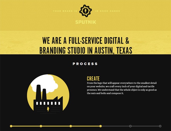
Sputnik Creative has a sequential slideshow presenting their work process:
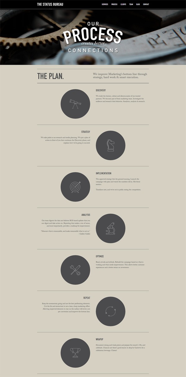
The “Process” page on The Status Bureau outlines the initial phases of a project (like discovery and research) up to what happens at the end of a project:
Case Studies
Discussing certain projects in great detail can provide your site users with more compelling content to consume.
Examples
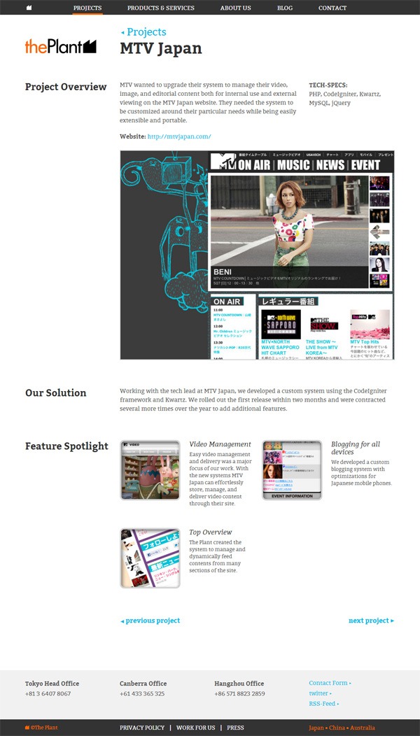
The Plant provides a handful of case studies on their site, such as the case study of their project with MTV Japan. They state the unique challenges of the project, their solution to these challenges, the technologies they use, and a list of features the project has:
Another exemplary example of using case studies in portfolio sites can be found on digital agency BKWLD’s site. Here’s their McDonald’s case study:

Quote Request Form
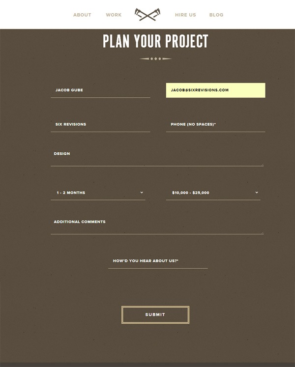
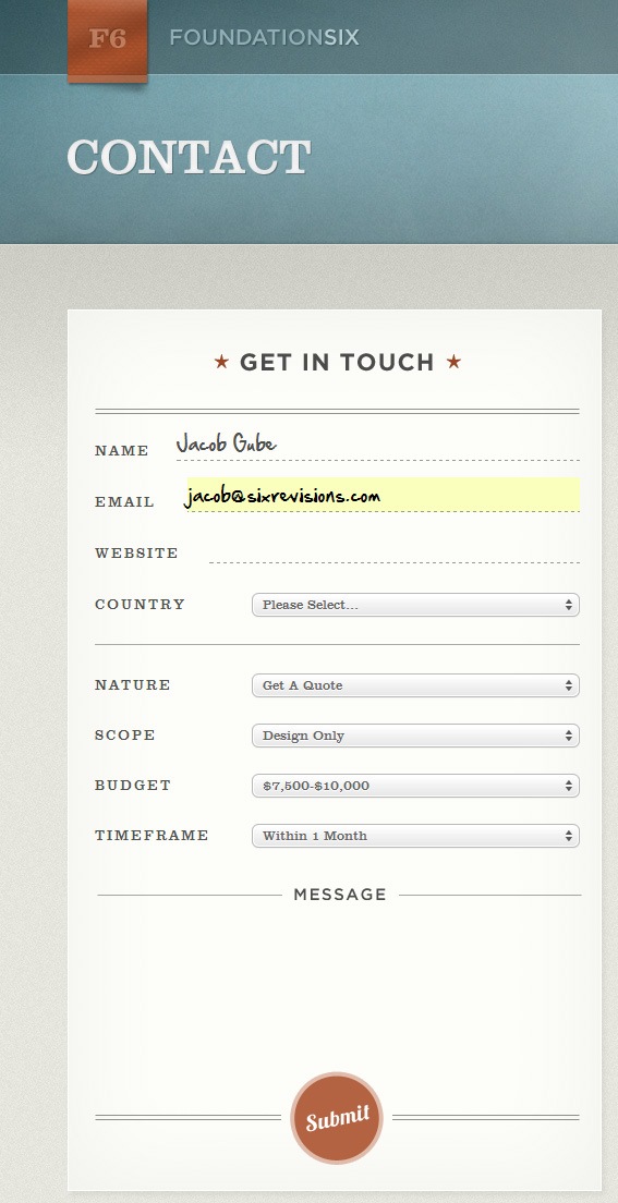
Beyond a simple contact page, some portfolio websites choose to have a quote request form instead. A quote request form asks users to provide relevant information — e.g. the scope/nature of work, timeframe, and the budget of the project — so that the portfolio site owner can send a price quote to the requestor.
Examples
Here’s a quote request form example (on the Built portfolio site):
Another quote request form can be found on the Foundation Six “Contact” page:
Conclusion
Building an online portfolio can be a daunting task. But if you keep the purpose of a portfolio website in mind, the path to the finish line is a clearly guided process.
I hope you gained some useful tips and ideas for your own portfolio website!


