Discussion, comments, critiques, opinions on type Throughout the semester typographic works related to projects and assignments will be posted
Instructions
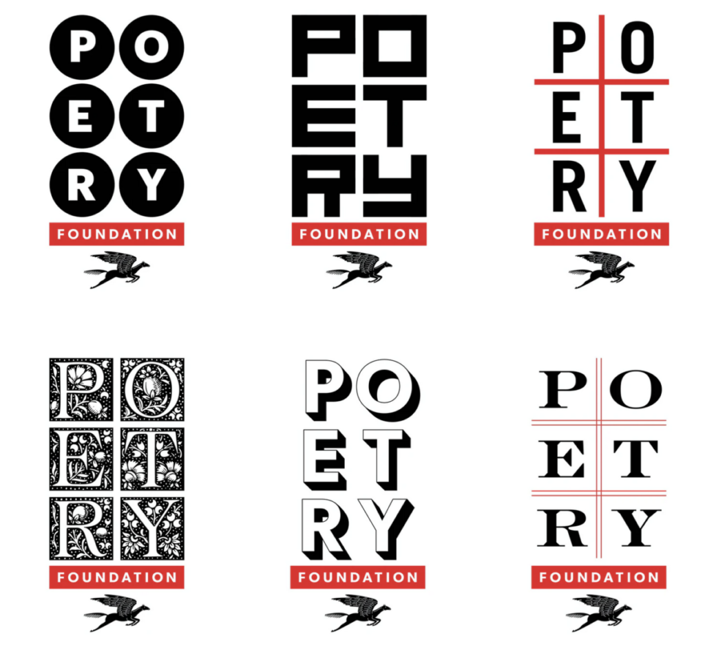
Logos done by Pentagram’s
Michael Bierut. for Poetry Magazine.
- Do you think the overall concept works?
- Which one or ones of these do you think works the best and why?
- Comment below
- Observe the variety way in which the typography is the concept, illustration,
Resources
http://www.typeroom.eu/article/pentagram-s-michael-bierut-poetry-foundation-s-new-typography
https://www.poetryfoundation.org/POETRYMAGAZINE/ARCHIVE#1918

