Type Talk
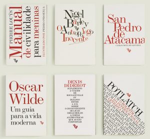
Select what you consider to the strongest cover design from the image below.
Explain why.
Due Before Class MARCH 27
Contents
Client: Fenda Edições
Design
João Bicker
http://www.fba.pt/portfolio/projects/fenda+book+series-4
The project for this series of books is based on a self imposed restriction with the aim of exploring the expressiveness of the text. All book covers are designed using only two colors – black & red – over a white background. Monotype Modern Extended, a typeface to been seen rather than read, is the sole graphic element apart from the publishers logo. The vast diversity of subject matters and ages of the texts in this collection is reflected on the cover designs, with the treatment of type seeking to capture the sense and flavor of each text and each author.
here are some others in this series
Save
Save
Save
Save
Save
Save


