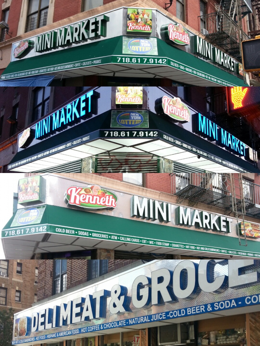
Light Box (Signs) used in NYC Deli-Groceries

Today, I wrote a guess post on a friend’s blog called “New York Type” where I went in detail about certain similarities that can be found in Light Boxes in NYC Deli-Groceries. The similarities help this type of business to differentiate them from other businesses since they are very eye-catchy and aesthetic. As a result, numerous owners of Deli-Groceries are renovating their business so that they can attract more customers and hoping to increase their sale percentage. Two of the main similarities are as follows:

  1. The use of “Diamond Plate” covering the box (Shiny and long lasting material)
  2. White-colored (Transparent) letters with a basic font illuminated with beautiful-changing lights
De la Cruz Construction

By Josel De la Cruz (De la Cruz Construction)

To find more information, please read the detailed and informational post on “New York Type

Business Signage

The Typography used in the signage of a business whether small or big, plays an important part when it comes to attracting costumers and when creating an unique image for your business.

signs-businesssigns2[1]

Take this signage of Focused Advocacy for example: The contrast of the white with the blue works perfectly; the blue gives a calm yet sophisticated feel to the logo, while the white gives the logo a simpleĀ and innovate look. The typeface use for this signage is very simple and bold, again helping achieve the look this company was going for ( Innovate Simplicity). This signage is a great example of how simplicity canĀ help achieve a sophisticated look.

signs-businesssigns1[1]

Another good example is this signage for Telvent Caseta: The San Serif Font used on this signage creates a modern look. The red color use for the word Telvent helps create an energetic feel, while the black for Caseta creates a balance between both colors. What I like about this signage is how they succesfully used scale for the two different typefaces, and the way the scale interacts with color giving this signage a modern yet energetic look and feel.

About the blogger- Hi, my name is Perla Sanchez and I am currently a junior graphic design student at the NYC college of Technology with a passion for Typography design.You can check out my blog at https://openlab.citytech.cuny.edu/typellustration/.