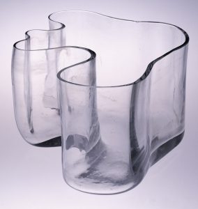
The first and second image are a great example of using transparent. The use of the clear glass helps the background to activate with multiple backgrounds. For example, they will show off the color and shape of what’s inside them, which simply give a beautiful layout of depth. I like them in both colors, I could imagine how beautiful they will looking when using the background with other design elements.


As for the last two, the use of transparent and layering create an interesting visual effects by layering different colors and shapes on top of each other to clearly send the message of relation to the second one. As a result, the powerful use of transparency and layering work to build a great complexity by allowing multiple layers merging together. It works well to direct the viewer effectively using contrast and many more.


