
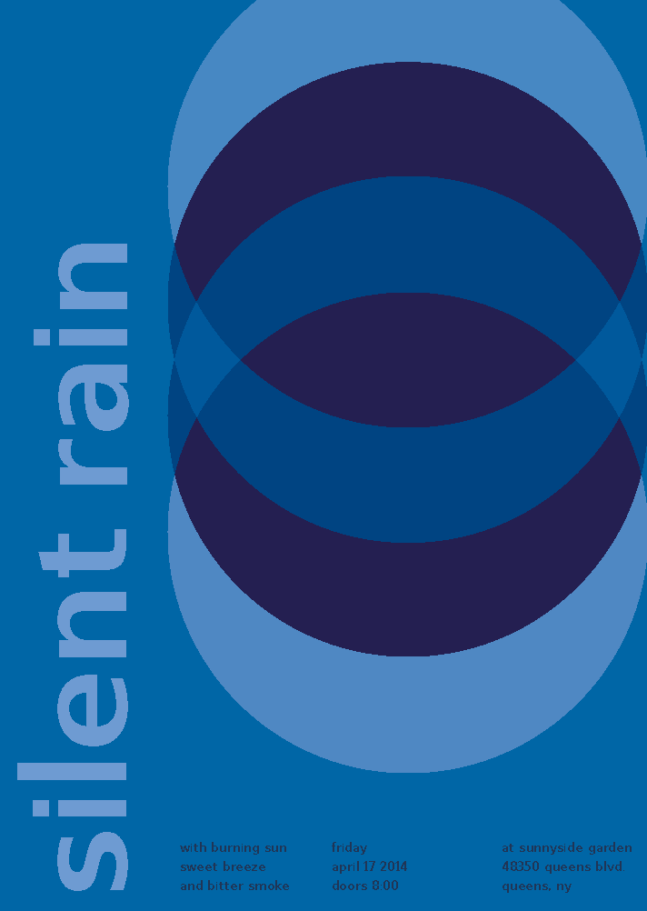
Using the already made swiss style band poster I made with my group, I recreated it in Adobe Illustrator. Recreating the poster was easy for me because i already have had experience with Illustrator but i was having trouble with the color. I tried to use no more than three different levels of saturation of blue. “Less is more” was what i had in mind. This took me about 1 hour to do.


Lovely work Divina. The band poster looks great. Like I said in class, maybe switching the dark blues with the muted blues (including the text) might make it a little easier to read the band name, keeping the background color the same. But again, this looks great! Nice job.
The only thing I would’ve changed is the text on the bottom.. the color maybe. It’s hard trying to make the poster a “cool” theme, but it is kinda hard to read. Great job though! I really like the overall outcome.