
I loved working with colors for this project. It was fun and made me realize the importance of color. When the teacher told us to illustrate a harmonious moment I found it a bit difficult. I think it is rare to feel harmony within yourself and others. Once I found my harmonious moment I had more difficulty choosing a medium. I wanted to do it on Adobe Illustrator but realized that it would be very difficult. I ended up just cutting out paper and painting with gouache. I was really stressing over this final because I felt like there was no time to actually put all my effort into it. In the end it came out ok. Overall I think this project was great as the last project for the semester. To look back into your life and really think of a harmonious moment is something most people don’t think about as often as they should.
Color Harmony: Final
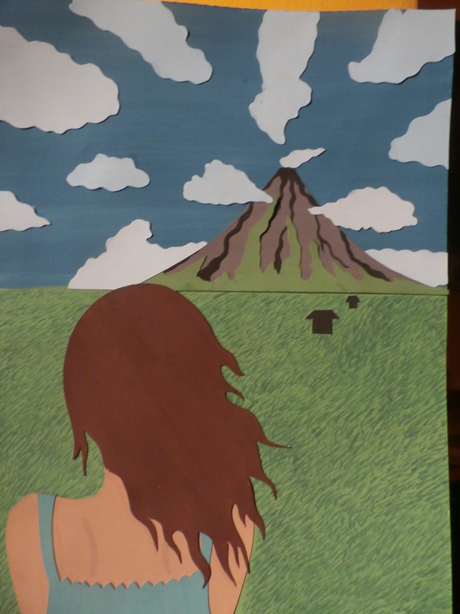
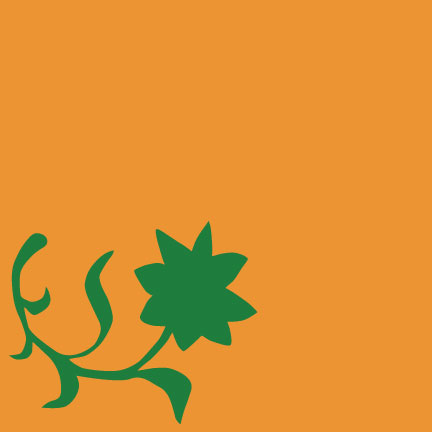
I used gouache paint and cut paper to make my final piece. To be honest I really think that I could have done better. At school when we were critiquing, my professor and peers pointed out some things that were really helpful. For example, there are too much clouds, the proportion of the clouds need to change. Same with the volcano. It is too detailed and fights for attention with the girl. My professor also pointed out the less is more rule. I could take out the volcano and it will still give off this harmonious feeling. This took me about 4 hours.
Color Harmony: Color Inventory
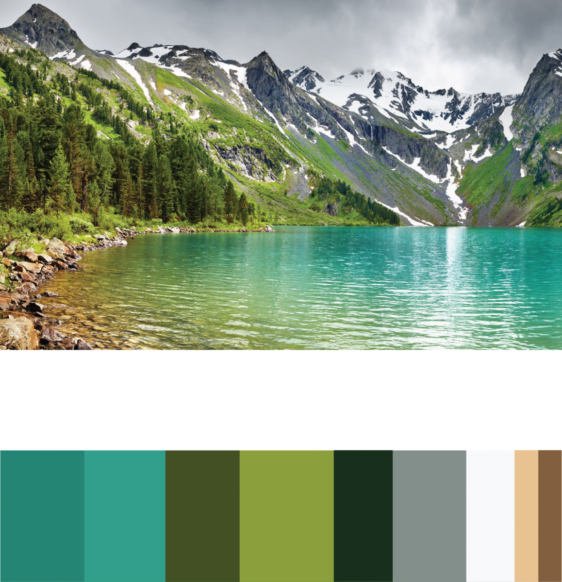
This is my color inventory for the free study. I am going to be using these colors for my harmonious project. I’m trying to give a calm, serenity, and peaceful feeling and i think these colors will work well with my moment and at the same time convey my feeling of the moment. This took me about 10 minutes to do.
Color Harmony: Free Study Sketches

For the free study we had to illustrate a moment in our life where we felt harmony within ourselves, others, or nature. My harmonious moment was when I visited my country (Philippines) and i was looking into this field full of grass and rice fields. In the distance I saw a dormant volcano with sky’s so blue and the clouds were really beautiful. In that moment I felt happy with where my life was heading and also one with Mother Earth. I didn’t exactly make 10 sketches of the moment.. more like 10 objects I saw. I will fix this. These sketches took me about 20 minutes.
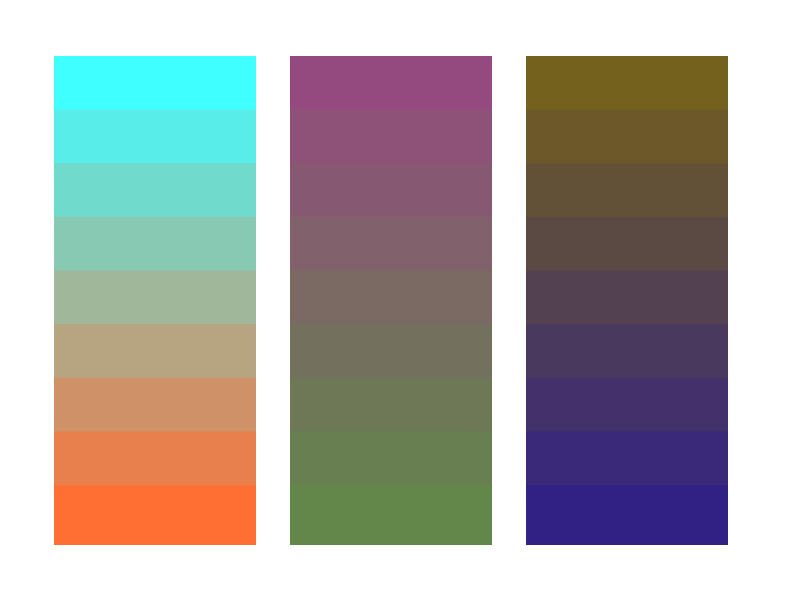
Color Harmony Palettes
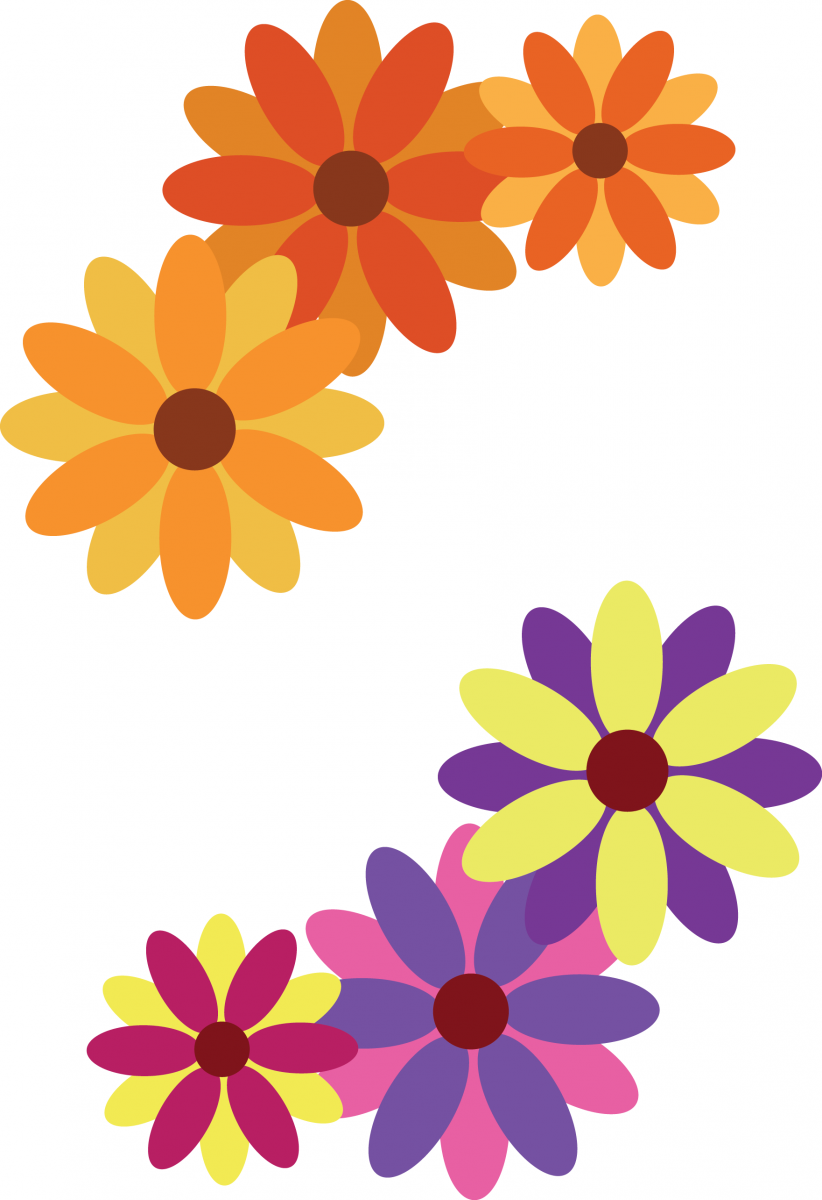
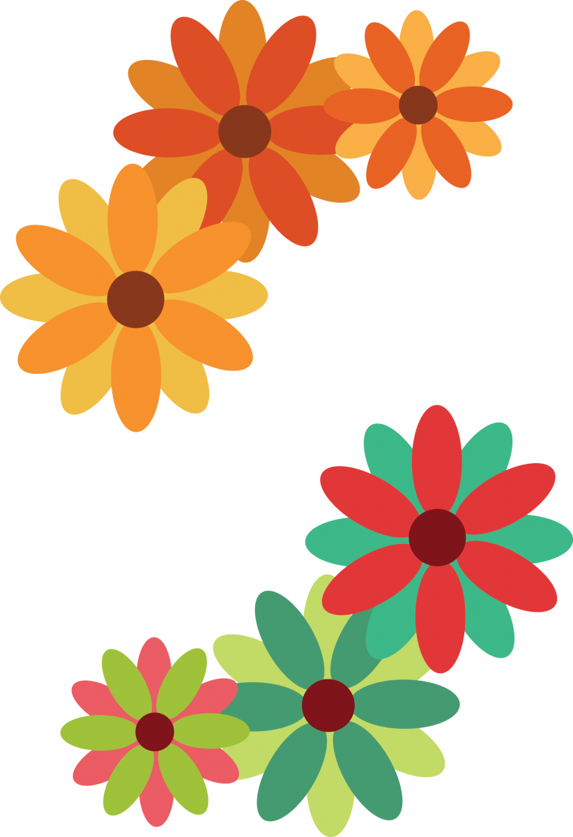
These are my color palettes that I made on illustrator. I only look me about 5 minutes on each, so 20 minutes all together. I like how they turned out. Although, I think i should’ve changed the analogous palette (the top flowers) for the second version.
Color Interaction: Critique
This project was one of my favorite projects. I love color and throughout this project I have gained a new perspective for color. Not only have I been able to train my eyes to see the difference of hue’s saturation, value, and temperature , but also how colors interact with one another.
Making the color interaction pairings was a bit confusing at first but turned out to be fun. It amazed me to learn the shift of value, value & hue, or just hue in the middle color depending on the background color. It is like magic! As i learned to see the difference, doing the pairings got easier for me.
I am usually not fond of doing group projects but the color interaction freestudy has opened up my mind to that idea. The free study itself was unique and interesting, It was fun getting to know my partners, Maya and Loubna, and figuring out a color and icon that each represents one another. We really worked well as a team, making a timetable and assigning work equally. I am proud and thankful for Loubna and Maya. Not only did we complete the project faster than we expected but I also gained two new friends.
Overall this project was amazing. The best part for me was being able to go to the Brooklyn Botanical Garden because I gained a whole lot of new perspective and inspiration. I think i could’ve spent more time on making my thumbnail sketch and improving my color interaction pairs.
Color Interaction Freestudy: Final

This is my groups final outcome with our free study. As you can see we changed the colors again. This time we are sure these colors represent us. I am really proud of my partners, Loubna and Maya, for their contribution and help.
Digital Progressions Experiments


- Tint progression

These are my digital progression experiments. They were easy to make. I did struggle a bit with the complimentary ones. This took me about 10 minutes to do.
Field Trip: Brooklyn Botanical Garden
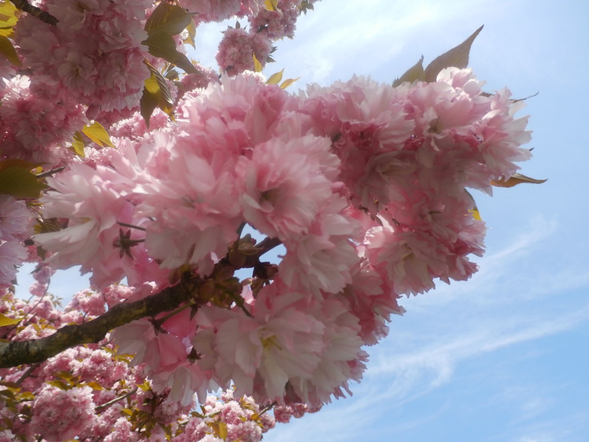
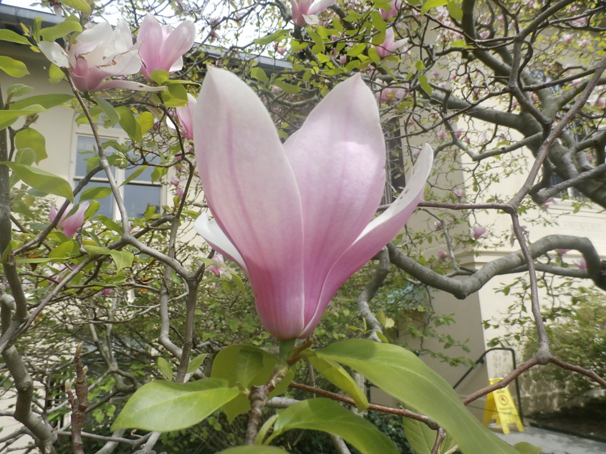

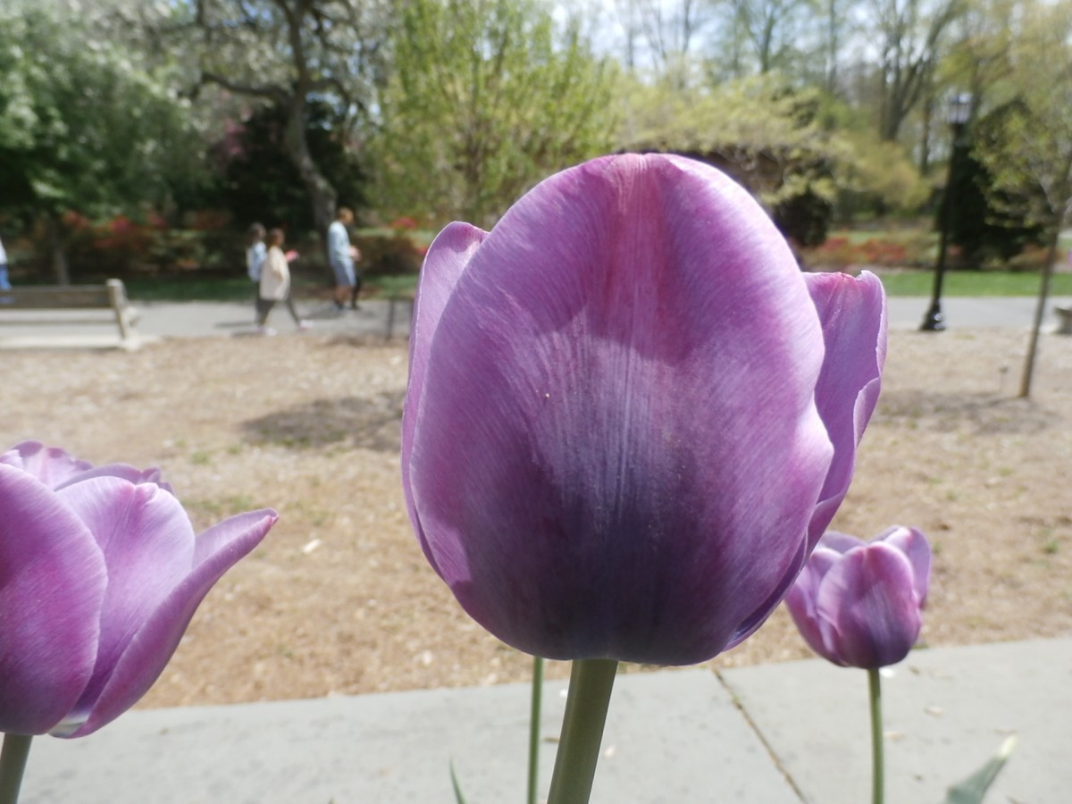
Going to the botanical garden was an amazing experience. All the flowers are beautiful and it was a sunny day with a lot of fresh air. I took pictures until my camera died. I found many tint tonal progressions but it was difficult to find shade and complimentary tonal progressions. This trip made me realize how colors interact well with others and the beauty of color that earth is able to create.
Color Interaction Freestudy: Color Mockup
![]()
![]()
As you can see, my group and I had trouble deciding on colors. We chose blue for Maya because she is sophisticated, smart, quiet, and reminds us of water. At first we decided on a muted blue but realized a chromatic grey blue was better. For Loubna we decided she was red because she is outgoing, a bit crazy, and unique. We tried a muted red but it didn’t really go well. So we switched it to green. My group saw me as a purple and later on as a yellow.
To be honest we did not like the colors we came up with. We will most likely change it.
This color experimentation took about 30 min. We are still unsatisfied.

