The AIGA 2013 We the Designers exhibit was focused on the political world during President Obamas term. Visiting the exhibit I saw some very interesting pieces. Though the designs were effective with the message they displayed some stood out more then others.
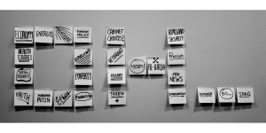
Timothy Goodman created a piece called “OH…” in 2008. The piece displayed in the AIGA We the Designers exhibit was a photograph, printed on an inkjet printer, of post- it notes each displaying an issue that President Obama faced during his first term. The post- its were arranged to spell out “OH” with three ellipses following.

The photograph is in black and white a conscious choice considering President Obamas mixed ethnicity and it being such a big story at the time. The contrast photo puts the focus on the design and the issues that are put on display. The repetitive use of the post- its to spell out these obstacles gives the piece a sense of unity and consistency as it trails off with the final three issues creating ellipses. Each note being hand written with one obstacle on them, some with more emphasis then other with the use of an exclamation point or underlining, in no clear order gives each obstacle a different gravity and allows them to not be viewed in an particular hierarchy of but does allow the viewer the freedom to decide this.
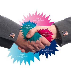
Timothy Goodman made another entry that also appeared in the exhibit, an untitled photo montage and vector piece made in 2011 printed from an inkjet printer. The picture shows two hands shaking both with american flag lapel pins in each sleeve with 5 bubbles all with jagged edges surrounding them. The five bubbles each include a major event of President Obamas first term in no particular order. The colors of the bubbles, the centered hands shaking contrasting the white background all combine to draw the viewers attention to the piece. The jagged edged bubbles and their individual distinct colors are designed this way to further draw the attention of the viewer to the information in the bubbles. The font used for the first line of the bubbles is a script font headlining the accomplishment followed by a serif font on the following line with the year in the same font to complete the accomplishment. The colors further highlight each accomplishment of the term while the shaking hands can be interpreted as an agreement that these are in fact victories worth acknowledging.
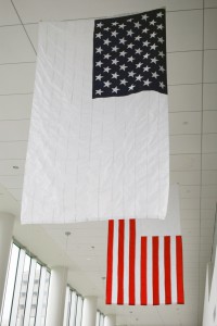
Thomas Starr contribution to the AIGA We the Designers exhibit is called Exploded View made in 2011. It was two sewn nylon flags hanging from the exhibit ceiling. Each flag had a portion of the American flag on it. One had the stars filled in and the stripes whited out while the other had the stripes and the portion where the stars would go were whited out.
The issue was the clear divid in American politics between the Democrats and Republicans. The simple design of the flag in two parts is powerful because the American flag is such a big symbol that displaying it as two parts is eye catching in itself. Within the context of the political climate the message becomes clear that the divide of the political parties was in fact also the divide of America itself. The colors fitting in with the two political parties allows the simple message to come through easily.
These designs stood out the most to me. Their message was clear and effectively conceived displaying a deep and powerful message in a subtle and in some case not so subtle manner.


