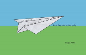
Originally for my first Visual Quotation I wanted to create an abstract train. This one idea became to separate concepts. The first of the two turning the abstract train into a flying paper air plane. I added a background to it, representing the sky and the ground to further emphasis the air planes flight. For the quote I chose the san serif font Noteworthy after searching though the available font and seeing that it fit well with the air plane. The word “whooshing” I decided to increase the tracking of the word to emphasis the the passing of the deadline much like the flying airplane is meant to. The serif font I decided upon for “whooshing” is Apple chancery since it allowed even more focus on the word when contrasted against the rest of the quote. The paper airplane uses a paper texture since i did not feel placing a white or off white color for it would be effective.

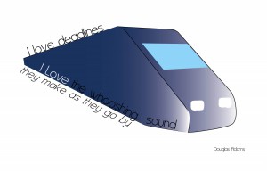
For my second visual quote i went back to my original idea of a train. This time I completed the train and after a few revisions I settled on a blue and white scheme for the train. The san serif font I decided on was Asenine because its light stroke weight complimented the simplicity of the train. I put the “I Love” portion in white because I wanted the focus to be on those words rather then “whooshing” on this concept. I placed the last line underneath the train to parallel the train as if it were the tracks the train rode upon.
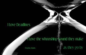
For my final visual quotation I decided to use a photo. Going with the quotes relation to time with deadlines I felt like the best way to convey time passing was to use an hourglass and place it as a background image and place the text over it. I chose the san serif font Dream Orphan and made it green to contrast the black background of the image.
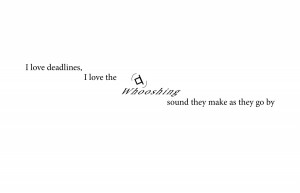
Here are some of my early concepts, hey we all have to start somewhere.


