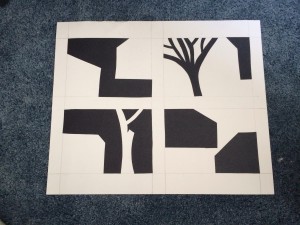
These are my four thumbnails which I’ve decided to use for my cutout images. There are two which are clearly stable images (the ones with the trees) and two which are ambiguous. I believe that I could have improved the bottom right image to be more ambiguous by making the shapes of the structures negative spaces, instead of using the black paper to represent them.


I like your drawings, although they all feel more stable than ambiguous. If added a bit more black, to the bottom right, it might become more ambiguous.
I can see you used ‘economy’ in your work. I’m guessing the bottom two are ambiguous and the top two are stable. Really neat work and really nice cutting I’ve got to say. Though, I feel you could’ve used just a little more detail to show the ambiguity in your work. You could’ve also used more unified sketches like the ones in your thumbnails, but overall, I do like how simple it is as well. Good Luck!
Very interesting! They are simple yet catching to the eye. 🙂 Keep up the good work.
Your thumbnails are look simplistic and impressive. Nice!
Nice. Very simple. Neat and clean.