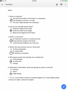
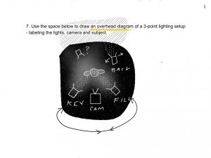
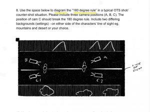
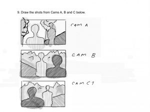
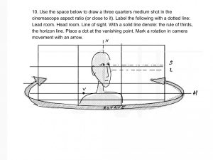
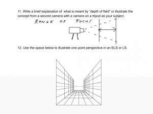
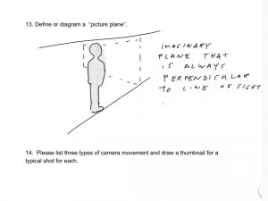
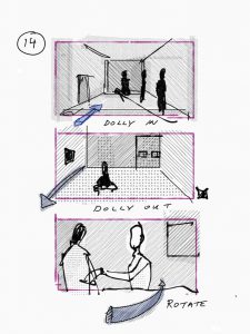
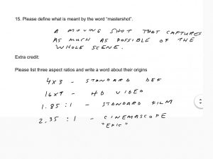
Quiz answers
Taco Bell “psycho dog” lawsuit
Animatics
Animatics
Animatic
Noun. a preliminary version of a movie, live-action scene or animation, produced by shooting successive sections of a storyboard and adding a soundtrack.
Source: wiktionary
- Why animatics developed
- To show complex movement and sfx
- Test viability (budget and space/time constraints)
- Gives distance to the filmmaker – first time you can be a passive viewer/ let something “sit”
- uses of animatics
- Timing (rhythm) – things that are hard to time
- Special effects/ transitions
- Audio (choosing music/ voice)
- Camera movements
- Distance
- Who uses animatics?
- Director
- Actors especially working with animated characters or objects
- Sound booth – VO actors
- Types of animatics.
- Hand-drawn animatics (hand drawn storyboards) https://www.youtube.com/watch?v=F8Iys-KXfFc
- Pencil tests (motion of characters or objects) https://www.youtube.com/watch?v=xMLMQtFVQuU
- Motion preview (inspiration media that deals with motion within the frame)
https://www.youtube.com/watch?v=PLxI6kW7bFU
Videomatic
Noun. A rough videotaped version of a scene that uses actors or production staff in blocking the action, actor placement, timing and camera angles.
Source: Exploring Storyboarding, Wendy Tumminello (chapter 12)
Bluescreen/ greenscreen – an area of the picture with a designated color to “key” out. There are two types of keying : chroma and luma.
Exploring Adobe Premiere.
- How to import jpgs
- How to create pans and zooms
- How to make and import temporary/ rough VO
3D animatics
- Low cost 3D model (proxy model) instead of stand-ins allow filmmakers to experiment with camera positions.
Timing
- Length (rt= running time)
- mood/pacing
- rhythm/ changes in pace
Frame Rates
- Film vs. TV
- NTSC vs. PAL
- Calculating frames for animation
- Fast and slow motion
Timing for expressive results
- Consider the following rules:
- Sad shots have soft and slow motions
- Energized sequences have fast action/ movements and more cuts
- Anxious shots have fast motions but with long pauses
Cinematic or Cutscene
A cutscene or event scene (sometimes in-game cinematic or in-game movie) is a sequence in a video game that is not interactive, breaking up the gameplay. Such scenes could be used to show conversations between characters, bring exposition to the player, set the mood, reward the player, introduce new gameplay elements, show the effects of a player’s actions, create emotional connections, improve pacing or foreshadow future events.[2][3]
Cutscenes often feature “on the fly” rendering, using the gameplay graphics to create scripted events. Cutscenes can also be pre-rendered computer graphics streamed from a video file. Pre-made videos used in video games (either during cutscenes or during the gameplay itself) are referred to as “full motion videos” or “FMVs”. Cutscenes can also appear in other forms, such as a series of images or as plain text and audio.
source: wikipedia
Multimedia:Design:Methodology – storyboard
Useful wiki about process of multimedia design:
Benefits of storyboards for multimedia
- They’re easy to create – can use pencil & paper
- Allow the designer to anticipate problems
- Serve as a common reference point for design teams and clients, providing firm specifications for both.
- Becomes the “Contract” document between you and your client, and places a boundary on your presentation. This is *important since multimedia production can lead to forever changing specifications.
- Becomes the working document for the multimedia project team.
-
Client requirements and User definition
What is the purpose of the web site – from the client’s perspective?
- To inform?
- To entertain?
- eBusiness?
Target audience
Identify some of the following:
- The age range
- Designed for children, teens, adults
- Gender (If appropriate)
- Site for Car Parts, Women’s Shoes, etc
- Ethnicity/Culture/Language/Gender
- Is your site for an international audience?
- Will you need to handle multiple languages?
- Level of computer experience
- Technical site on Computing Hardware, Children’s gaming site
- What interest areas you would expect visitors/users to have.
- E.g. Interest in sports, collecting, trains, cooking, etc…
- Devices used to view site
- E.g. ePad, Mobile phone
And for each identify what should be done to address these needs. —vmvadmin 17:47, 21 August 2011 (EDT)
Answer the following questions:
- Why would someone want to visit my site, or use my multimedia application?
- Why would someone want to revisit the site or the multimedia application?
- How can the site/application be future proofed?
http://www.virtualmv.com/wiki/index.php?title=Multimedia%3ADesign%3AMethodology_-_storyboard
Essay about Interactivity
Processing – an open source software for artists and designers.
Meditating on mouse history helps generate interactive ideas.
https://www.processing.org/tutorials/interactivity/
Casey Reas and Ben Fry
The screen forms a bridge between our bodies and the realm of circuits and electricity inside computers. We control elements on screen through a variety of devices such as touch pads, trackballs, and joysticks, but the keyboard and mouse remain the most common input devices for desktop computers. The computer mouse dates back to the late 1960s, when Douglas Engelbart presented the device as an element of the oN-Line System (NLS), one of the first computer systems with a video display. The mouse concept was further developed at the Xerox Palo Alto Research Center (PARC), but its introduction with the Apple Macintosh in 1984 was the catalyst for its current ubiquity. The design of the mouse has gone through many revisions in the last forty years, but its function has remained the same. In Engelbart’s original patent application in 1970 he referred to the mouse as an “X-Y position indicator,” and this still accurately, but dryly, defines its contemporary use.
The physical mouse object is used to control the position of the cursor on screen and to select interface elements. The cursor position is read by computer programs as two numbers, the x-coordinate and the y-coordinate. These numbers can be used to control attributes of elements on screen. If these coordinates are collected and analyzed, they can be used to extract higher-level information such as the speed and direction of the mouse. This data can in turn be used for gesture and pattern recognition.
Keyboards are typically used to input characters for composing documents, email, and instant messages, but the keyboard has potential for use beyond its original intent. The migration of the keyboard from typewriter to computer expanded its function to enable launching software, moving through the menus of software applications, and navigating 3D environments in games. When writing your own software, you have the freedom to use the keyboard data any way you wish. For example, basic information such as the speed and rhythm of the fingers can be determined by the rate at which keys are pressed. This information could control the speed of an event or the quality of motion. It’s also possible to ignore the characters printed on the keyboard itself and use the location of each key relative to the keyboard grid as a numeric position.
The modern computer keyboard is a direct descendant of the typewriter. The position of the keys on an English-language keyboard is inherited from early typewriters. This layout is called QWERTY because of the order of the top row of letter keys. This more than one-hundred-year-old mechanical legacy still affects how we write software today.
Banner Ads – animated gif
Animated gif banner ads have been the web standard for many years – made in photoshop. The ads are simple animations. The process often goes from drawing to photos and back to digital intermediate.
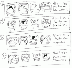
A basic 4 frame banner – uses a horizontal text hightlight animation. How would you add interactivity to this?
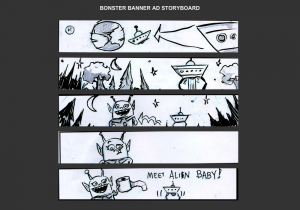
A 5- frame banner ad “alien pit-stop”. How could this be more effective? What is motion arrows could help get this joke across?
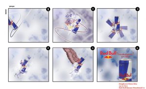
A Redbull concept storyboard. What is essential to successful execute this concept? What is the storyboarder banking on?
What does this ad need to be more effective at such a low frame count? What is counter-intuitive about this ad?
What visual technique is used here? How is interactivity achieved?
Does this story model apply to the ads above? If so how do each of them incorporate it?
Sizing for computer screens
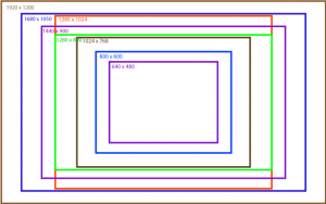
With multimedia, we are no longer restricted by aspect ratios – rather sizing is connect to screen resolutions.
Which of these website sizes are also aspect ratio sizes for video?
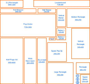
Some popular online ad sizes .
File weight is important for banner ads for quick loading.
Interactive web ads:
Types of games and associated shots
action (FPS) – POV or Subjective shots
adventure – Full shots/ high angle POV/ Birdseye
advergame – detail shots or close-ups of product/ retro video games with product placement
arcade game – varies – new one are often motion sensor (wii or kinnect technology)
R.P.G. – Birdseye shots
RTS – Extreme Wide shots
sandbox – Objective shots / wide shots / POV / Birdseye
How does “editing” happen during gameplay?

