Author: Wilna Michel (Page 1 of 2)


References:
- Cassegard, Carl. “Activism Beyond the Pleasure Principle? Homelessness and Art in the Shinjuku Underground”. Third Text. Sep2013, Vol. 27 Issue 5, p620-633. 14p. 5 Color Photographs. DOI: 10.1080/09528822.2013.830446.
- Knoblauch, Ann-Marie. “The Mainstream Media and the “Shocking Bad Art” from Cyprus: 1870s New York Reacts to the Cesnola Collections.” Near Eastern Archaeology. Jun2019, Vol. 82 Issue 2, p67-74. 8p. 1 Color Photograph, 5 Black and White Photographs, 2 Diagrams. DOI: 10.1086/703746.
- DI SIA, PAOLO. “DESCRIBING THE CONCEPT OF INFINITE AMONG ART, LITERATURE, PHILOSOPHY AND SCIENCE: A PEDAGOGICAL-DIDACTIC OVERVIEW”. Journal of Education, Culture & Society.2014, Issue 1, p9-19. 11p.
- Kalle Lasn, “The Future of Design”(lecture, TYPO Berlin, 11thInternational Design Conference,Berlin, May 2006)
- Kenya Hara, Designing Design,trans. Maggie Kinser Hohle and Yukiko Naito (Baden: LarsMüller, 2007), 435
- Gioia, T. “Michael Bierut: “The differences between mass culture and elite culture are getting less meaningful”. Its Nice That, 29 September 2017. 14p
According to Heller the concept of mainstream vs underground is relevant in Contemporary design. He speaks on the concept of design being mainstream and that marketers steal ideas from undiscovered or underground artists and bring them to the mainstream media as new media. Heller also speaks on how Underground bands led the way to commercialized mainstream culture. He continues to speak on how there are rarely any underground art that was not introduced into the mainstream culture.
The designer I have chosen is Micheal Beirut. He ties into this dichotomy because he also believes that there are barely any underground art or designs that are not introduced into the mainstream culture. In his writing “Designing under the influence “, he speaks on the mainstream culture. He talks of how his intern created a design that reminded him of Barbara Kruger ‘s designs. He speaks on the similarities between the design in the typeface used, the color palette and combination of the aspects. He then asked his intern if she was inspired by Barbara Kruger and she said that she never heard of her.
He continues on to to speak of how that Kruger’s work, had just become apart of the design atmosphere and become a template for people everywhere. He also speaks on the debate of whether people can “own” a graphic style. Beirut then says legally no. He then speaks on experience in the past where he saw the similarities between the American eagle apparel logo and very logo that Chermayeff and
Geismar’s Bruce Blackburn had designed for the American bicentennial back in 1976. He states that the logo design has hanged but was questioning whether it was due to a lawsuit or due to legal issues.
Cassegard, Carl. “Activism Beyond the Pleasure Principle? Homelessness and Art in the Shinjuku Underground”. Third Text. Sep2013, Vol. 27 Issue 5, p620-633. 14p. 5 Color Photographs. DOI: 10.1080/09528822.2013.830446.\
DI SIA, PAOLO. “DESCRIBING THE CONCEPT OF INFINITE AMONG ART, LITERATURE, PHILOSOPHY AND SCIENCE: A PEDAGOGICAL-DIDACTIC OVERVIEW”. Journal of Education, Culture & Society.
2014, Issue 1, p9-19. 11p.
By: Knoblauch, Ann-Marie. “The Mainstream Media and the “Shocking Bad Art” from Cyprus: 1870s New York Reacts to the Cesnola Collections.” Near Eastern Archaeology. Jun2019, Vol. 82 Issue 2, p67-74. 8p. 1 Color Photograph, 5 Black and White Photographs, 2 Diagrams. DOI: 10.1086/703746.
Key Words
- imitari
- image
- seismology
- code
- denotation
- denotational
- cannotational
- signifier
- composition
- alimentary
- coextensive
- linguistic
- dispatching
- puedo-truth
- ideolect
Questions
- I wasn’t too clear on what the author was trying to say with the word “italianicity”?
- “We can now understand that it is precisely the syntagm of the denoted message which “naturalizes” the system of the cannoted message”. In this i wasn’t sure if he viewed this aspect as a positive or negative.
The first ad is an advertisement by Dove for their multicultural campaign. The second is a multicultural ad by Airbnb for Superbowl 51.. The third is a controversial ad by Protein world in which other companies in response to this ad created ads 4 ,5 and 6.


For this weeks reading, the articles were a little bit confusing. However the gist was the effect media and technology has on society. McLuhari speaks on the change each of these aspects had on us and or interaction with our environment . He speaks on how media and technology are an extension, of ourselves. In the day and age of technology we live in today, technology is an extension of the person who owns it. There are many people whose phone are an extension of themselves and cannot simply live without their phone. Not only technology but media is also an extension of ourselves. It is the way we learn of what others are doing or the news in or area. All media no matter the medium is an extension of the receiver and the creators. The creator in using old techniques and sharing the story of the writer or in historical movies or inspirational movies history. Technology has created a way to share information and relay stories of the past. This is seen in all media and technology. This Could been seen in apposite light or a negative light depending on your opinion on media and technology and on your dependency on it.
This reminds me of a movie I saw called the circle. It about how the main character joined a media and technology company and how she notices how everything she does at the company effects the society. Although it is totally fiction it could be seen as a future for us if we continually become dependent on technology. As a person within this society I continually use my technology, however I try not to be too dependent on it.I love to do art and see it as an extension of myself, meanwhile I love doing digital art, I also love song traditional art. This was a discussion that my class had in one of my graphic design history class. We went into depth on how technology has improved the fields of graphic design and how it and media has effected history. Most media in the past has been an extension of the artists and creators beliefs whether it be political or not. For example the political cartoons and the posters n the late eighteenth and early nineteenth century.
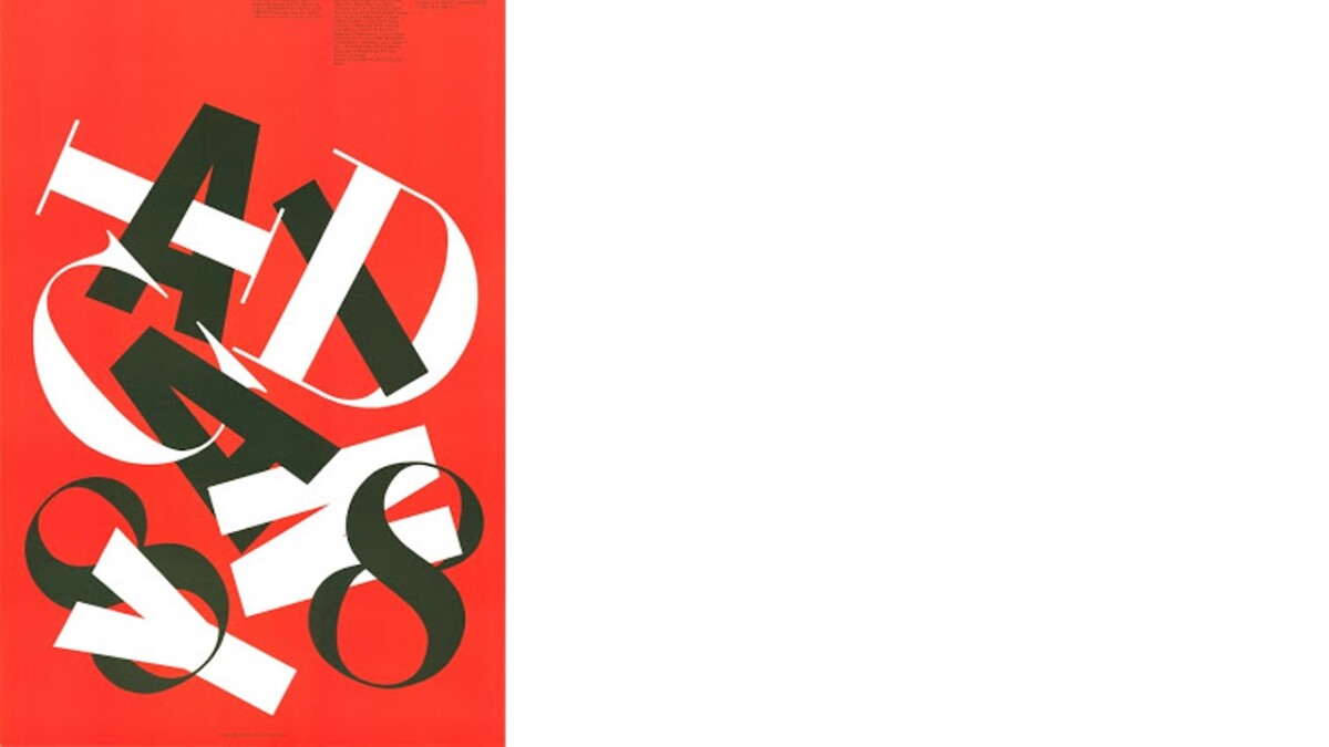
The New Typography was a movement where there were advancements in design and and typography. The new typography created a new way of designing without the limitations of the grid. It was interesting to learn Jan Tschichold’s opinion on typography; especially after learning about him in one of my graphic design classes. Jan Tschichold was a revolutionary figure in type and design. Most of his designs were asymmetrical and unseen in design. His works were a reflection of a new typography and combined the German designs. Most of his works were red and black. It contained geometrical shapes and asymmetrical typography. In the first text” The New Typography” by Jan Tschichold , he talks on the difference between old typography and the new revolutionary typography. He speaks on the purpose of old typography , whose aim according to him was to show beauty and was limited to the grid and units. The Constructivists opposed the new typography; how organic and fluid it was. The New typography gives unlimited scope for variation and allowed for more flexibility and focused on modern design.
The last two articles spoke on the technical aspect of the old typography. Based on the grid of Swiss typography, they took design elements and subjunctive them to a tight organized layout. To Brockman , the constructivists design was more beneficial to society and to the field of Graphic design. It was done systematically and pushed forward the creative aspects of the designer. To Brockman the grid system helped cultivate creativity, color and all the creative aspects of graphic design. In the Gerstner text,”Designing Programmes”, he goes into depth on the positive aspect of the new Swiss typography based on the grid. To him creativity only comes through organization and strict criteria. He states that designing is to pick out certain aspects and combine them. Based on him, design is the art of selection, and the process is to create the scheme and develop it based on certain criteria and restrictions.
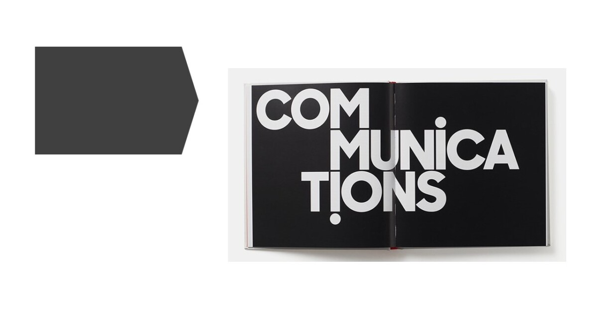
The last two readings talk about the history of typography as a form of communication. Typography is also a type of art in which the style within the letterforms shows the art style of the artist. As designers typography plays an important part in graphic design. It helps to show our purpose and communicate with the viewers. I also agree with Bayers opinion in the source ” On Typography”. Typography is no longer fluid but, however dependent on the purpose of use of the type. The type has become the main center of graphic design, it no longer is used secondary to the graphics but is used firstly and everything is arranged around it. With its constant use, it no longer is art-recognized by many. Meanwhile, typography is combined with photography, creates a new field and way of communication. Through the Typophoto, Typography is once again made center and seen by all. It then creates a link between the typography and the viewer. According to László Moholy-Nagy; Typophoto (1925), the time we live in today has created new ways and processes of creating new typography.
The First text by Walter Gropius however, talks about the history of the artist. He first emphasizes the fact that art cannot be taught, meaning that learning art from school doesn’t really give you the experience to create a finished piece of art. However, it gives you a foundation, that combined with your creative mind, creates a sense of art. Also, the school only prepares students to create pieces of art for a client. It once again leads to typography being a service art. We are taught to create works of art that can be used to communicate our client’s needs and not to show our creativity. I think that is the reason why society doesn’t understand the importance of design. There are not that many designers that step outside the box and create new designs.


Recent Comments