Contents
Class Info
- Class Date:
Nov mon 27
Announcement
Lets review 3 posters, will give feedback in class so you can update.
Objective:
- Learn a new Illustrator Tool: Blend Tool
- Continue Project 3: Understanding Design Continuity in a series
Type Challenge during class:
How to create a typographical blend in Illustrator
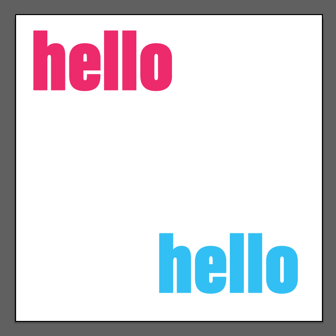
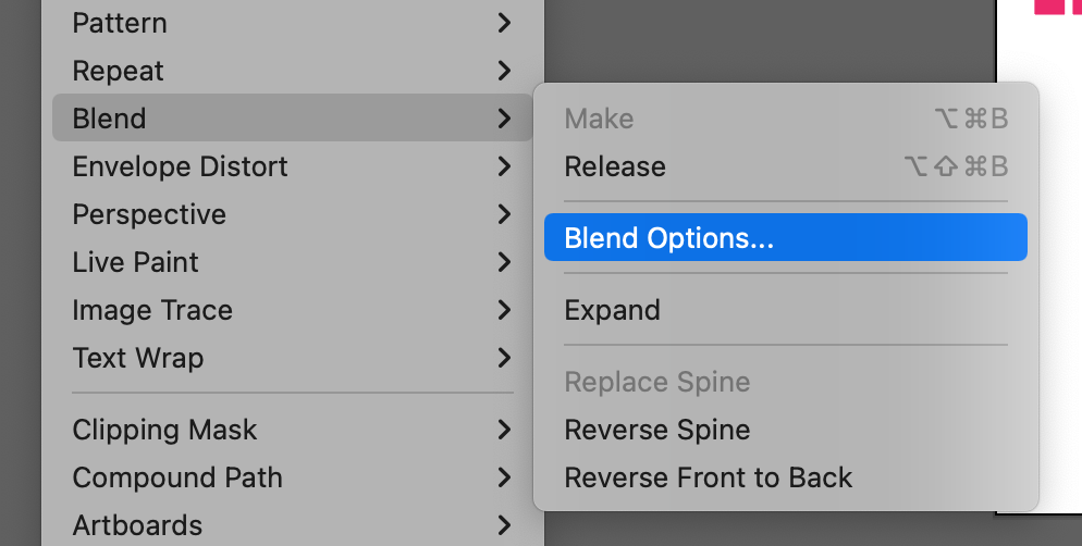
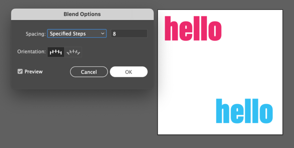
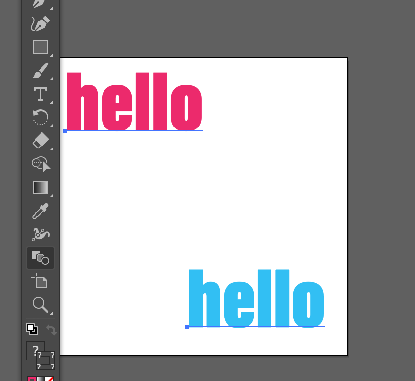
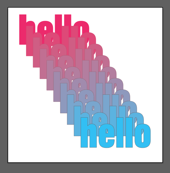
Save your Illustrator file
Export your artboard as jpg
lastname_TC_blend.jpg
Place in Dropbox
Continue Project 3:
Social Media Posts (for Exhibit)
- Create a series of four (4) typographical posts that will be used to promote Annoying! Art Exhibit across social media. These must work together.
- Specs:
- Illustrator (Preferred application, as you can use tools not available in InDesign)
- 1080 x 1080 pixels (Common social media square format)
- RGB colors (for screen only)
- USE an Image
Take an abstract photo or create a texture or create a gradient.
We will use it as background only. No illustrations. Use your own image or Creative Commons art only (credit source as required by CC) - Your designs must take into consideration all concepts previously explained this semester: typeface selection, visual hierarchy, use of a grid, color and legibility, alignment, line space, word and letter spacing, etc.
- You can use the tools that you already know…(Offset paths, outlines, 3D, planes, blend tool and others)
Illustrator
Create new document 1080 x 1080 PIXELS / 4 artboards
RGB color / 150 dpi
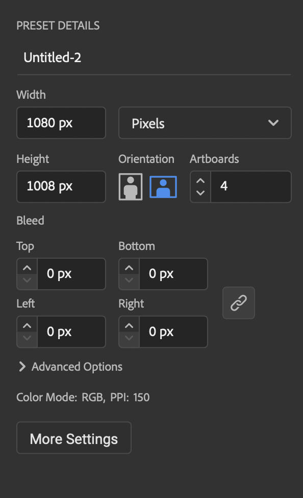
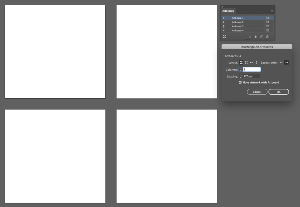
Choose layout/ Spacing 120 pixels (for now) between artboards
1. Square one (top left): Must Include
Annoying
See Link
Use Color and a solid background
2. Square two (top right): Must Include
Your own title (for your annoying item)
and other annoying things
See link
Use Color/Gradient or Use Bkgd image (remember your own or creative commons use only)
3. Square three (bottom left): Must Include
Annoying!
Art Exhibit
See link
Color/ Use a Bkgd image (remember your own or creative commons use only)
4. Create your own SPECS (bottom right)

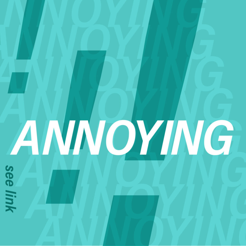
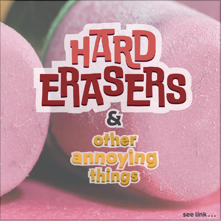
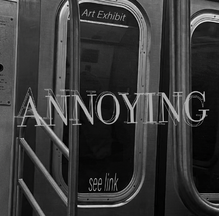
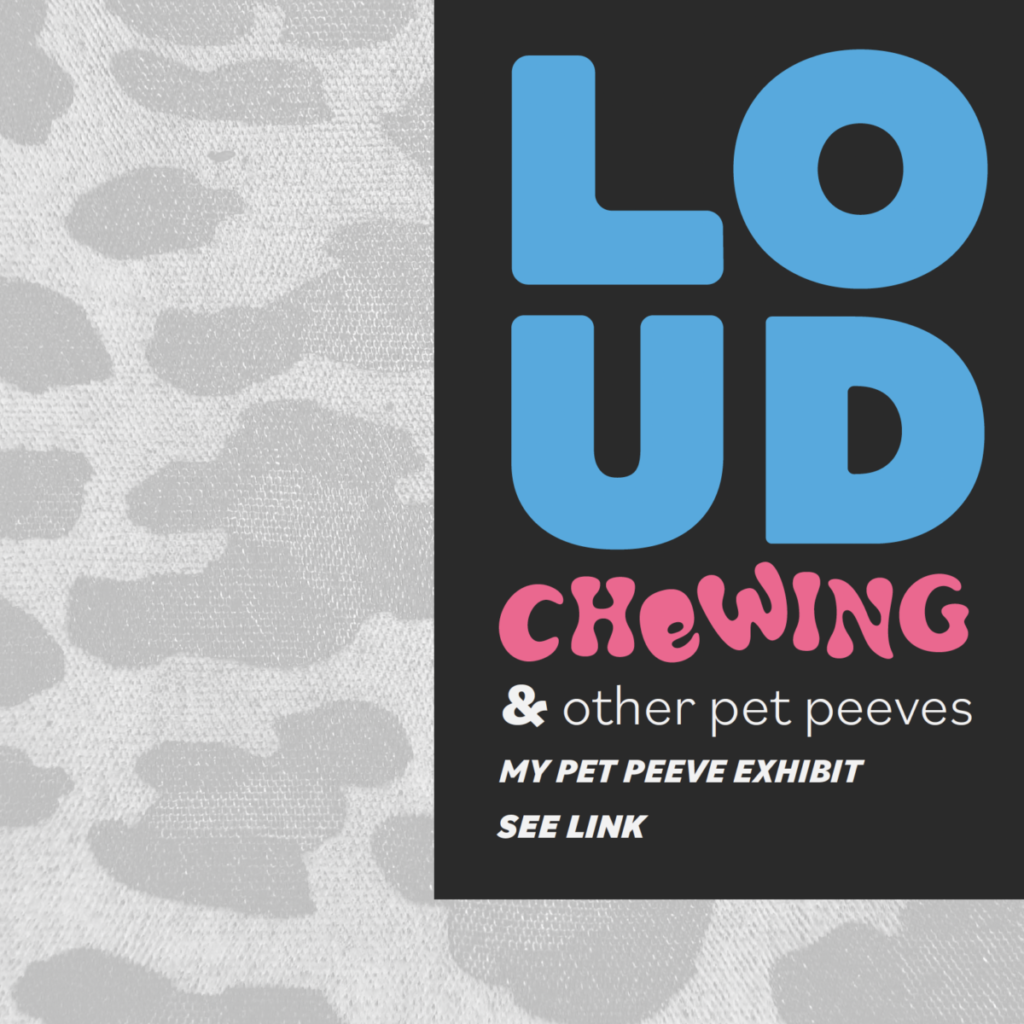
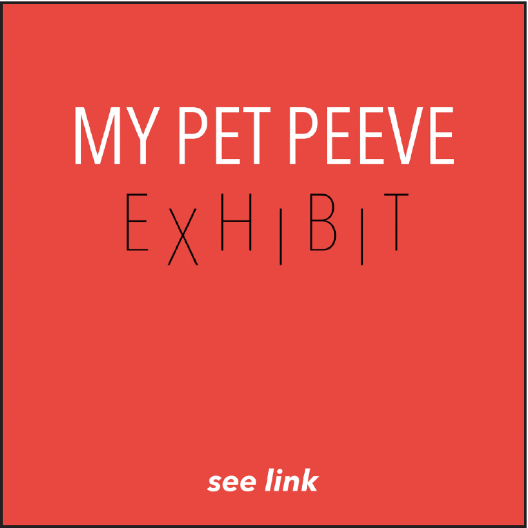
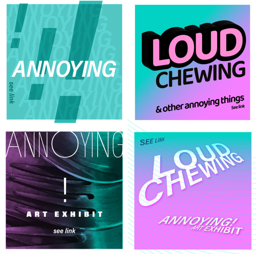
- Look at examples below (Please note that your solutions must be different than these). Is the hierarchy appropriate? Are the colors and images offering the viewer an easy to read experience? Are pt. size, line space and letter space working in a cohesive way?
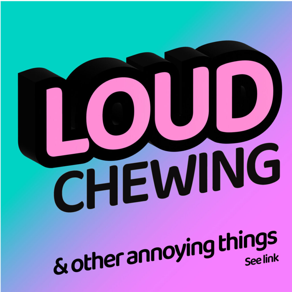
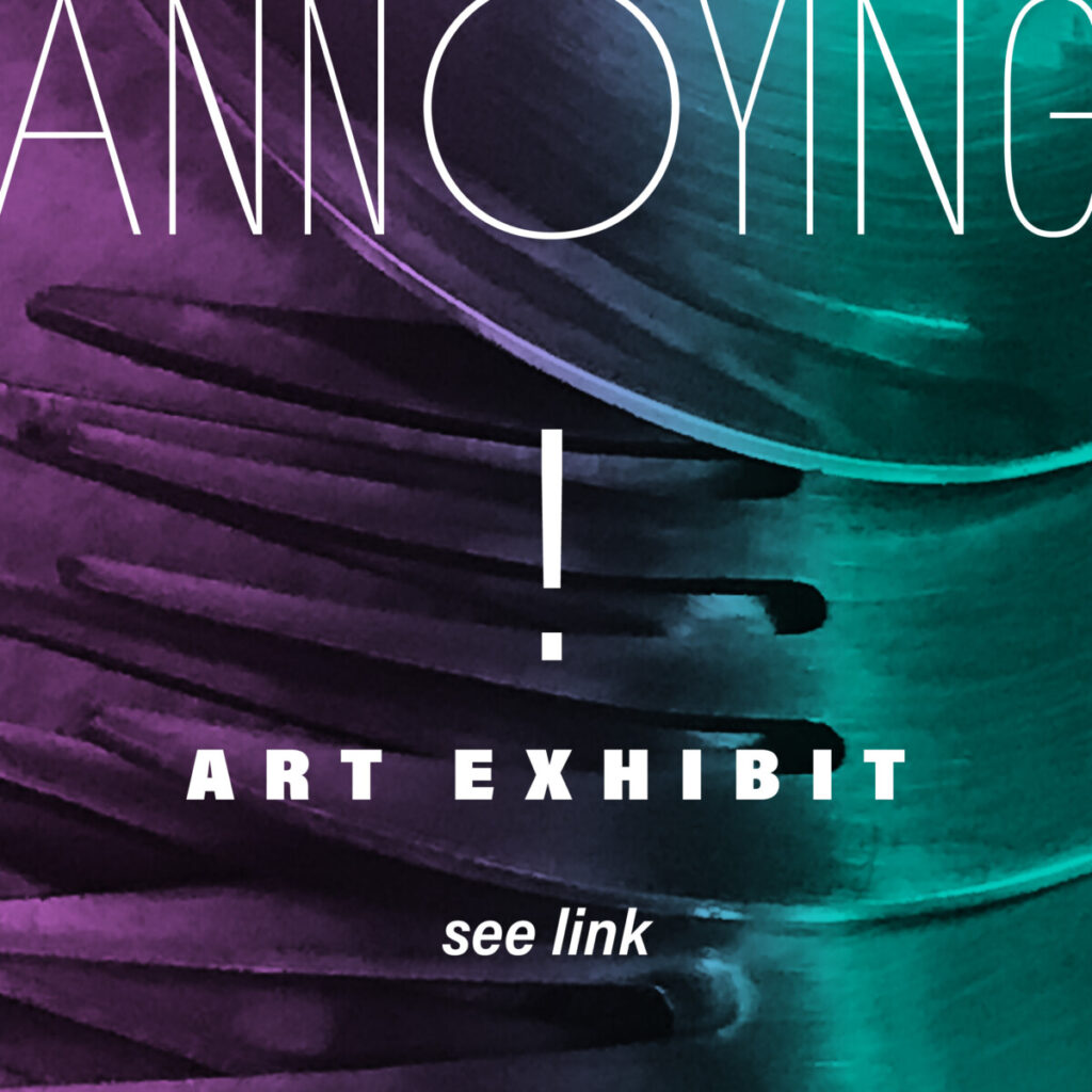
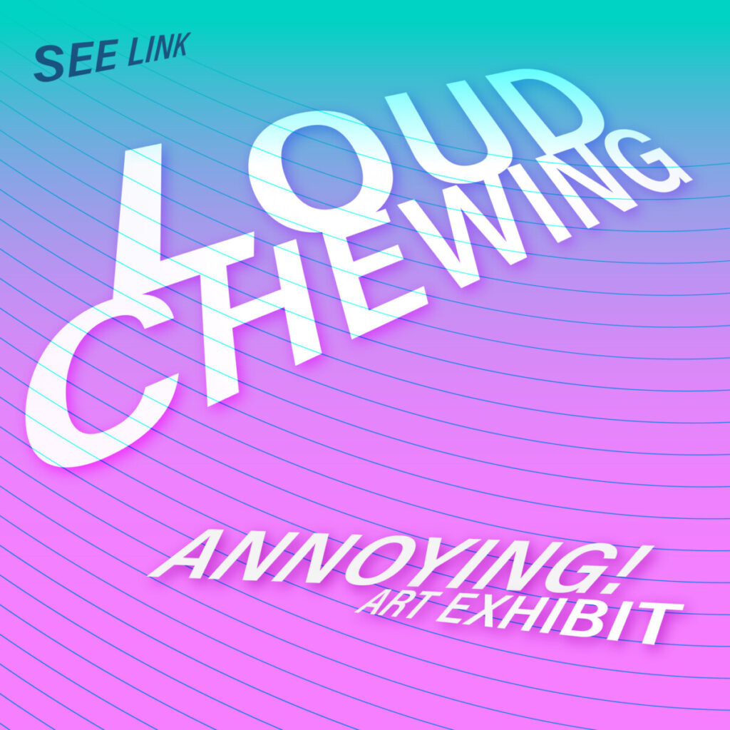
_______________________
Let’s also study these example done by class / peers :
These examples use the following topics covered in class:
- Typography: Typeface selection with variables of weight (bold, regular), CASE (CAPS, C & LC), FR Alignment. Word Spacing and line height (tracking/kerning and leading)
- Design Concepts: Visual Hierarchy, Color Contrast and Legibility, Placement
- COLOR and Legibility
- Tools (tech skills) 3D and plane / offset path /repetition / Touch type tool
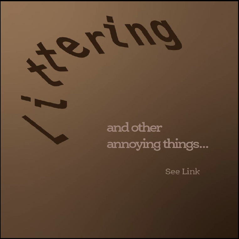
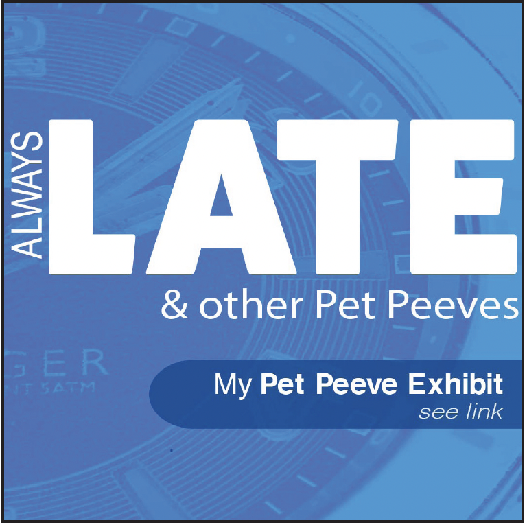
Note: Assignments from different semesters do not include the same text.
Assignment
- Due before next class:
- Complete 4 social media postings (see above)
Save your Illustrator file - Take one screenshot of all images or
Export page JPG (ALL)
This way I can see all 4 squares in one image
- Name your files:
Lastname_first_name_social_media_1.jpg
- Complete 4 social media postings (see above)

Place in Dropbox
_______________________________________________________________________
Graphic Assignments are always due the day before class at 11:30 pm, and must be placed in class drive (COMD1127 DROP BOX link) unless indicated otherwise. Assignments uploaded during class on the day that they are due are marked as late.
Participation Activities (Scavenger Hunts, Type Talks and Type Challenges) are due during class or the day before class at 11:30 pm if indicated by the instructor.


Leave a Reply