Contents
Class Info
- Class Date: Monday October 30, 2023
Topic
- A look ahead
PRESENTATION for PROJECT 2 / Class 19 - SPECS for PRESENTATION will be provided next class.
- Part 1
- Four Expressive words (1 page)
- One of your four words with 3D studies
- Part 2
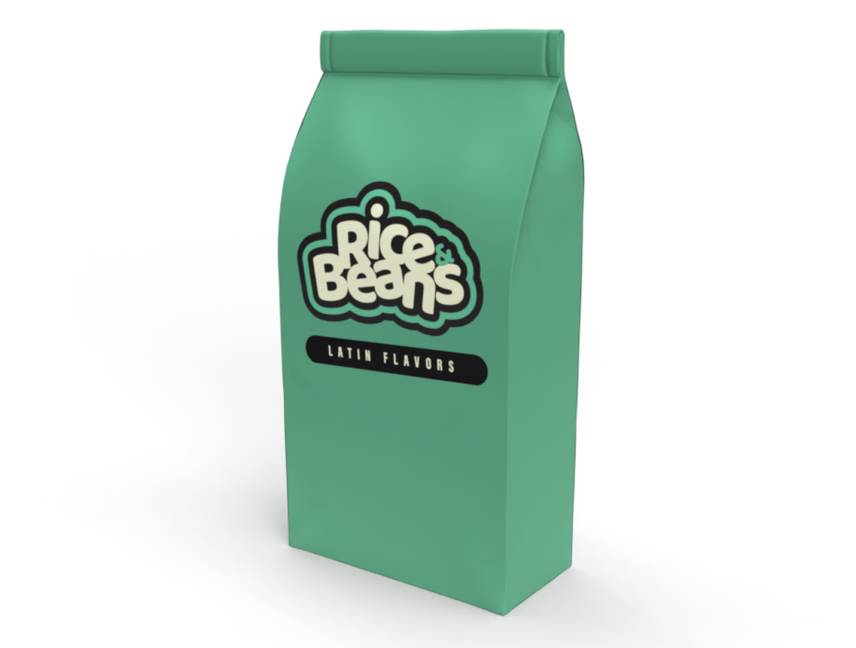
- Favorite food sequence (1 Page)
- Favorite Food color and edits (1 page)
- Favorite Food: Mock up (1 page)
This is Today’s lesson - Model placed in augmented related (maybe/info to come)
Objectives
Visualize our typographical solutions in-place.
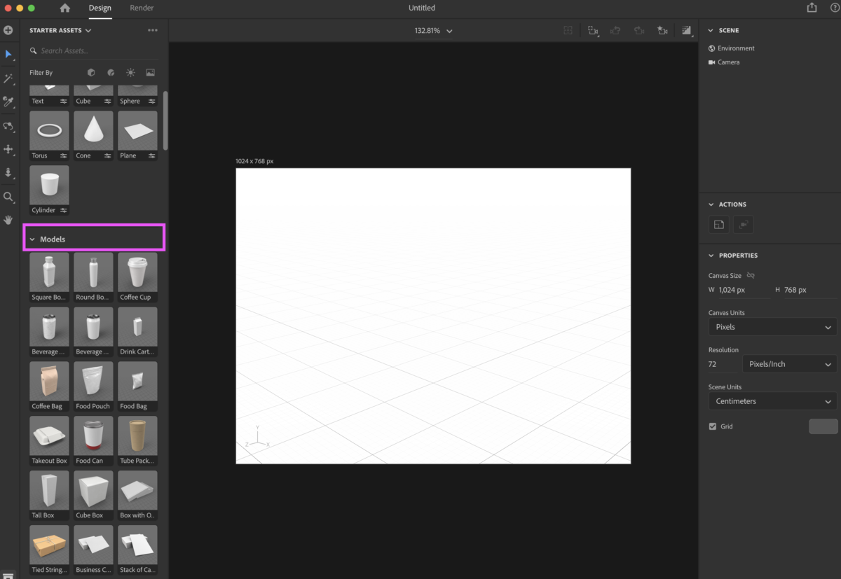
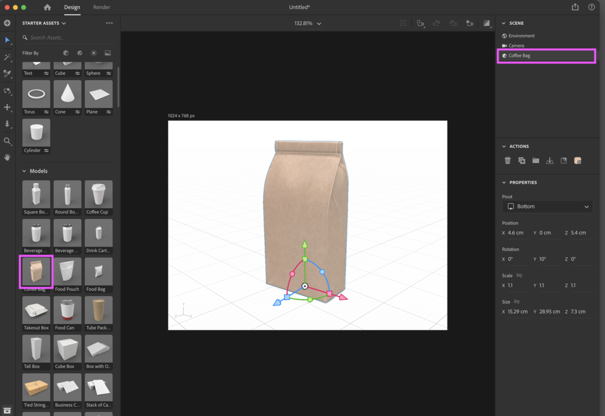
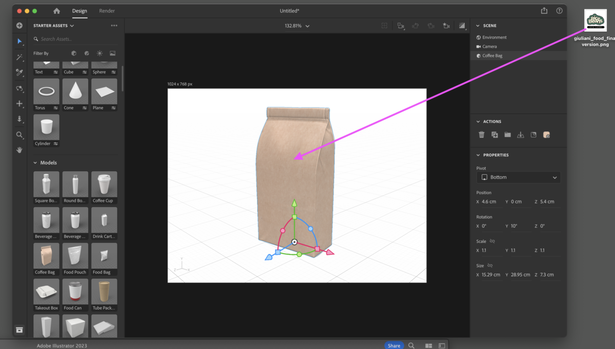
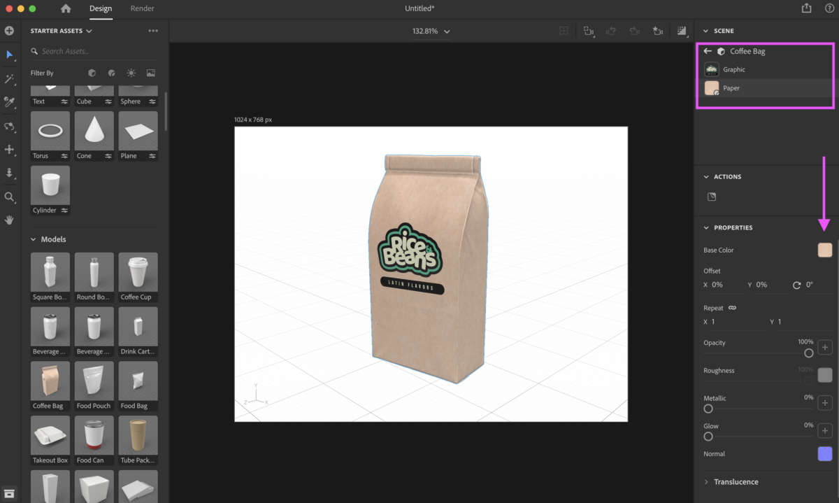
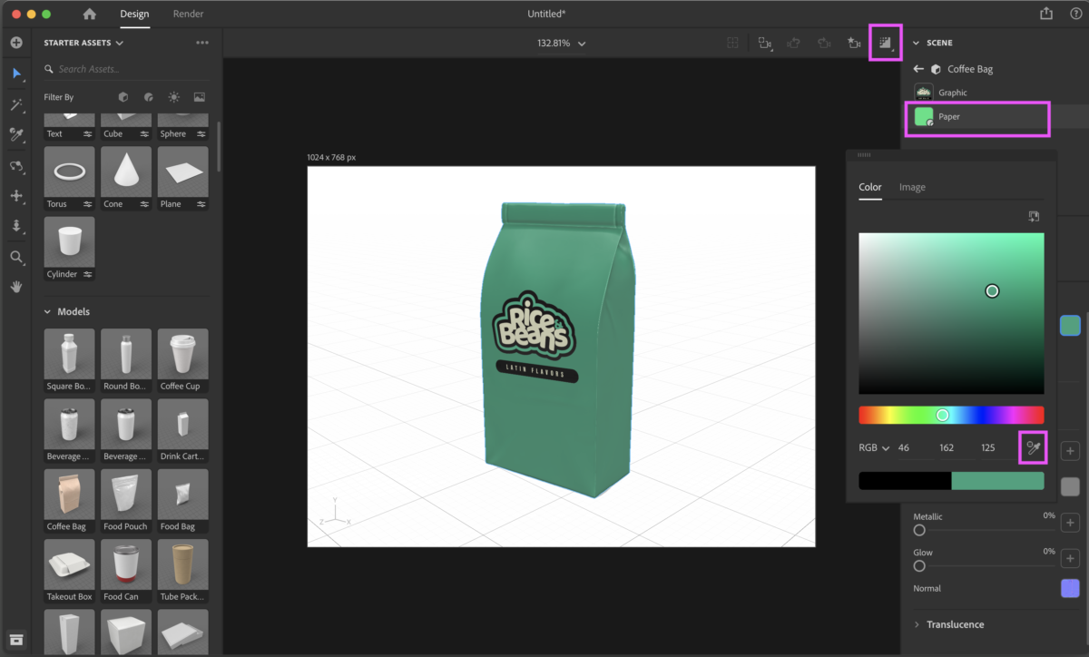
We will use Adobe Dimension to create a mock-up of a restaurant/food industry related product.

Activities
During Class: Type Talk
Look at the work of these lettering artists:
Darren Booth
https://www.darrenbooth.com/lettering
Martina Floor
https://www.martinaflor.com/work
Gia Graham
Jessica Hische
https://jessicahische.is/working
Mary Kate McDevitt
Adrian Meadows
http://adrianmeadows.com/
Danny Pelavin
- Create a new post: Last Name_TT_letteringartist
- Give it Categories:
- Student Post
- Student Post Type Talk
- Select a piece from one artist.
- Take a screen shot and add it to this post
- Who did you choose?
- What do you like about this piece?
- What do you like about the style of this artist.
Assignment
Graphic Assignment
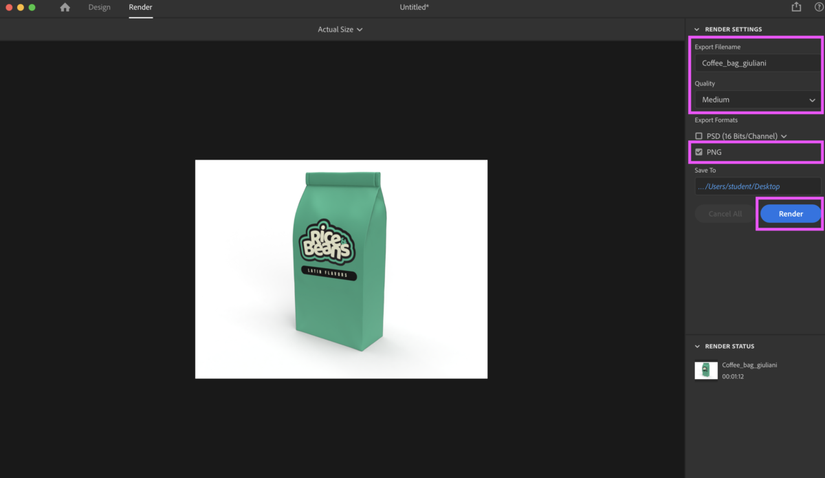
Complete Mock-ups
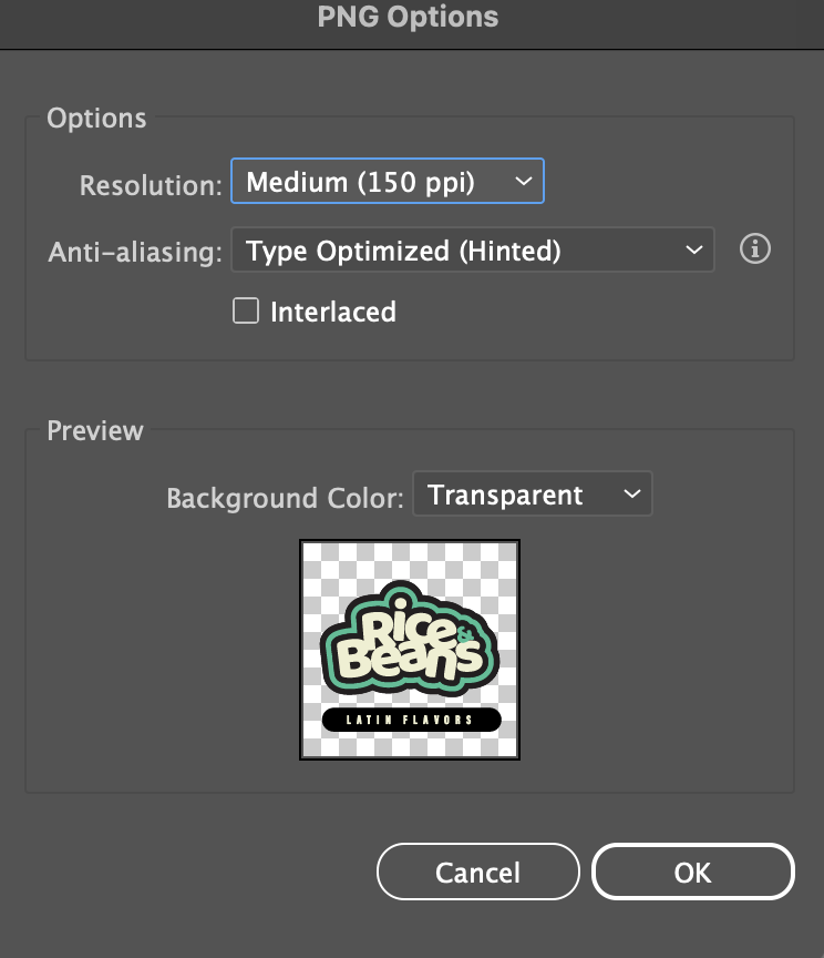
lastname_food_mockup.png
Place in Dropbox
_______
Graphic Assignments are always due the day before class at 11:30 pm, and must be placed in class drive (COMD1127 DROP BOX link) unless indicated otherwise. Assignments uploaded during class on the day that they are due are marked as late.
Participation Activities (Scavenger Hunts, Type Talks and Type Challenges) are due during class or the day before class at 11:30 pm if indicated by the instructor.


I chose Darren Booth. What i like about this piece was the usage of different colors in letters and what i like about the style is the font and how different colors being mixed up can convey a lot of emotion.
Lin_Merlion_TT_letteringartist
I chose the artist Marina Flor. The reason I chose her is because I felt her work looked special, stood out to me and her lettering and detailing looks very unique to me, unlike any work I have seen before. I felt this way for a couple other of her pieces as well which is mainly why I chose her. I enjoy looking at the flourishes and you can tell she spent a good amount of time on her pieces. The more in depth you look at this piece you start to see even more details you didnt see before such as the crown in the middle and the flourishes inside the letters look very different.
i chose Mary Kate McDevitt. I like the color combinations she uses in her designs and the style of fonts too. I also really like how expressive her designs are. You can really see and feel the expressions she is trying to convey with the choice of font and color.
Mary Kate McDevitt is one of my favorites, the book I passed around in class was from her.