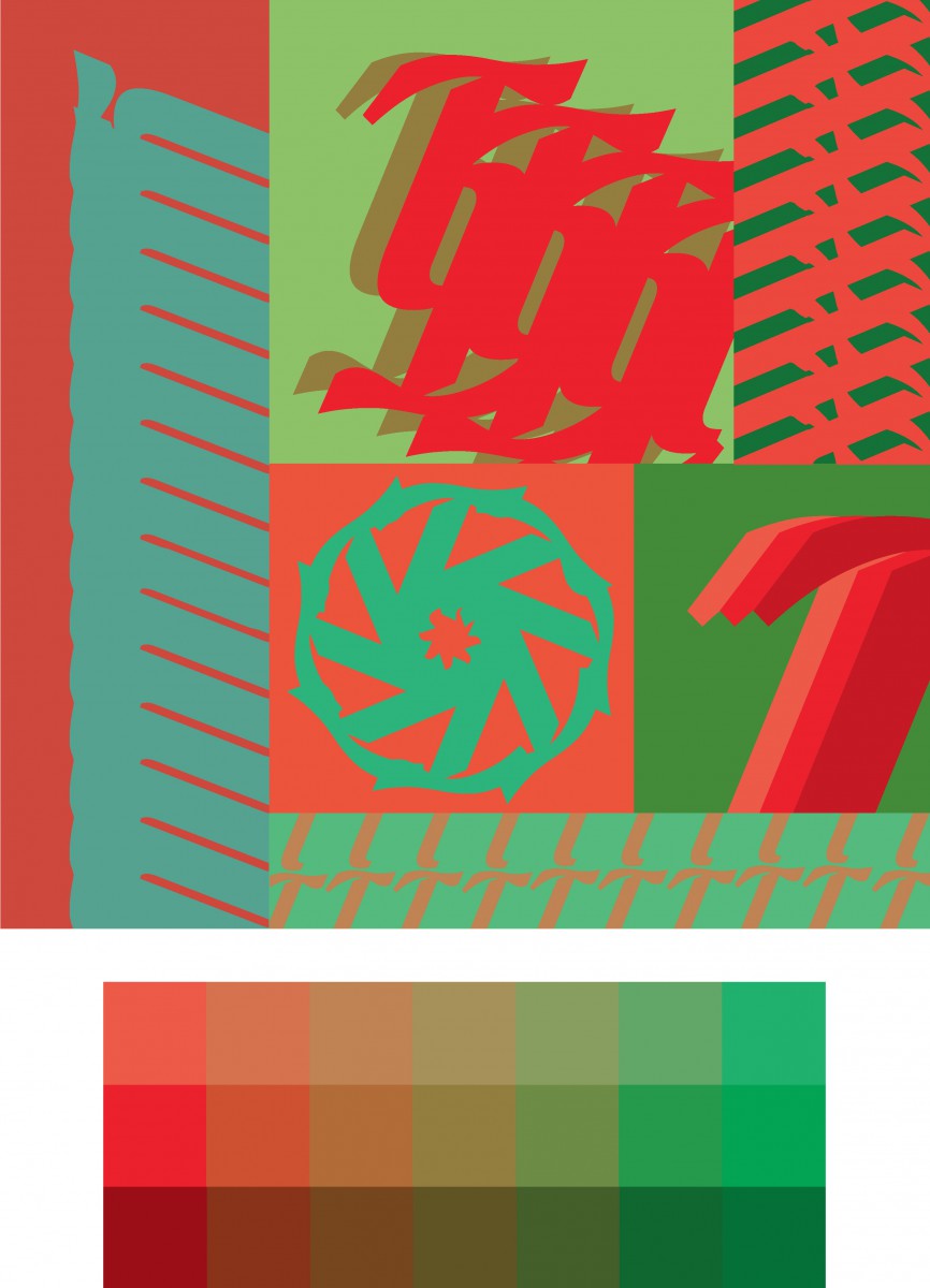
In this project we had to pick a letter, a font, a pair of complementary colors, and use them to make patterns. The goal of this project was to get acquainted type and designing with type. Started out with sketches and then all the students moved into drawing and coloring. I chose to use Illustrator for this project. Illustrator have everything I needed, so I thought it made more sense to utilize the software. It made the process much faster, but it’s kind of like cheating because the software made this project much less creative and challenging. This was also the first time that I really used the gradient tool. I don’t really like the software generated gradient, but in this case it worked great in creating the tint and shade boxes of the complimentary colors.
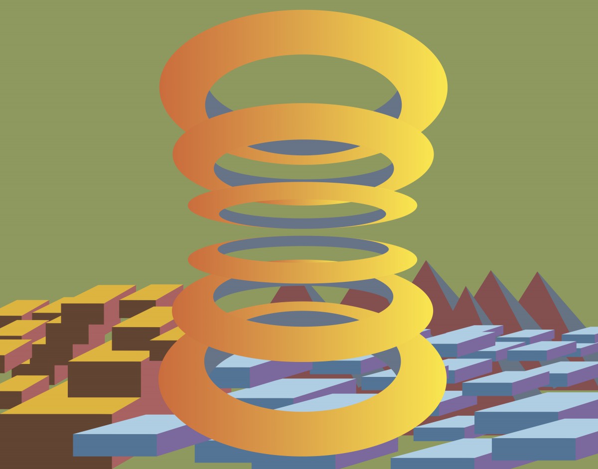
We were asked to produce works that are similar to works by the artist Al Held. He worked mostly with geometric shapes. This project is suppose to help us to explore the interaction between different shapes and how they all fit into space. When I was sketching I spent some time on figuring out how to draw a ring with rounded surface by only using lines. I didn’t want my findings to go to waste, so I incorporated certain elements into this project. The rings are thinner and sharper than my sketches because I didn’t want them to allude too much to actual rings.
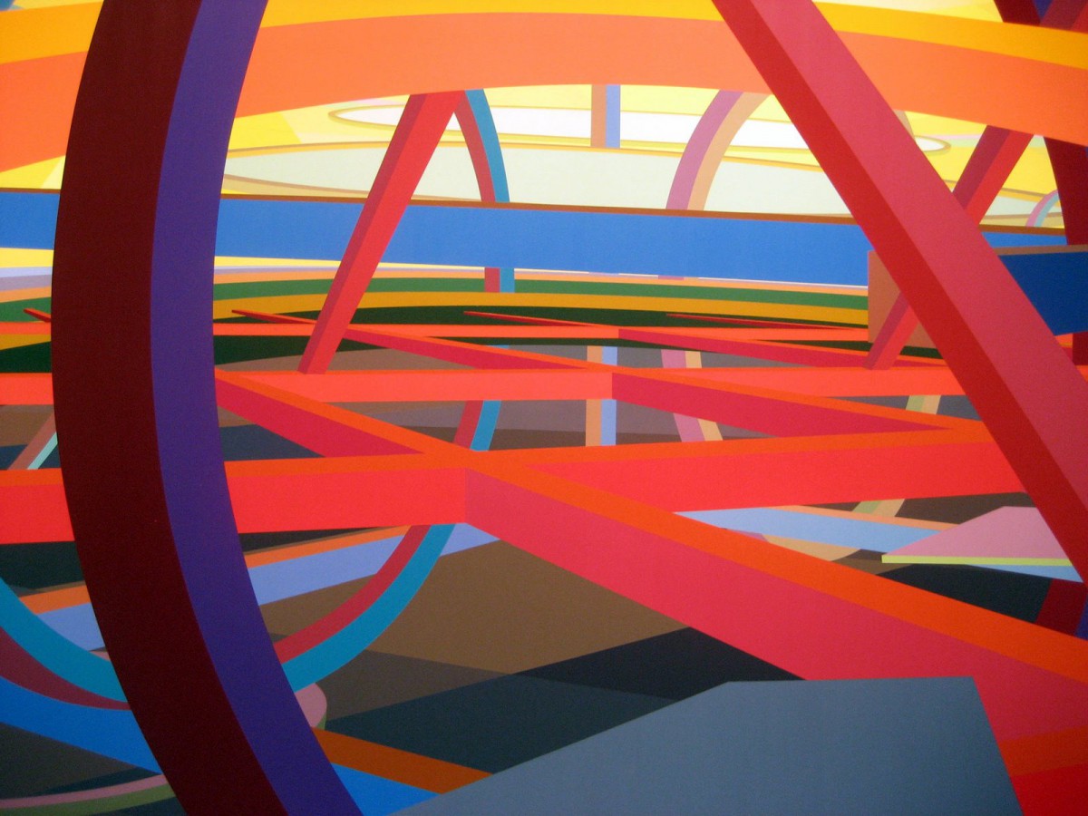
This is an example of Held’s geometric-abstraction paintings.
He started creating these works after feeling being limited to his previous works involving two dimensional hard edge abstraction.
“This scanner is a piece of ****”
-Some guy somewhere after the scanner was invented. Probably.
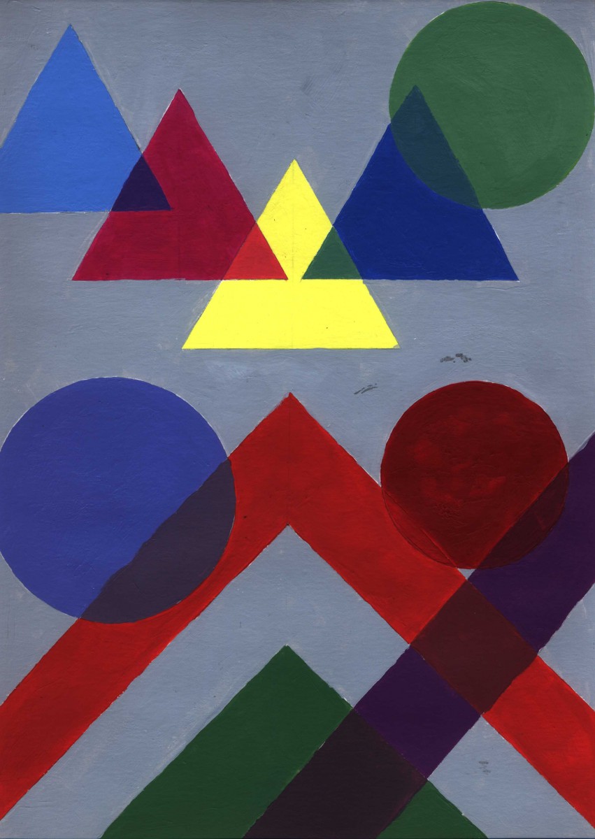
This project focused on training the students’ ability to mix colors. The design and painting of the overlapping geometric shapes made this dull and repetitive practice more creative and challenging.
