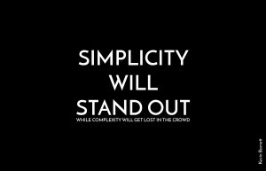
“Simplicity will stand out, while complexity will get lost in the crowd.”
—Kevin Barnett
My first visual idea for this quote was to make the word simplicity to really stand out with clean, white background while the word complexity literally gets lost in the crowd. Therefore, I visually created the contrast of simplicity and complexity by making each word take half of the space on the artboard.
My second idea was to, again, make ‘simplicity will stand out’ be the focal point of the design using simple typography. Then, I placed ‘while complexity will get lost in the crowd’ in a single sentence beneath, and aligned to the line on top. Previously, I had black type on white background along with a border but now I took the border away and inverted the color.
For this design, instead of using plain typography I also used imagery. It took me a long time finding the right imagery that fits the quote perfectly. A girl wearing white dress standing still and looking up with people/the crowd by passing her with the motion effect making them blurry. With an image like this, it’s hard to make the type legible so I created a white banner with type(simplicity will stand out,) on top, and the other half of the quote in a single line, aligned to the type in the banner. Then, I created a dragging and blurry effect to ‘while complexity will get lost in the crowd’ to match the crowd walking pass her.(Resource:https://www.theodysseyonline.com/alone-crowd-poem)


