
The exhibition of “The Jazz Age” in Cooper Hewitt Museum shows a variety of art pieces from the Roaring Twenties, a period of economic prosperity and cultural change. Graphic design was also being influenced significantly. Many designers immigrated to America, mostly from Vienna and Berlin bringing new forms of creativity and spreading art movements like Cubism.
Poster, ITF INTERNATIONALE TENTOONSTELLING OP FILMGEBIED (International Film Exhibition), 1928
Designed by Piet Zwart
Letterpress on wove paper
H x W (Sheet): 85 × 61 cm (33 7/16 in. × 24 in.)
H x W x D (Frame): 103.5 × 78.7 × 3.8 cm (40 3/4 in. × 31 in. × 1 1/2 in.)
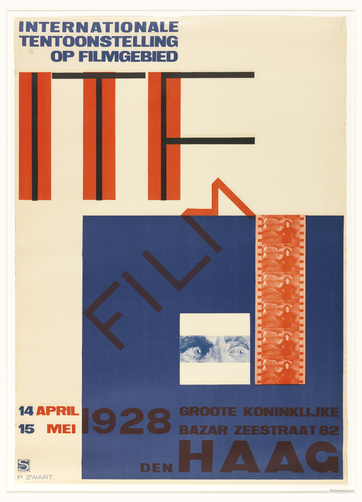
http://cprhw.tt/o/494ac/
Since this semester I took art history in graphic design, I’ve been interested in modern art. Modernism was directly caused by the terror of World War I and influenced by the industrial revolution. Reject in logical thinking and religious beliefs, modernists uses geometric shapes, typography in abstract forms. I like how the type integrates with the blue block especially the letter M in the word FILM, how it’s tilted on an angle that fits the stroke of M right on top the edge of the block also creating a perpendicular angle.
Poster, UNIC, 1932
Designed by A.M. Cassandre
Lithograph on paper
H x W: 160 × 119 cm (5 ft. 3 in. × 46 7/8 in.)
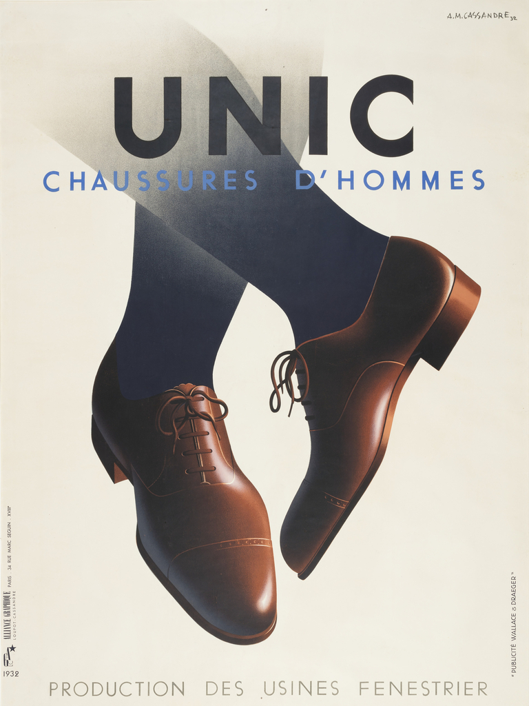
http://cprhw.tt/o/77skP/
I like how the poster illustrates a simple, direct subject with clean typography on the upper part. The designer purposely creates the fading effect on the upper part of the leg because it might interfere with the type on top. The designer, A.M. Cassandre was one of the influential early graphic designers that created the huge impact on communication design. His famous work was an ad for Container Corporation of America.
Poster, BYGGE OG BOLIG UDSTILLING (Exhibition of Buildings and Homes), 1929
Designed by IB Anderson
Lithograph on paper
H x W: 83.2 × 62.2 cm (32 3/4 × 24 1/2 in.)
H x W (Mount): 97.5 × 76.5 cm (38 3/8 × 30 1/8 in.)
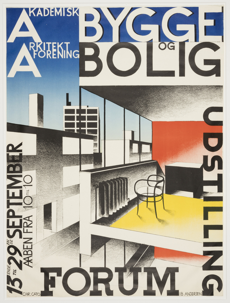
http://cprhw.tt/o/BKmE4/
I was instantly attracted to this poster when I walk towards it in the Museum. This poster gives a nice contrast and clean geometric feel by using the three primary colors, lines of the architecture, and type surround/perpendicular to the edge of the four sides of the poster.

