Face Masks 2022

About Task

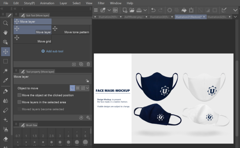
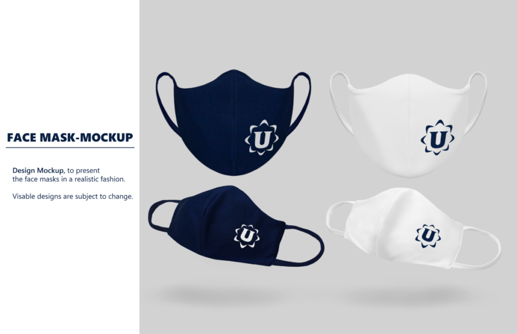
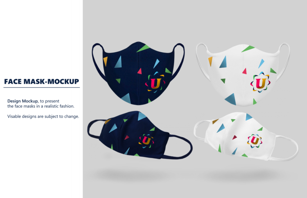
The task I was given was to design a some face mask mock-ups with the organization logo. The design was of my choice as long as it included the organization’s logo.

Reflection

When designing the masks, I first took a simplistic approach by utilizing the dark navy blue associated with the organization’s rebrand color palette and a white version of their logo. The first mock-up showcases the masks in two variations of the same colors.

In the second mock-up, I duplicated their confetti-like design style and added them to the masks. I then used the original logo’s colors to match said style. The goal was to make the face masks simple yet representative of the non-profit organization.

The Designs

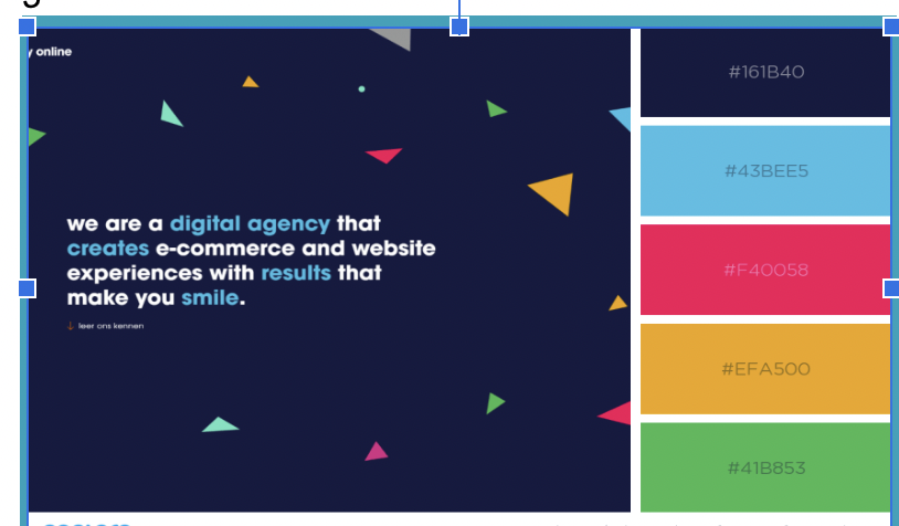
The Rebrand Color Scheme & Logo
MAY 2022 NEWSLETTER

About Task

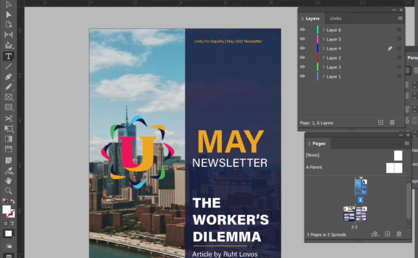
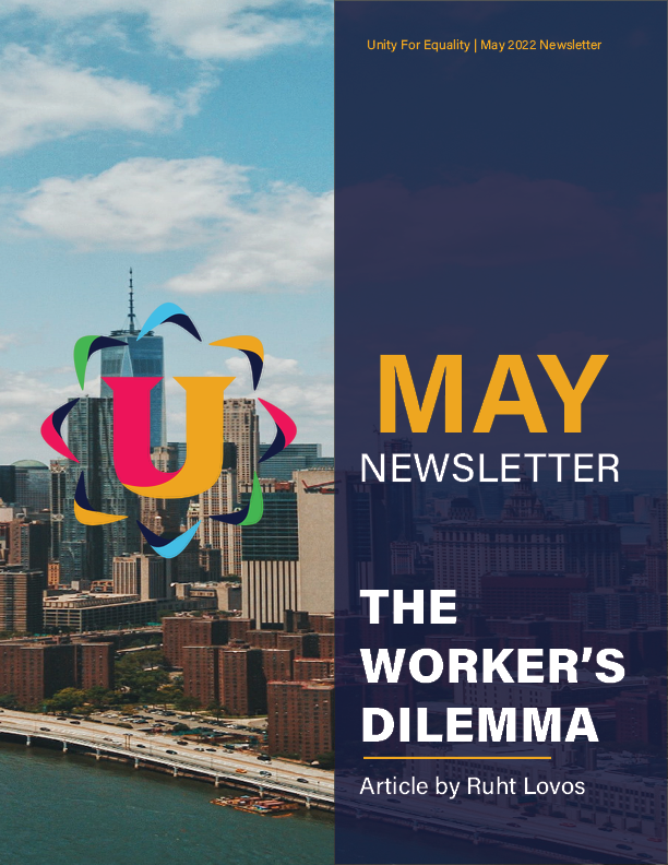
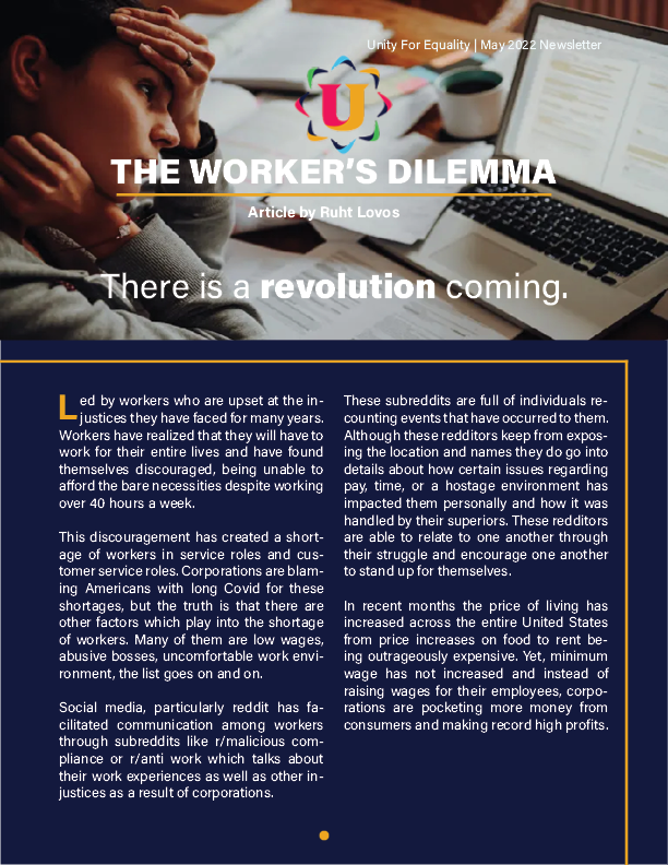
I was given a task to use a required article and create a page design for it. It was to be A4 size with maximum two pages and the finalized design will be in PNG format. I was given the option to utilize the organization’s rebrand color scheme and new logo for their design identity.

Reflection

This was a fun experience as I was given a guideline of how designers would create the professional look for their pages. With the new found inspiration, I was able to create unique designs for three pages, as I had gone above and beyond to add a cover for the latter two. Of course, it was not required of me to make said cover based on the feedback received, so I designed the second page as an opening entry to the article. However, all pages are included below to showcase my work.

The Designs