Here we go! my visual concepts. Though this is my first time using Adobe Indesign and messing around with it in time i figured out how to do some things, it might be basic but its better than nothing! hopefully as time goes on by I will learn more advanced things and become used to it.
The Quote I used is: “Be Kind For Everyone Is Fighting a Hard Battle” by Plato (428–427 BC to 348–347 BC), although some people believe it was not him because it does not sound like his work. some people believe this quote is from Philo of Alexandria and I just recently discovered this quote is used in numerous ways be different kinds of people but enough about the orgin of the quote, on with the Concepts.
1.
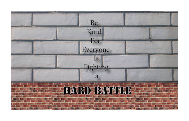
 For my first ever concept I decided to go do something simple (mostly because I am new to indesign) what I did here was bring out the meaning of the quote using its background and the “HARD BATTLE”, now when I think the word “Hard” I imagine something like a rock though I decided to use a solid brick because I believe it represents the word hard at its best, not only that combine it with battle, a battle is hard and solid like a brick, compared to a rock that is not all straight and all over the place. A hard battle must be fought face to face like a brick wall standing in your way and what better than to use brownish beaten up old bricks to represent that “Hard Battle” battles are not easy, they are tough and rough. The words before hard battle “be kind for everyone is fighting a” is put with the clearly organized and grey brick because the grey brick represents clean, tidy, not all over the place. in other words its organized and it feels like it has its life under control, contrast to the bottom brick where its all muddy and rough. but see how the type goes down? its almost as if the words are trying to be together despite the background going with one part of the quote and the other background going with another.
2.
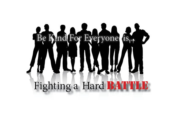
This concept I like. this is my second concept for the same quote and it was not a easy one. When i did this one I had a different idea, a idea of using the Word “everyone” as my template for this. At first I wanted to make the kids in my background stand out in the middle while businessmen walked away in front of them to make them stand out. but the didn’t work because of its own reasons so I just used the picture I had now.That made me want to use people instead of just background scenery. and personally what better way to show off that people have problems than real people themselves, and different ones at that. The reason why I chose this background was because it would look weird if I used real images of people. I wanted the people to be anonymous because that will make them be mysterious as if you don’t know them. Give them the feeling of a stranger which strengthen the quote “Be nice to everyone” as in different people. and to make it look nice I decided to make the text pop out with the background. something different compared to the first quote where the background was used as a template to hold the quote. This time the quote is barely being hold by the background. I had to move the quote and use white color to compliment the background so the quote can stand out I also used white on the text to compliment the word kindness. Now I put a huge emphasis on the battle because that’s the most important part of the quote for the first 2 concepts. everyone has a different battle. not all of them are the same. and the battle can go on for many years like a war. its tough. ill admit I used some of my ideas from the first concept to do this as well. and I believe it came out pretty good. better than my first.
3.
 Now….this. this is my third and final concept for this quote. I gotta say, its a step back from my other two quotes. originally what I wanted to do here was use the background picture of the hands to show the “kindness” aspect of the quote more. I wanted the type to go down as the hand extended itself to the person while the word “is” was in the middle so one part of the quote can stay in the top hand and the other in the bottom hand. the “fighting a hard battle” was supposed to look more like a tattoo as if the type was already glued to the arm but it seem to not work well because I don’t have chalkduster font. so I used the font I have now that I believed suited best along with putting the skin color inside the words so it will give a illusion as if someone tattooed on his arm like that. the “fighting a hard battle” stays with the bottom person because he is the one receiving the kindness. while the one in the op hand is giving the kindness” the hands touching is a symbol of unification which is why the “IS” is white. but personally this is not my best concept. this could have been done better.


