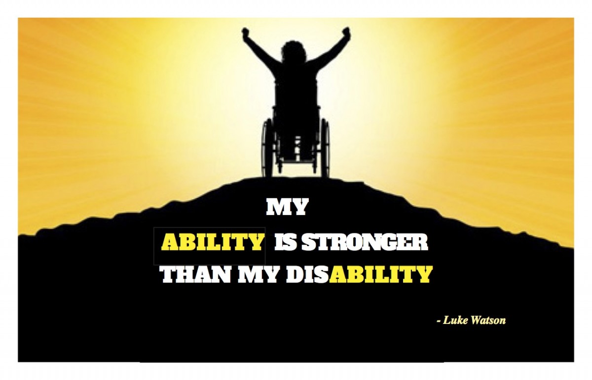
Concept 1 Draft 1: In this concept, we were given the choice of using an image with our quote. My thought and idea was to have someone in a wheelchair like myself to emphasize the word disability. Not only did I want to use someone in a wheelchair, but also in a happy way and showing strength. To me, this image with the sun being included, meant brightness. Also, the pose this person in a wheelchair is making to me fitted perfect with the quote. I interpreted as showing many emotions. I felt a feeling of success and triumph with this pose. Furthermore, this person is on top of a hill, which is often not easy to climb up to (pretty challenging). In the font itself, I wanted to keep the yellow from the sun but also white since the hill is black. This way, the quote would be easy to read. I decided to make the word ability stand out at the beginning and end. Therefore, I made it yellow and the rest of the quote white.
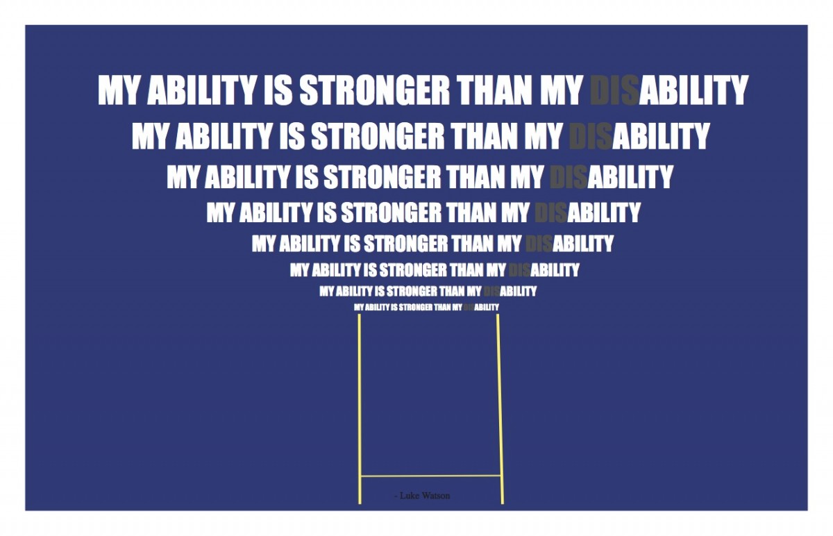
Concept 2 Draft 1: Going back to the concept of triumph, I decided to put the quote in a trophy shaped. In order to do this, I decided to use repetition. I repeated the quote 8 times (8 lines) making it look like the top of a trophy. Also, I added two yellow thin lines at the bottom of the text as if it was holding it. This is also to show the base of the cup. I made the background blue just because it reminds me of most handicapped accessible signs. Then I made the text white to make it visibly clear, except “dis” which I made dark grey. The idea of this was not to take it out but sort of hide it to make the word ability stand out more.

Concept 3 Draft 1: The whole idea of this concept was to show a handicapped person getting over a track (dashed line) or gaps. To make the text a little different from the previous concepts, I made the word stronger in black which matched with the handicapped character. However, I kept the same idea of the first concept with the rest of the quote. In this case, I made the word ability both times in blue. Again, blue was used in relation to most handicapped accessibility signs.

Concept 1 Draft 2: For my second draft, I decided I wanted to spice it up a bit more by adding more to the sunset. In my first draft, there was only yellow sunlight. Now in my second draft I wanted to portray the sunset in relation to the black hill. I kept my font type the same for the quote but a different font type for the author. In my draft one, I had put Luke Watson in italic, but it was hard to see. Therefore, I kept the same sans serif type. I did not like the position of the quote in my first draft, so I proceeded to align it from top to bottom in the middle of the hill. Also, I put Luke Watson (including the M dash) right under the quote instead of the right corner.
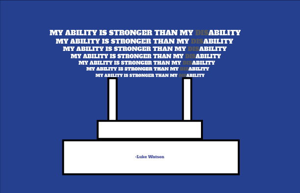
Concept 2 Draft 2: I wanted to keep the repetition of the quote for my second draft. The whole idea of this was to make a visual of a trophy cup. Therefore, the repetition would be the top of a trophy cup. I kept the background blue and the quote the same color of font. In order to make it look more like a trophy cup, I searched “trophy cup clip art” and made the bottom or base look like a real one as close as possible. I used boxes to portray the base of a trophy cup. I put Luke Watson where someone’s name would go in a real trophy cup.
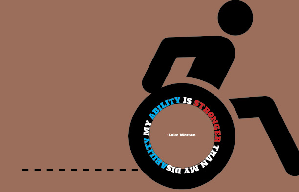
Concept 3 Draft 2: For my second draft, I wanted to make it a bit darker and cleaner in comparison to my first draft. I turned it the background into a darker brown, yet not too dark. Also, I changed the symbol of a handicapped person. Now, the symbol portrays a handicapped running in their wheelchair. I decided to keep the dashed line as in the first draft which symbolized a track. When it came to working with the quote, I thought of using the type on a path tool. I decided to put the quote around the wheel. I kept the word ability in blue, but this time a lighter one. Now, I made the word “stronger” in red. This is because I researched meaning of colors. I found out that the color red is associated with strength (as said in the quote).

