I chose to talk about BP because it’s a company that has been around since the 1920s. Before it was a brand, BP was a product range. In 1917 British cans of motor fuel that had previously been sold under the old label “Palm Tree Oil” were tagged as ‘”BP”, standing for British Petroleum. So far the company has a total of six changes done to their logo. From the beginning, a Mr.A.R. Saunders from the purchasing department won an employee competition in 1920 to design the first BP tag. A boxy “B” and “P” with wings on their edges, set into the outline of a shield. For the beginning, colors inside the shield did not matter. It wasn’t until the 1930s where they added the green and yellow colors to their logo.
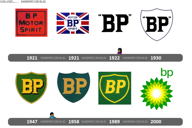
Long before BP gasoline was a mature product to need advertising of its own, some of the companies that would later join the BP group were helping to guide the medium. The original BP logo, known as the “classic shield” was designed by famous industrial designer Raymond Lowey. Introduced in 1979, it underwent a minor change in 1989. A fairly lighter shade was adapted to adjust the corporate image to a more “greener” look. The emblem was also given a cleaner appearance with the addition of a yellow border around the shield. Thus the shield logo stayed round till the 2000s.
Landor, a famous San Francisco design agency designed the current version of the BP logo. It was unveiled in the first quarter of 2000 to coincide with the widely known brand name change from “BP Amoco” to “BP”. This came about with a new slogan: “Beyond Petroleum”. The “Helios” symbol, consisting of a green and yellow sunflower, was designed to symbolize energy in its various forms. So these are the changes of the BP logo. The craziest fact is the price that was spent for the latest logo, a mere $211 million. Such an expensive design but very enriching for the San Francisco design agency.

