(PLEASE CLICK TO SEE GIF)
A City Tech OpenLab ePortfolio
(PLEASE CLICK TO SEE GIF)

The song “La Vie en Rose” was really well edited into Wall-E, and the commercial for U Supermarket. The song displays love and affection, thus the clip from Wall-E and the commercial display these elements. One reason is how the song starts off, all slow and steady. Just like how Wall-E met the other robot, and just how the commercial started with the baby being born and slowly progressing at a faster speed. A second reason to why it worked so well with the commercial is because, instead of the actual song playing, one could hear the melody being played by the babies cries. Third, this song has a message that both videos display really well, love, life and affection. This message is displayed through Wall-E’s actions to get the other robots attention, and in the commercial the message is displayed through all the newborn babies.
After visiting the Cooper Hewitt on October 25th of 2016, I had the opportunity to discover a great deal of amazing work. The first piece that really grabbed my attention was the TILE PANEL (ITALY), LATE 18TH CENTURY. One of the many reasons why this grabbed my attention is because when I was a boy, I had seen tile artwork back in my home country, Albania. I really like this piece because it shows how connecting all of these tiles can create a beautiful image, just like a puzzle piece. I can see the patience and hard work that it took to put down every detail in each tile. The tile is dated late 18th century and it was acquired in 1931. Its medium is tin-glazed earthenware, polychrome decoration, painted wood frame. This object was donated by Eleanor Garnier Hewitt and Sarah Cooper Hewitt and catalogued by Rebekah Pollock. It is credited Gift of Eleanor and Sarah Hewitt.
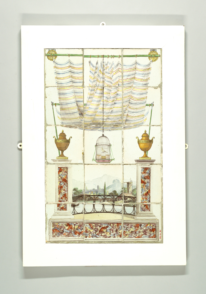
The second piece that moved my creative juices was the CHURCH BIRDCAGE, MID-19TH CENTURY. What I found so interesting about this, is the design of the birdcage. This birdcage is a model of a church in Flushing, Queens, New York; by the time the Hewitts owned the birdcage, the church was covered in stone. It is dated mid-19th century, and it was acquired in 1916. It makes me question the creator, ” Why would you go out of your way to create such a bird cage, but not let the bird fly free ?”. The whole idea of keeping a bird caged in such a beautiful design almost kills the beauty of it. I really enjoyed it because I started to connect the bird cage with life itself. “A church is supposed to free you, so why design a church as a birdcage?” Questions like this started going off in my head. Which is why I really admired the birdcage. This is exactly what art is supposed to do, move you. Make one question things.

The last piece that made it into my top three is the PRINT, GROTESQUE WITH DOLPHINS AND WINGED LIONS, 1532. It was engraved by Master of the Die. It is dated 1532 and it was acquired in 1944. Its medium is engraving on laid paper. This piece made it into my top three of the whole museum, because I love the engraving. The characters and the symmetry that the print has is very intriguing. Just because I have done printmaking before, I know how much work it takes to engrave the details and images into a little block. I only wish I could have it in my hands to work on it. Its truly a great piece of work. 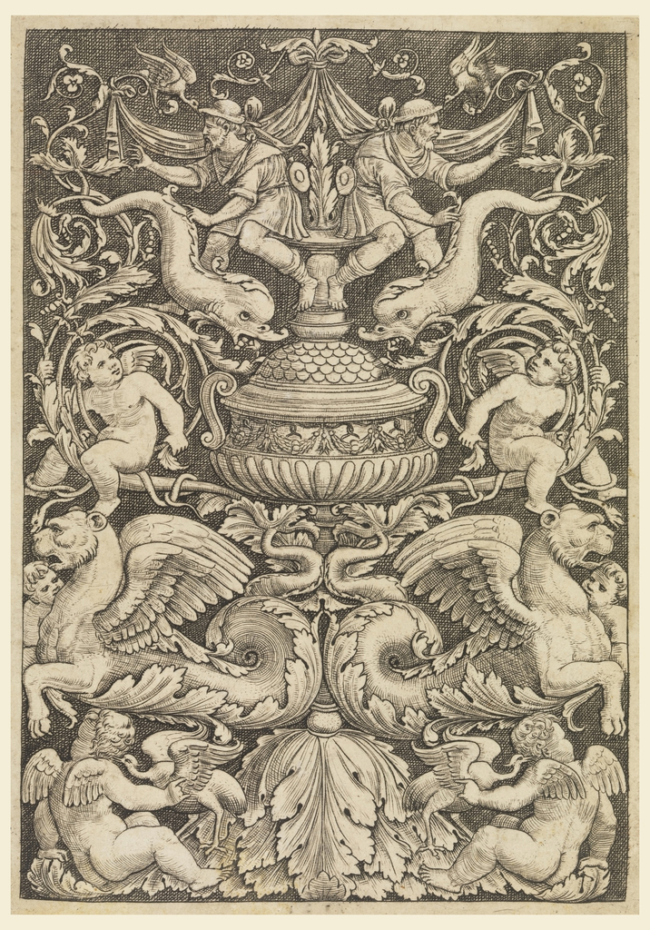
In all, the Cooper Hewitt had a great amount of work being displayed. I was really ecstatic to visit it for a second time. All the new additions made my trip worthwhile. I hope many people get to do the same, and go out there and enjoy themselves some fine art that moves them.
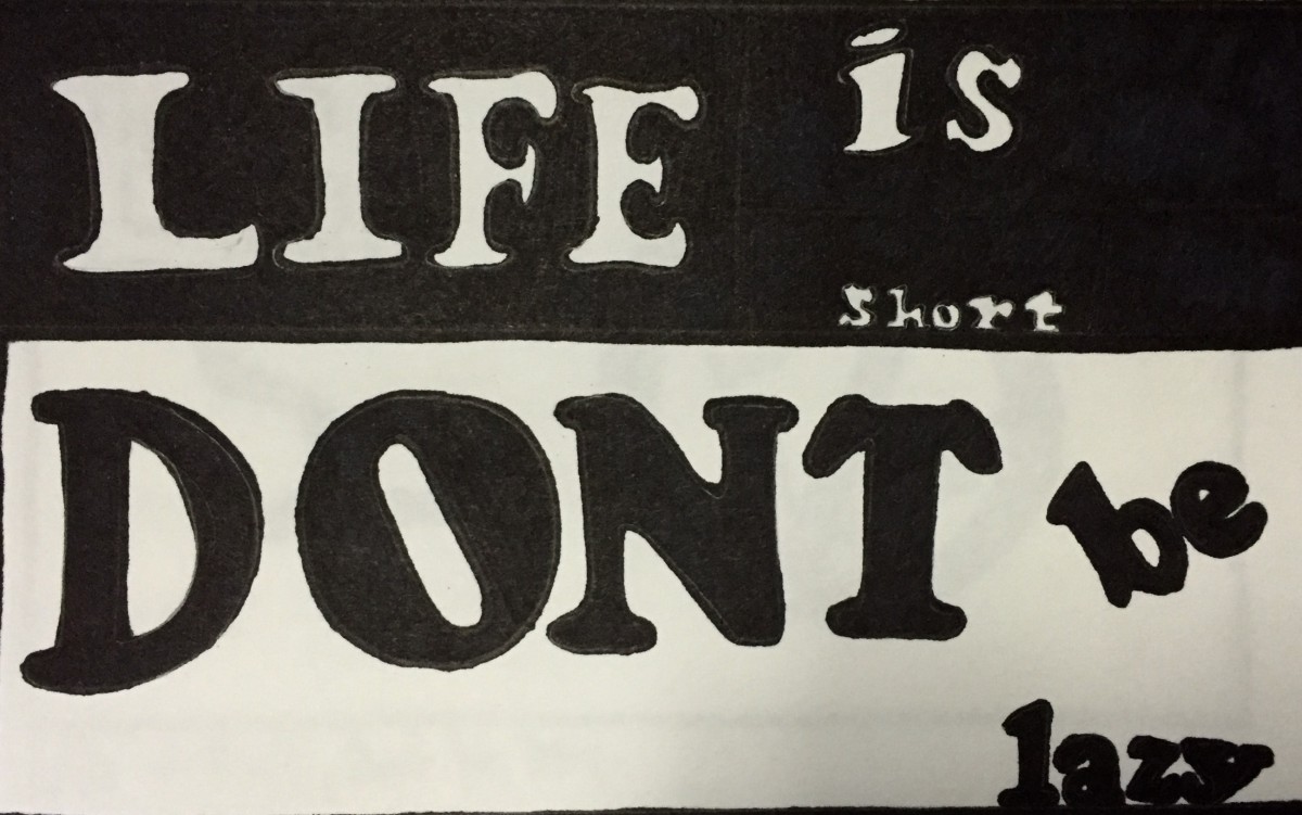
The typeface is Cooper Black, which is a heavy, old style serif. I chose this type of font and style to display my quote, because it gives off an old era type of warning. The word “LIFE is short” is in white because life is bright, and full of potential. Thus “DONT be lazy” comes off as a warning, and threat in capital and all black, in order to wake up the person reading this so they come to a realization that they don’t waste their precious life being lazy.
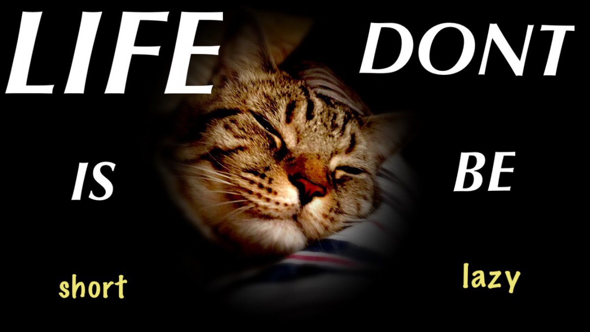
The typeface is Briem Script. I chose this font because it seems very modern and sleek. I chose to write my quote the way i did because of the photo that I have chosen. The background is a photo of my cat sleeping. Thus the words ” LIFE IS short” and “DONT BE lazy” seem to start from the top and go downwards make the reader nod their head up and down as if they are falling asleep but trying to stay awake. This way, the quote plays with the readers head.

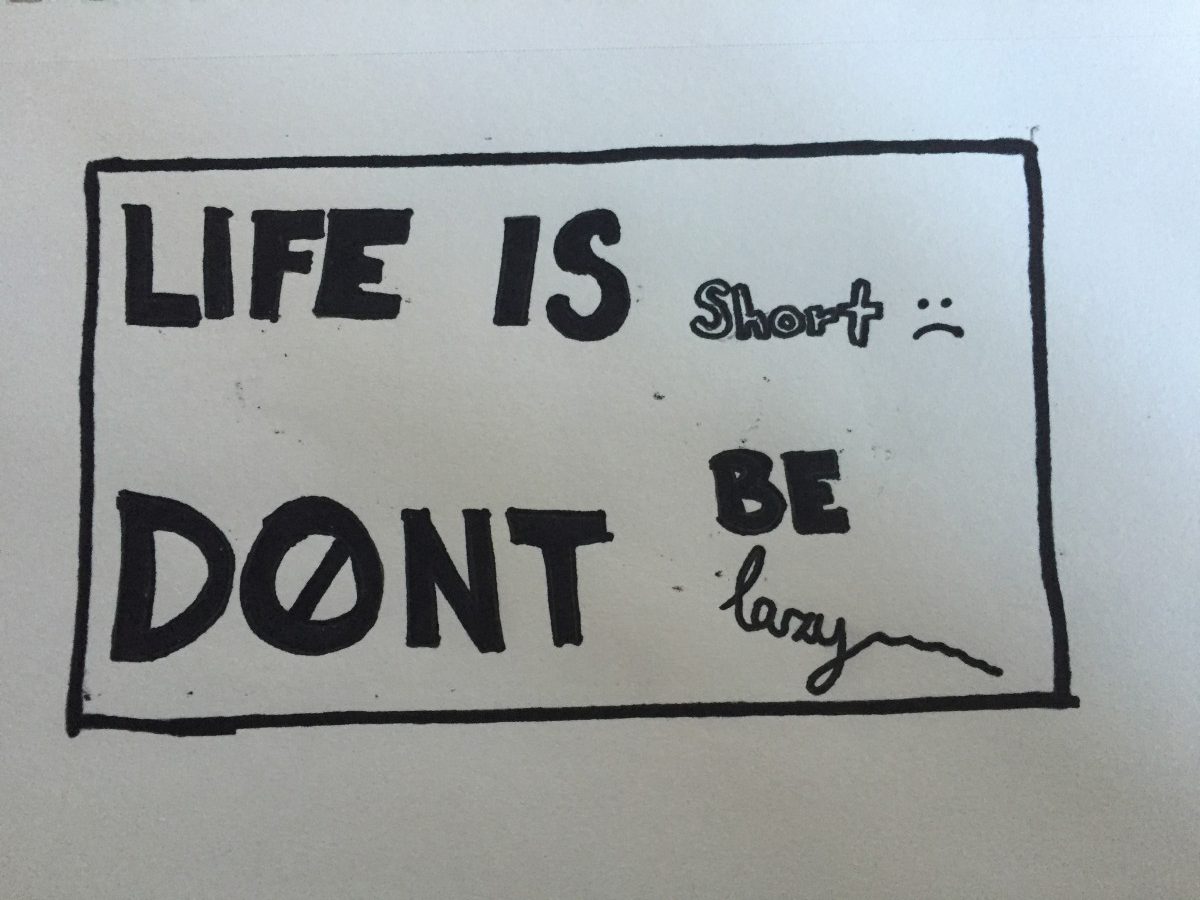
The typeface is Briem Script. This font is very thin which is why I liked to use it to display my quote. The way I visualized the quote on this piece is having the words “short” and “lazy” scream at the reader, but at the same time represent their flaws, being lower cased. In a way this motivates the person to get up and fix their flaws in their life to fulfill their potential.
I decided to change my visual quote, and after searching on the web I found one that says “Life is short, don’t be lazy”.
(This is where I got the idea) 


I chose to talk about BP because it’s a company that has been around since the 1920s. Before it was a brand, BP was a product range. In 1917 British cans of motor fuel that had previously been sold under the old label “Palm Tree Oil” were tagged as ‘”BP”, standing for British Petroleum. So far the company has a total of six changes done to their logo. From the beginning, a Mr.A.R. Saunders from the purchasing department won an employee competition in 1920 to design the first BP tag. A boxy “B” and “P” with wings on their edges, set into the outline of a shield. For the beginning, colors inside the shield did not matter. It wasn’t until the 1930s where they added the green and yellow colors to their logo.
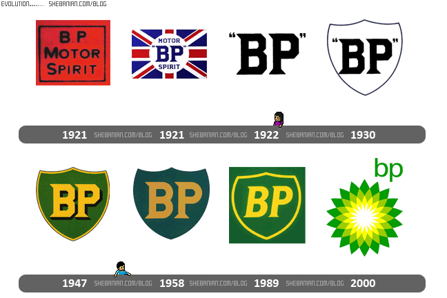
Long before BP gasoline was a mature product to need advertising of its own, some of the companies that would later join the BP group were helping to guide the medium. The original BP logo, known as the “classic shield” was designed by famous industrial designer Raymond Lowey. Introduced in 1979, it underwent a minor change in 1989. A fairly lighter shade was adapted to adjust the corporate image to a more “greener” look. The emblem was also given a cleaner appearance with the addition of a yellow border around the shield. Thus the shield logo stayed round till the 2000s.
Landor, a famous San Francisco design agency designed the current version of the BP logo. It was unveiled in the first quarter of 2000 to coincide with the widely known brand name change from “BP Amoco” to “BP”. This came about with a new slogan: “Beyond Petroleum”. The “Helios” symbol, consisting of a green and yellow sunflower, was designed to symbolize energy in its various forms. So these are the changes of the BP logo. The craziest fact is the price that was spent for the latest logo, a mere $211 million. Such an expensive design but very enriching for the San Francisco design agency.
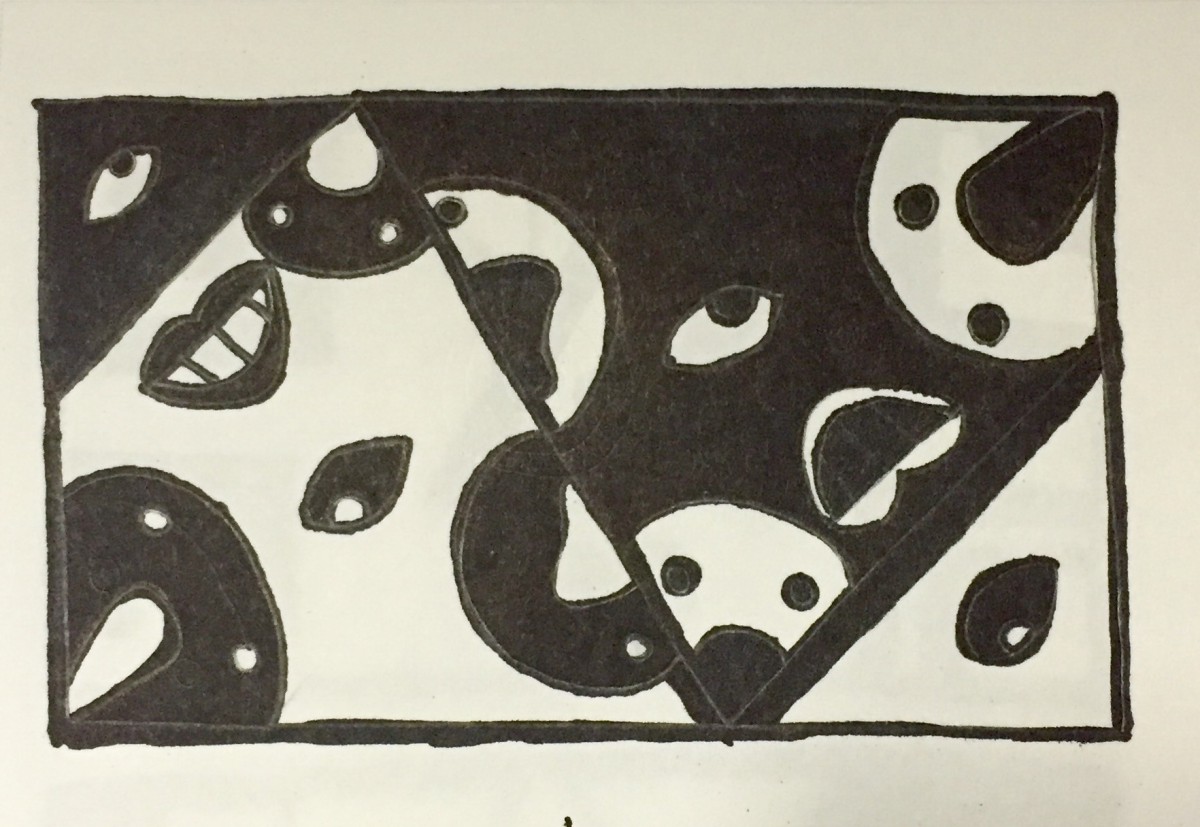
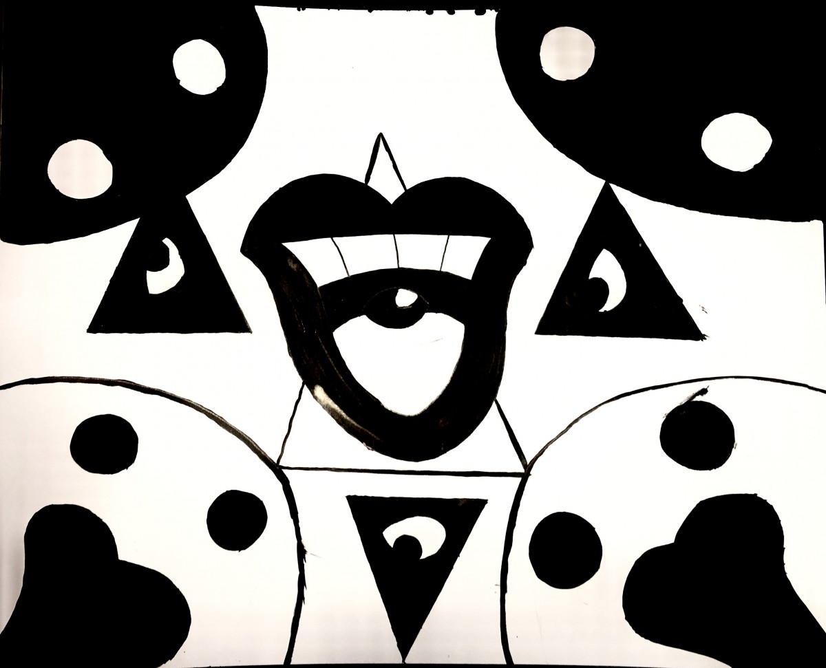
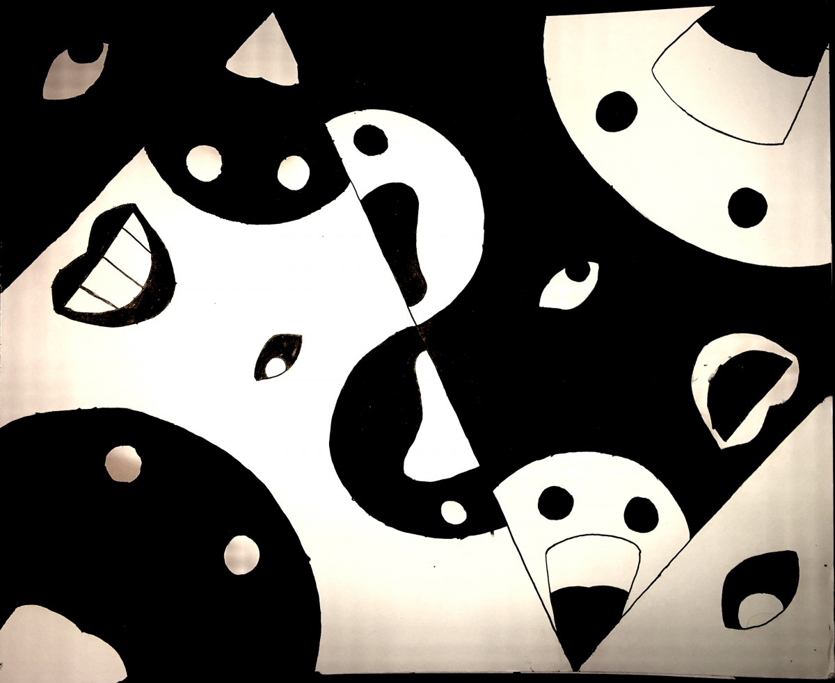
This is something that I have been working on. I like this project because, it represents the world around me. A lot of people looking, talking, and criticizing everyone and everything in this planet. This displays how I perceive the world through my young adolescent eyes. Especially on my portfolio this would go well as my banner, because many people will come on and see my work. In a way the little characters are funny, but the eyes bring this very still, creepy presence of stares. Hopefully this will come out to a final form and you will see it as a banner.
© 2024 Bekim Idrizaj's ePortfolio
Theme by Anders Noren — Up ↑
The OpenLab is an open-source, digital platform designed to support teaching and learning at City Tech (New York City College of Technology), and to promote student and faculty engagement in the intellectual and social life of the college community.

