From the field
AIGA 365 Design Effectiveness
Cenakovski
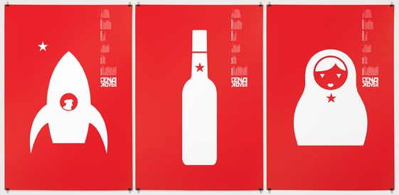 Design firm: Cossette/Identica
Illustrator: Marc-Andre Rioux
Discipline: Promotional design and advertising
Format: Poster
Upon entering the gallery, I was immediately drawn towards these vibrant, strong fluorescent red posters. “Cenakovski” is a collection of three 27 x 39 inch double-sided monochromatic posters with a high value of contrast created in offset printing. This collection was created as promotional material and also served as the menu for the fund-raising dinner to benefit Le Théâtre du Nouveau Monde, a thematic event whose creative platform is reinvented every year according to chosen theme and chef; this year’s theme being Russian. These posters stood out because of the really clear iconography and bold symbols.
Warning: Your Cell Phone May Be Hazardous to Your Health
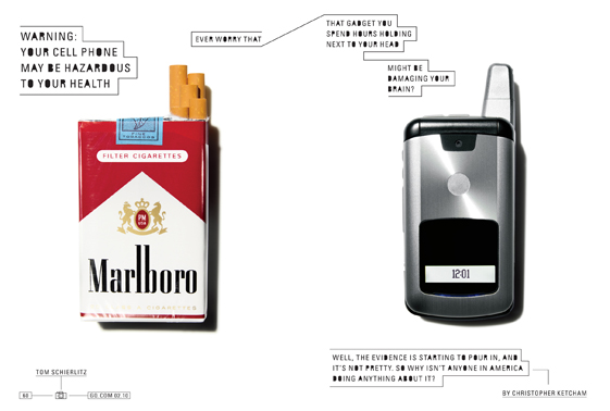 Design firm: GQ magazine, New York
Designer: Chelsea Cardinal
Photographer: Tom Schierlitz
Discipline: Editorial design
Format: Illustration, Magazine
An apparent feature that distinguishes this design is the fact that you get the point of the article without having to read it. Designed for GQ, a men’s fashion and general-interest magazine, this piece is simple yet eye catching with its play between the resemblance of the cigarette pack with a couple smokes protruding out of the top and the cell phone with its antenna. The text flow is well laid out drawing your eye from left to right across the page playing with a San-Serif font by blacking out the centers of certain letters to help create more contrast for the thin font type.
Chess
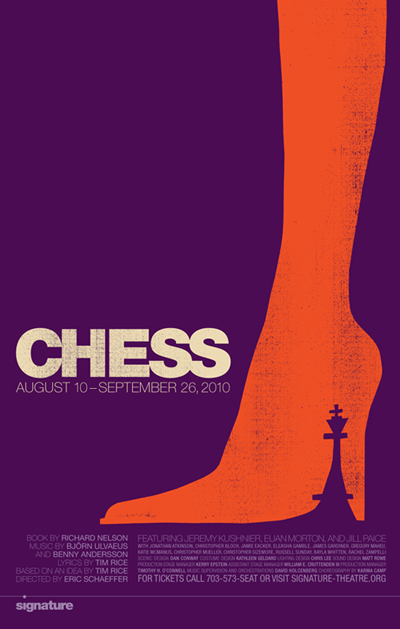 Design firm: Design Army, Washington, DC
Designer: Sucha Becky
Discipline: Promotional design and advertising
Format: Poster
I chose this poster for its play with the space between the heel and the shoe and the shape of the chess piece, this is a very simple and effective design. This poster was created to promote and sell tickets for this performance and to give a glimpse into the plot of the story. Great use of space and placement with the drawn out leg flowin you towards the main headline in bold and pertinent information following in a lighter weight font.


Recent comments