Academic Examples
Visually enhanced quote
The wonders at your feet – Visual enhancement
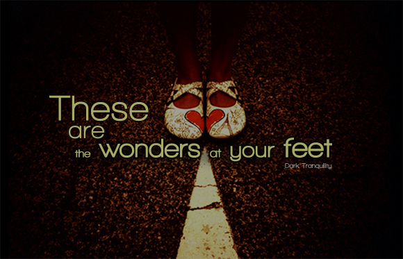
In this version of the quote enhancement I used a san-serif type face and pulled a light yellow from the image to create a soft blend but still maintain the contrast. The image used, with the arrow pointing to the heart shape on the shoes helps draw your eyes to the flow of the text and creates a break between the quote creating a new thought that for some love is a wonder and for others it is right before their feet.
The wonders at your feet – Type enhancement
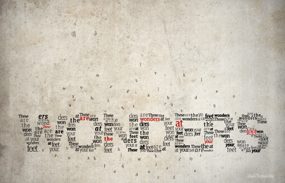
After staring at this quote for some time I found that the whole of the quote added up to the same amount of words as there were letters in the word “wonders,” which is the main focus of this piece. I wanted to emphasize “wonders” a little bit more for this one, and create something with just the type to enhance this quote. This piece works because there is some wonder to it, and the wonders at your feet can be anything this world has to offer us with interpretations varying for each individual. The font used on this project is Unit Slab Pro with the quote emphasized in red to provide the needed contrast.
The wonders at your feet – Type/Visual enhancement
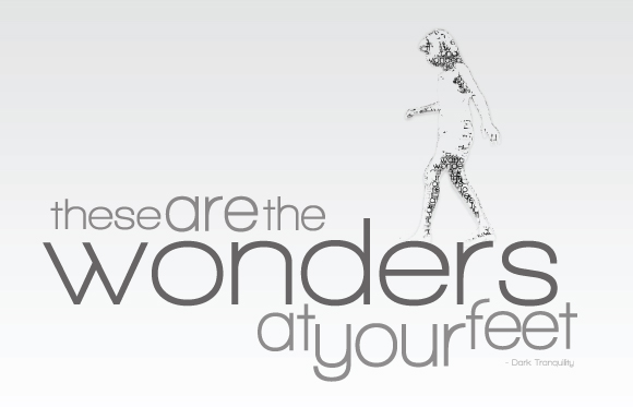 For this version of the quote I wanted to do something very simple yet effective. I created a silhouetted youthful child out of the quote and playfully placed her jumping across the letters of the word “wonders” beneath her feet. This is to symbolize the “wonders” and curiosities of childhood and youthfulness. For the font I used Walkway Expand Bold and played with various text size, weight and opacities to emphasize the quote as needed. The background is plain white the help create the contrast needed and to keep to a minimal design concept without cluttering up the page.


Recent comments