
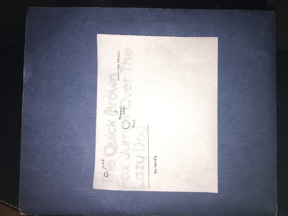
Typeface: Sans Serif
Font: Quicksand Regular
Size: 50 points
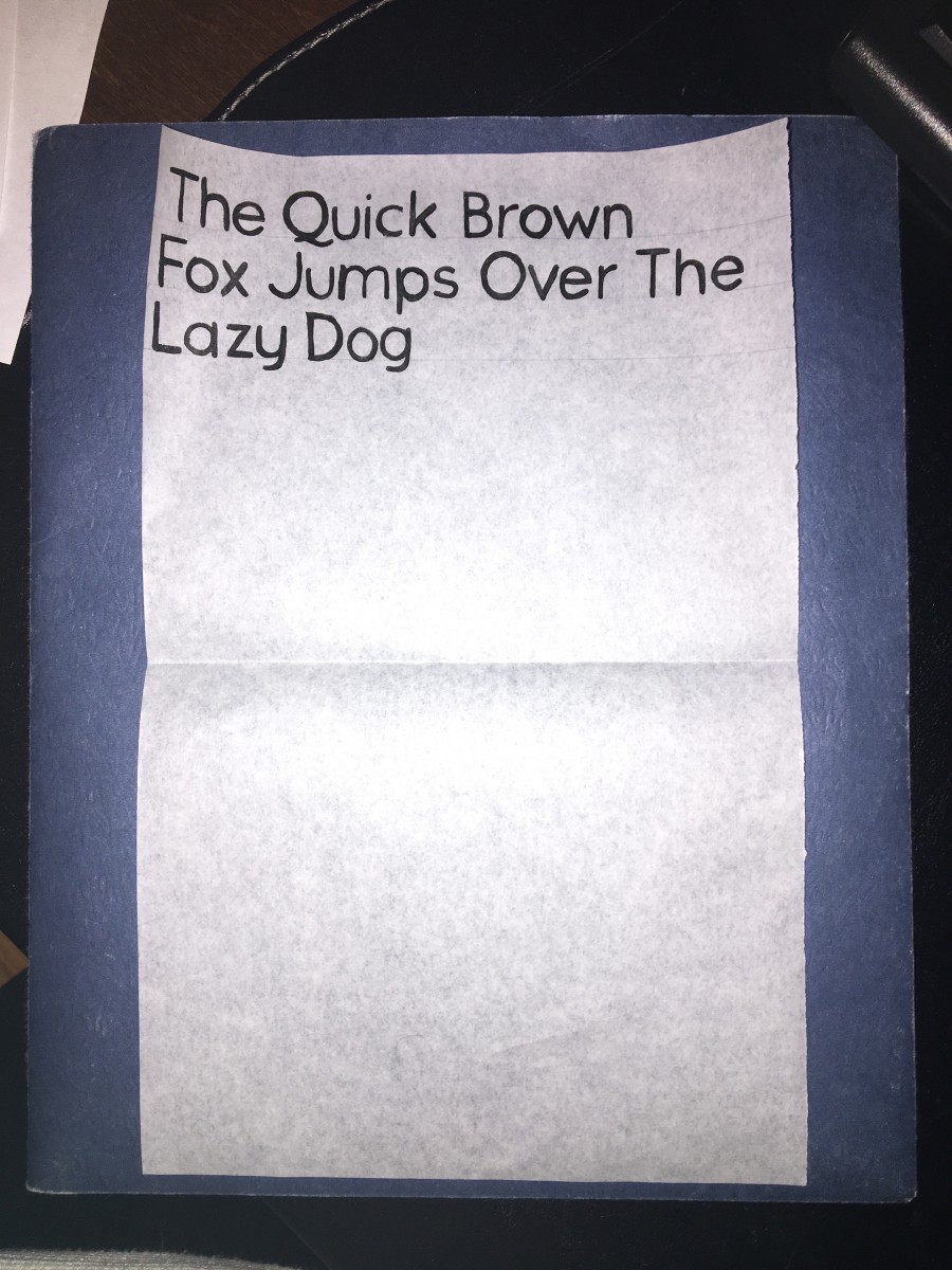
The transition between the first sentence and the second was the kerning. Although there might not seem like there is a huge difference, some words are spaced closed together, while in the second sentence each word is evenly spaced out. The letters that I found challenging were the ones that went over the baseline because I had to decide where to put them. When it came around to the second attempt, I was sure to kern each letter evenly and to make sure the letter touched the baseline.


Im Shari Adriana’s critique partner I think I like her font ”Quicksand Regular” tracing papers its nice. Adriana need to work on kerning but the tracking is very good it shows connections betweens the group of words.