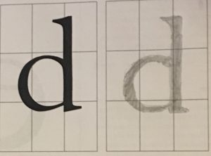
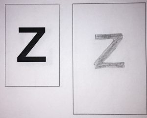
Old Style Family: Garamond (15th – 17th Century)
This type resembles classical calligraphy. I made sure to keep strokes thick and to make the serifs curved.
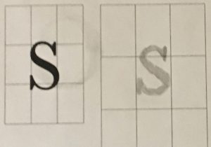
Transitional: Baskerville (Mid 18th Century)
This type has thick and thin strokes and therefore contrast. I made my serifs sharper for this type.
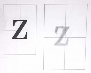
Modern: Bodoni (Late 18th Century)
With this type I remembered to keep brackets to a minimum. This type has an extreme contrast between strokes and hairlines.
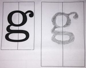
Egyptian or Slab Serif: Clarendon Light (19th Century)
There’s very little contrast between thin and thick strokes. For this type I focused on heavy serifs.
San Serif: Helvetica (19th – 20th Century)
This type is balanced and legible. I focused mainly on having no serifs.

