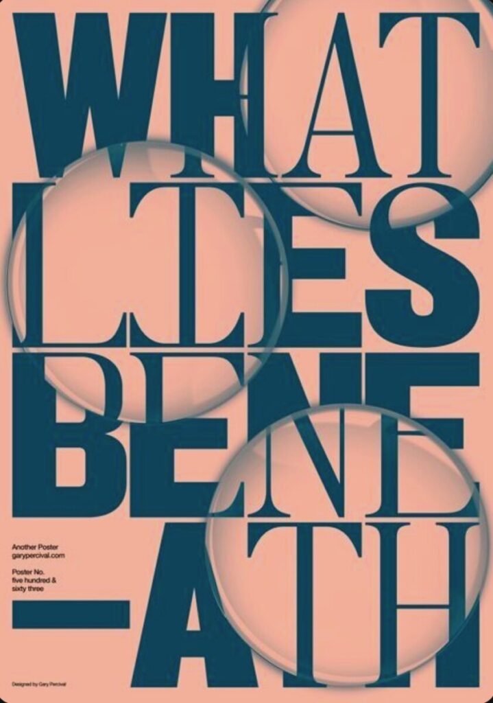


First image: I was looking at different designs with type on my Pinterest and came across this one. I enjoy the use of the circles in the poster which either represents a magnifying glass or a bubble. I enjoy the use of the space the designer used in their work. The type takes up majorly of the space but doesn’t feel too cluttered.
Second image: I also picked this image because of the play with the type. I enjoy how the colors are so simple but the way the type is manipulated makes this design a lot more appealing to look at.
Third image: I chose this image because I like the placement of the face and type in this design. The use of the different reds reminds me of how we have to make different hues of colors while painting.


